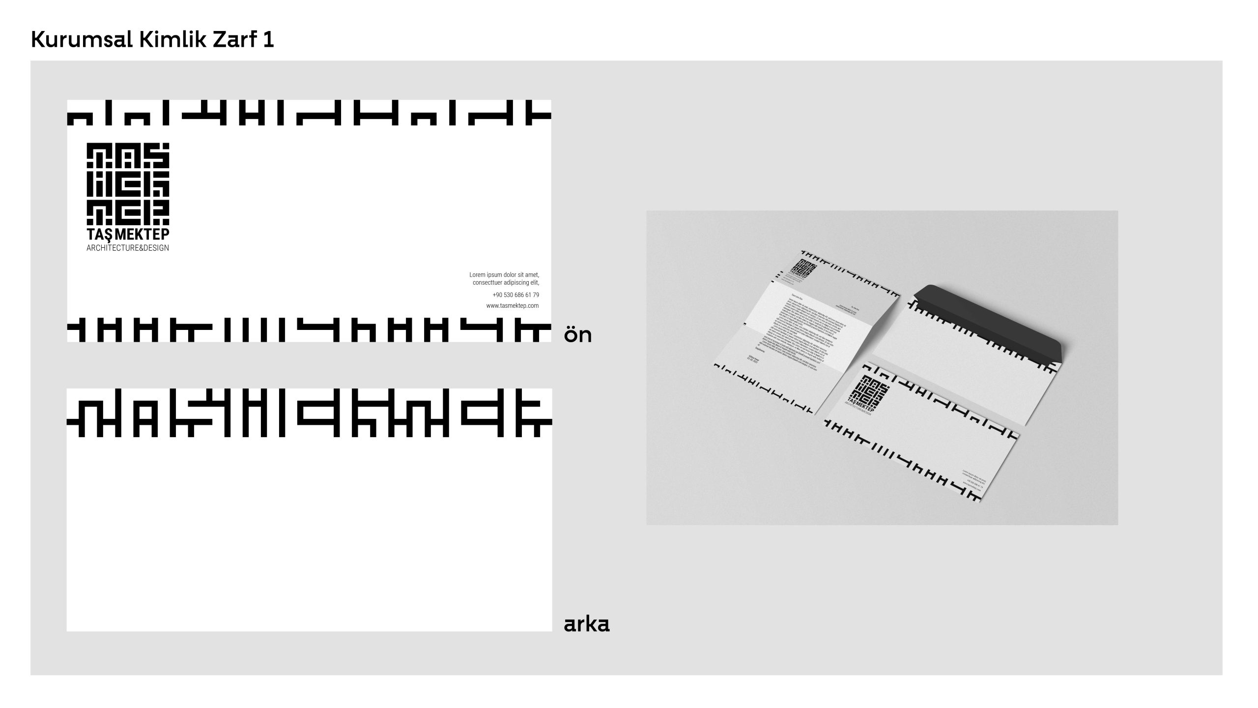
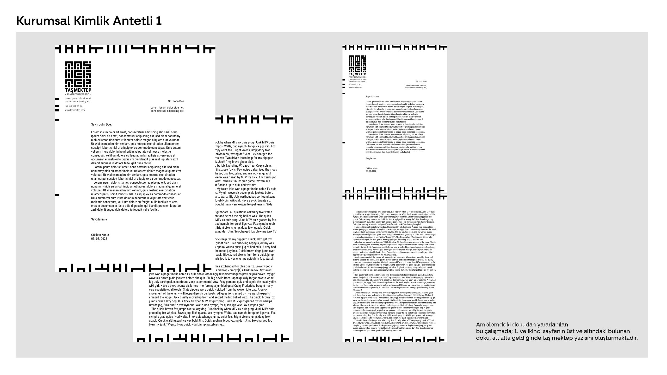
Taş Mektep, an architecture firm aiming to enrich living spaces with aesthetic, luxurious, and timeless stone designs, approached our agency as the first step in its establishment journey. Taş Mektep sought a corporate identity that reflects the firm’s unique vision and high standards, requesting a strong and confident visual identity.
- Visual Identity
- Website
- Social Media Design
Logo Design:
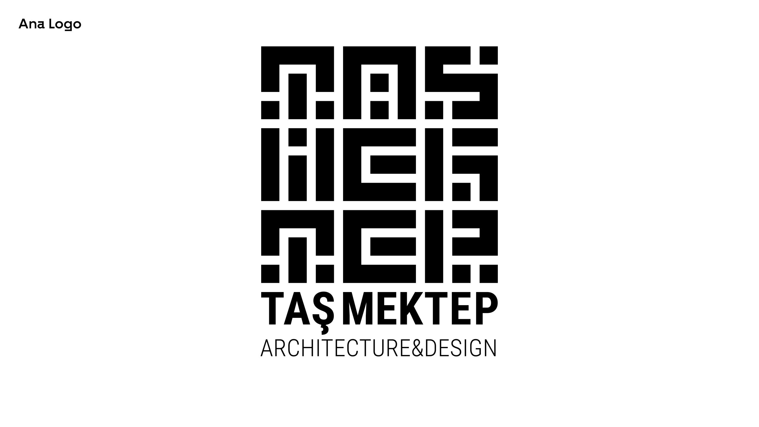
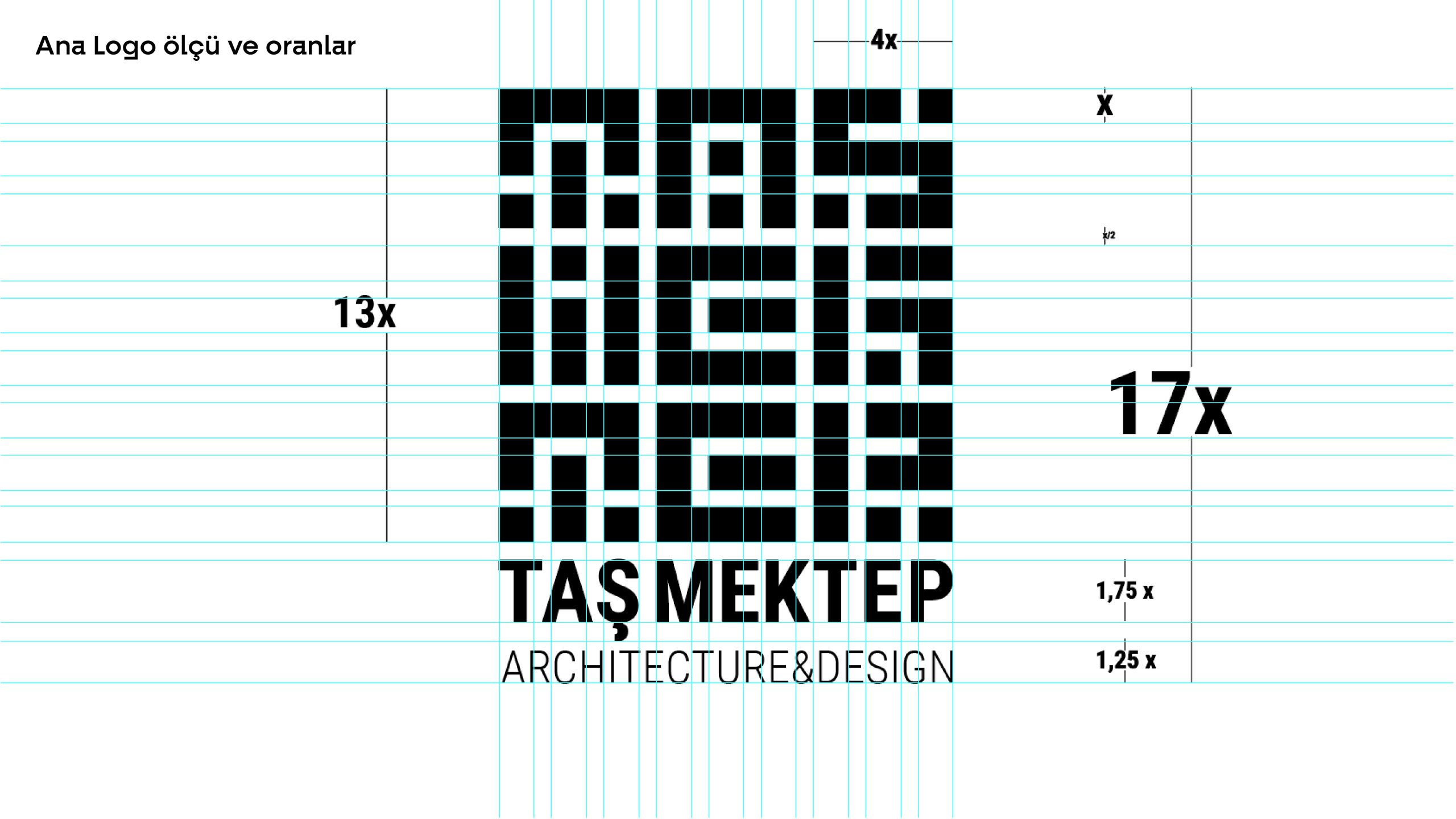
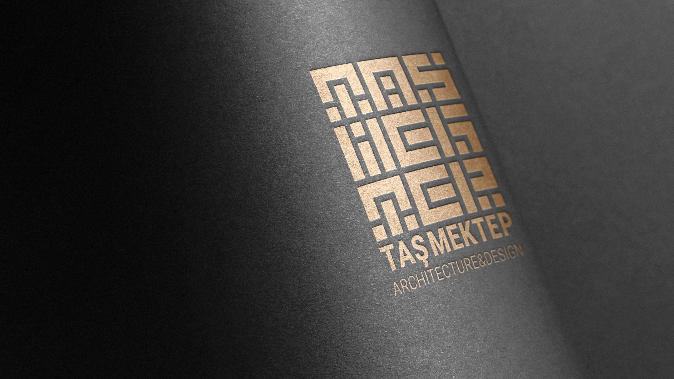
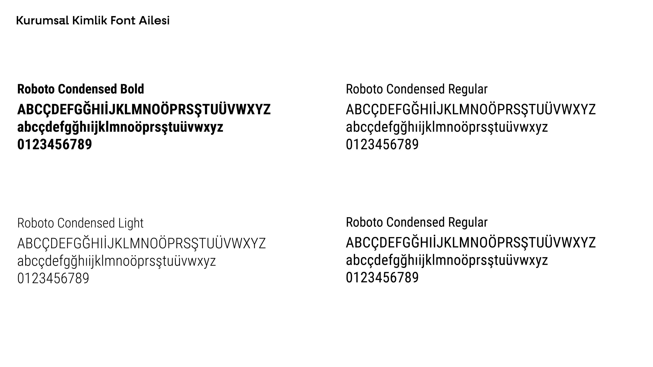
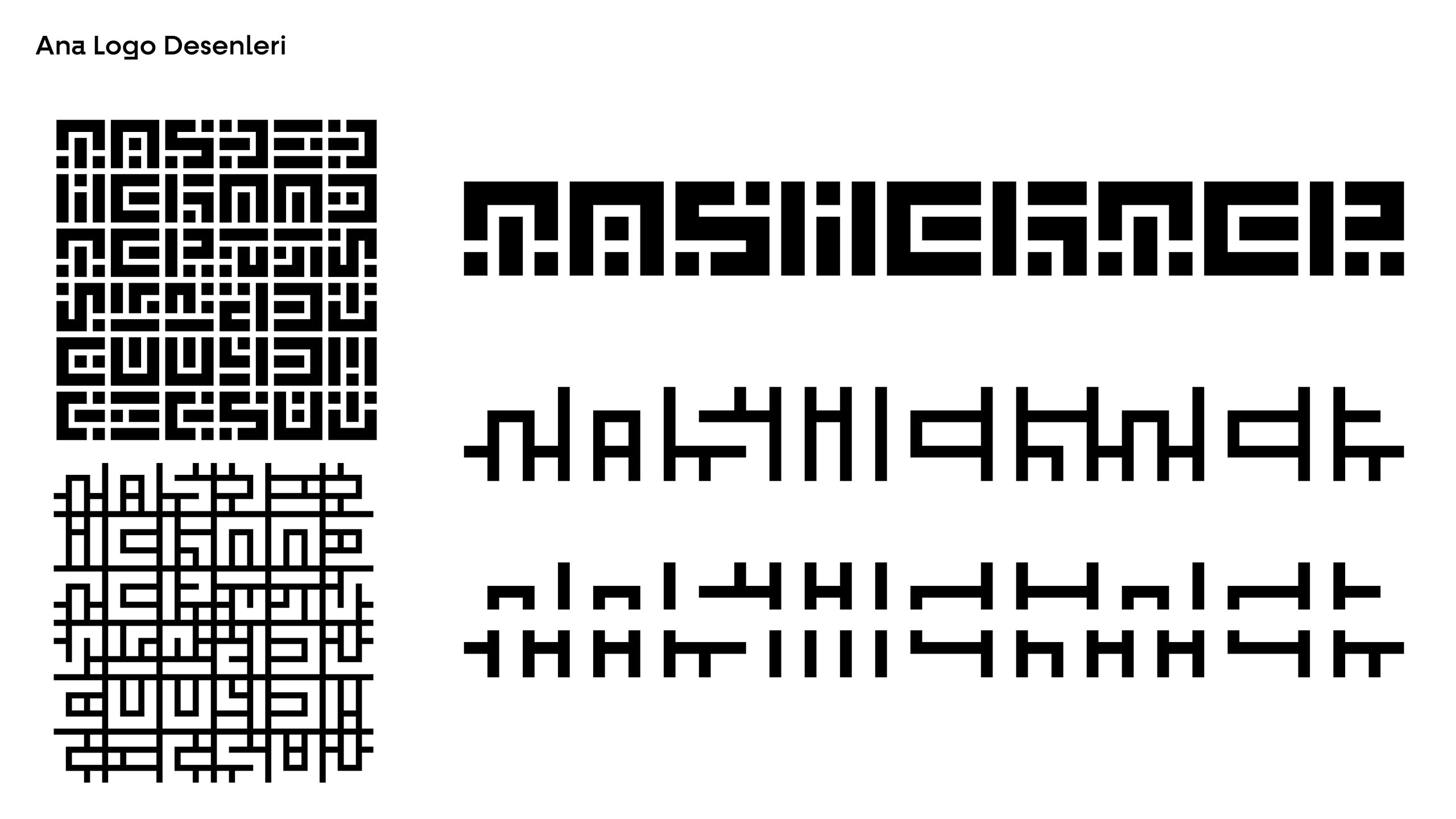
The logo was designed to form the words "Taş Mektep" with a block stone aesthetic that evokes the feeling of stone walls. This approach creates a strong visual impact while symbolizing the firm's focus on stone-based architecture. Typography: To ensure readability, a clear and modern typeface was chosen to balance the detailed stone-like emblem. The light and distinct typography ensures easy recognition of the company name and adds an overall sense of strength and quality to the logo.
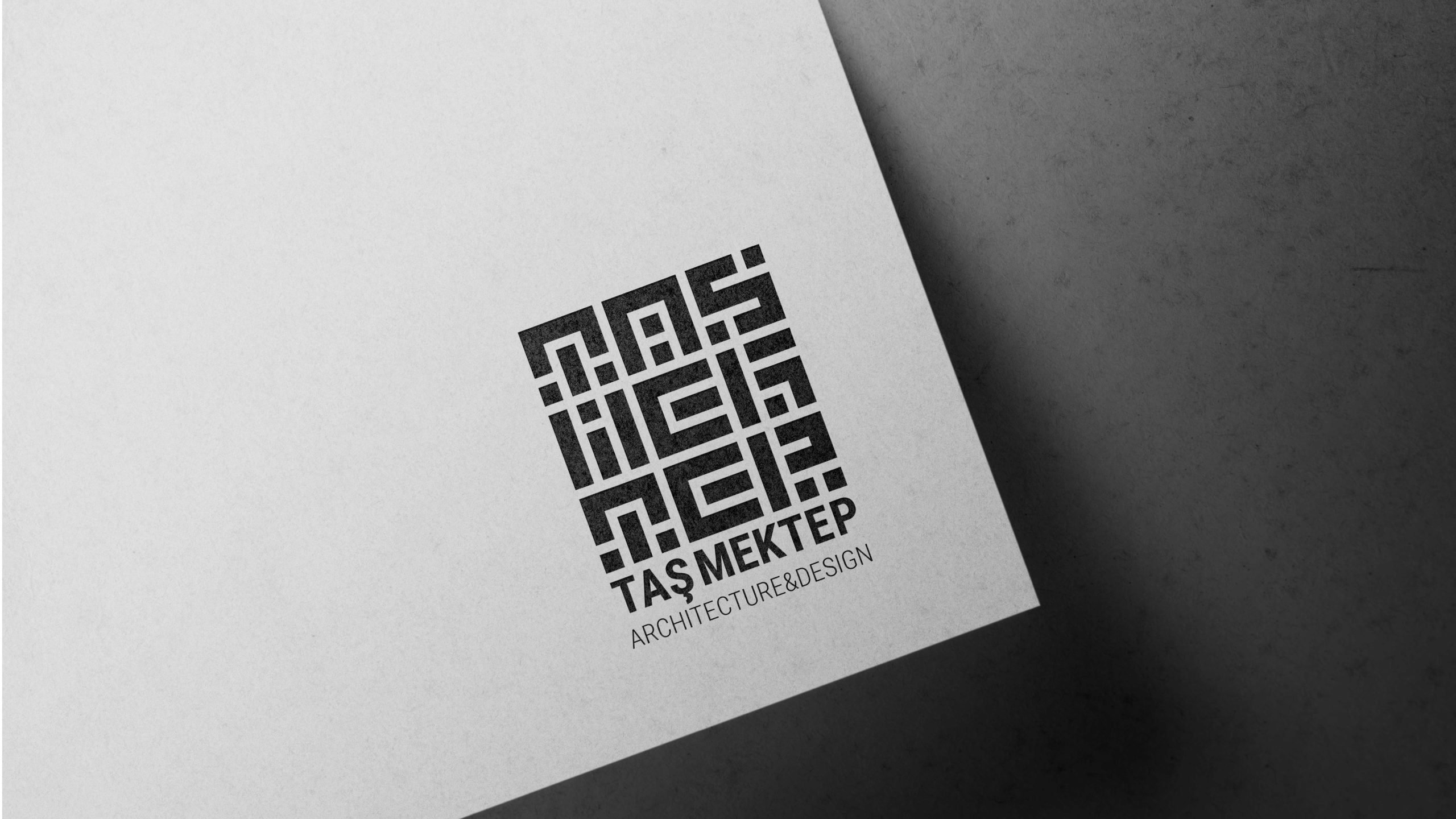
Color Palette: The use of black and white provides a classic and timeless appearance that reflects the firm’s commitment to luxury and high standards.
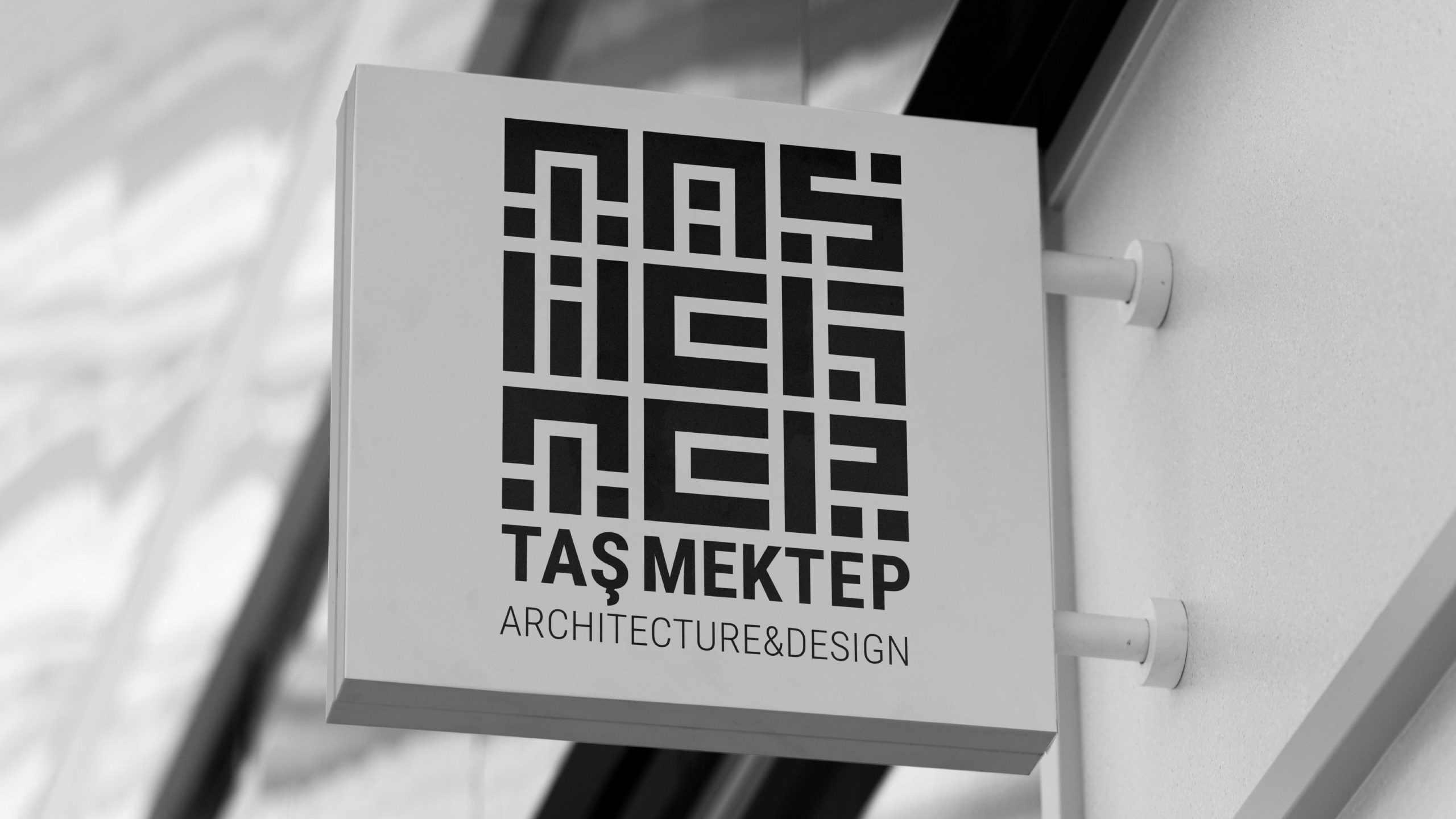
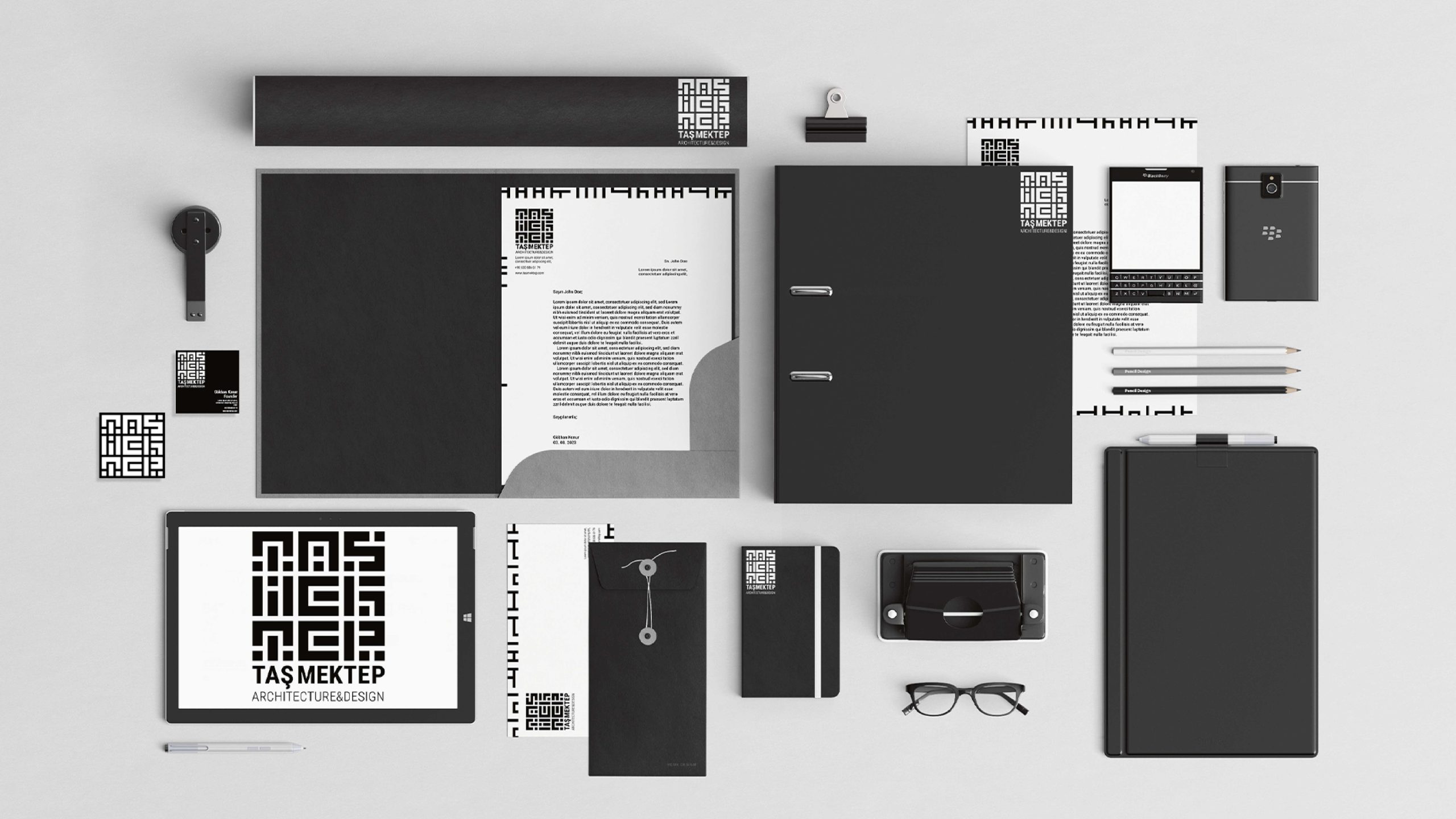
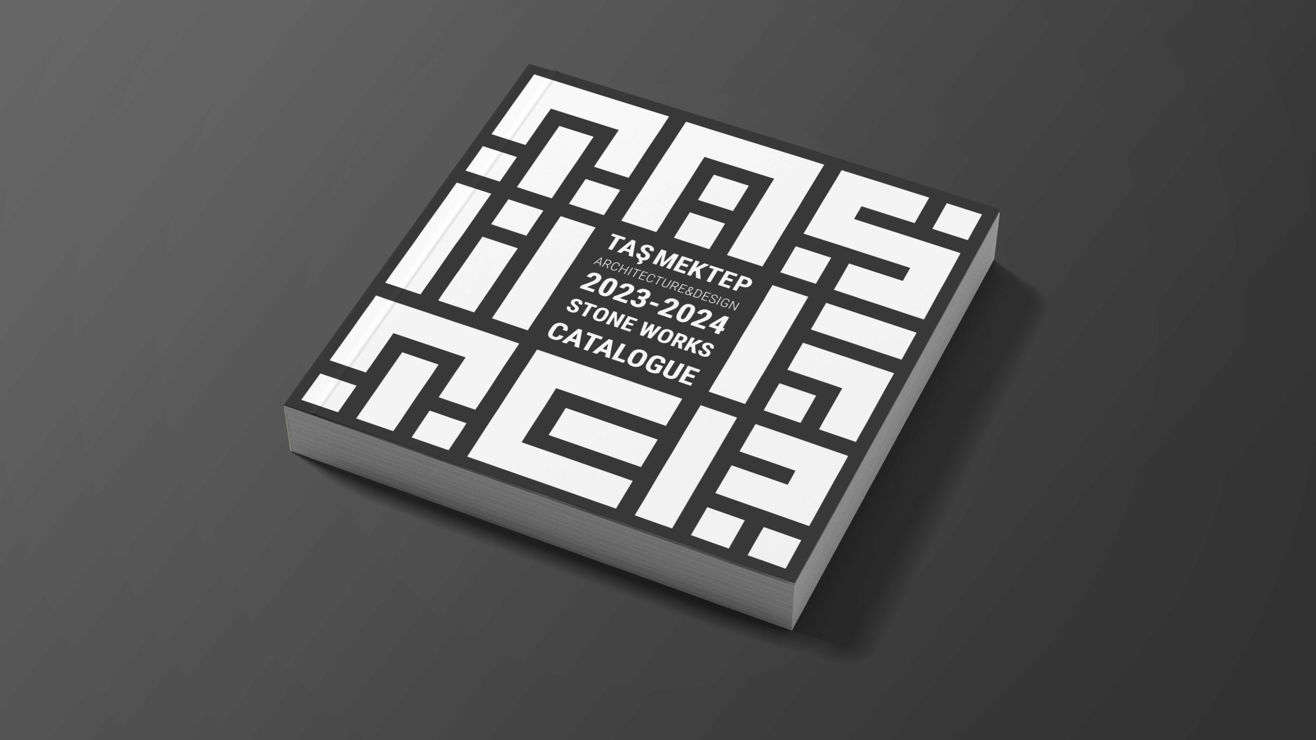
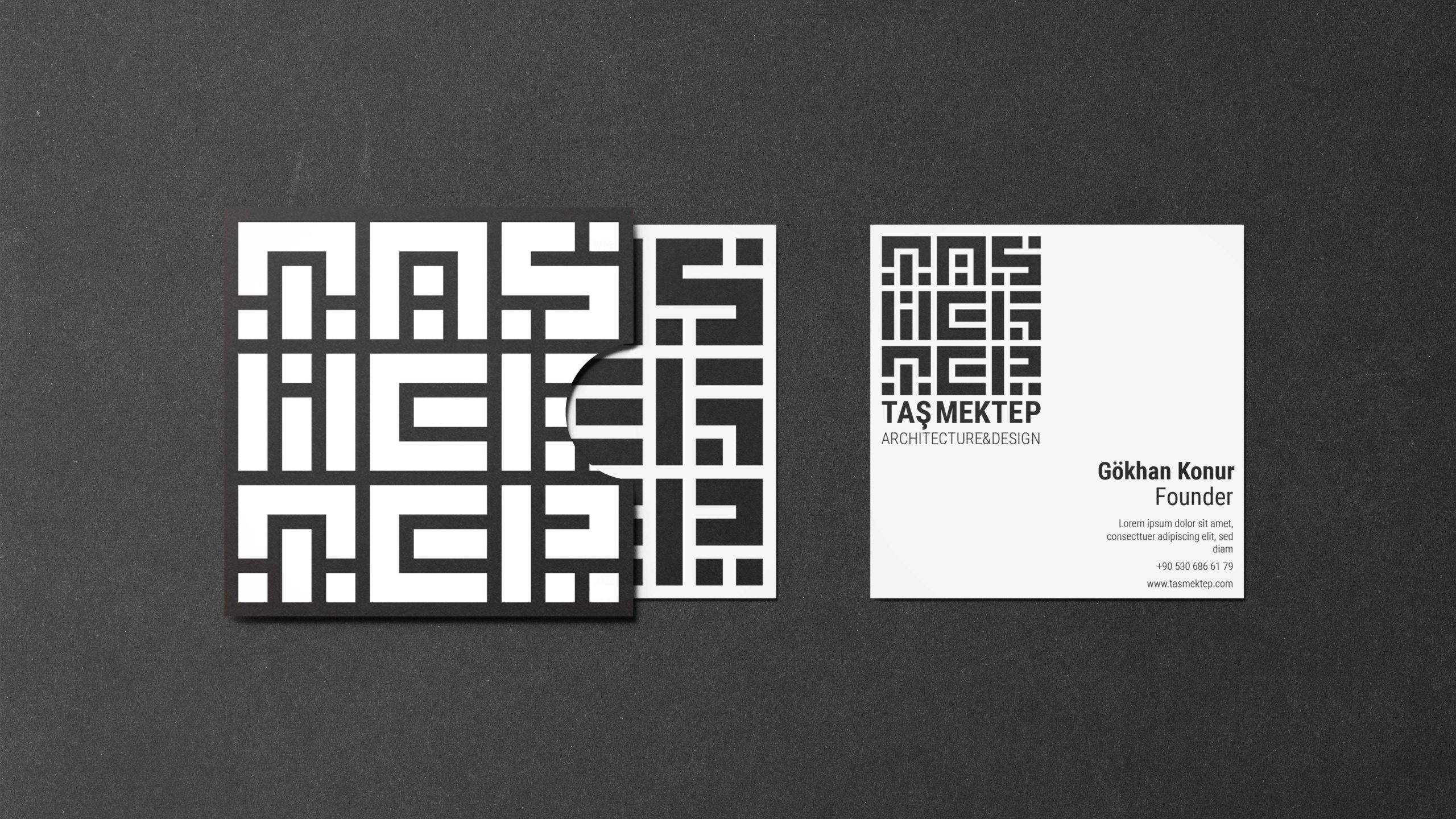

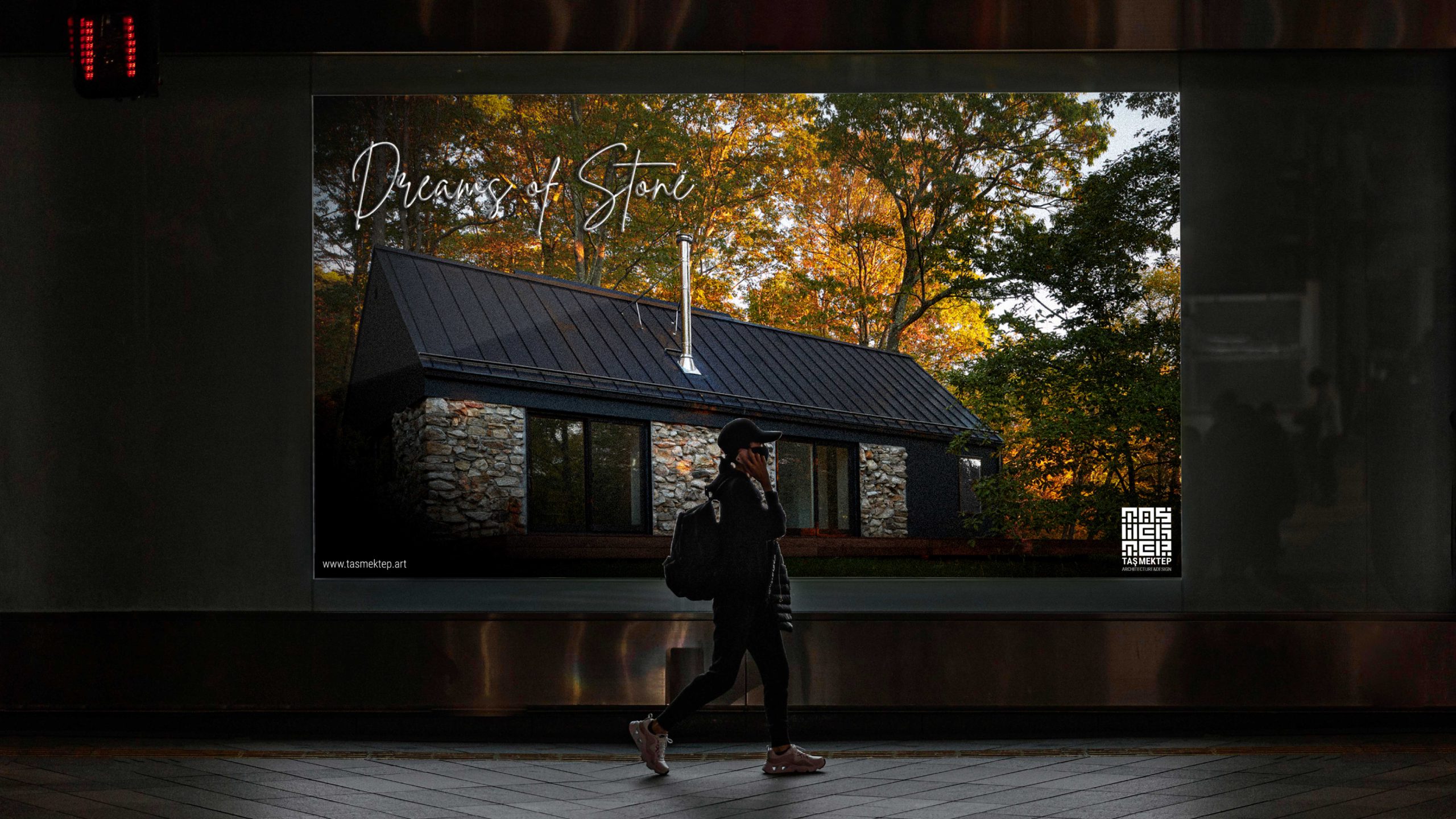
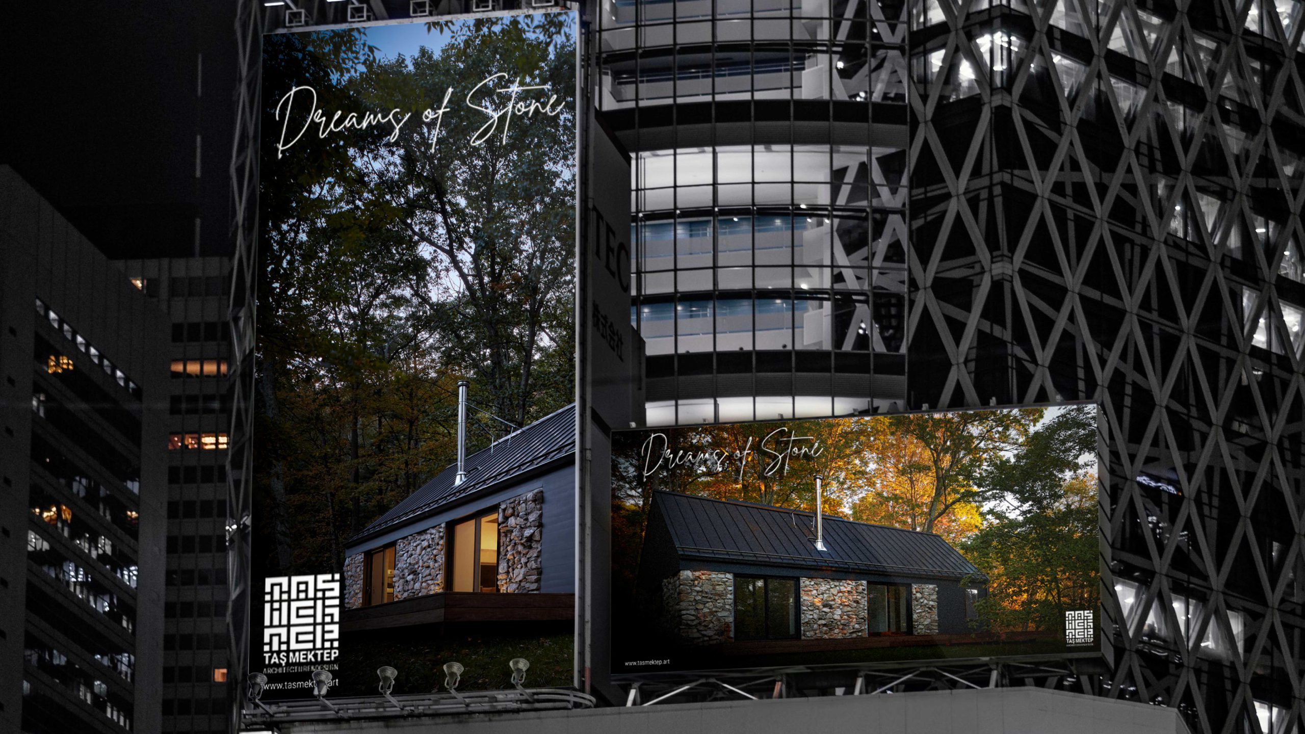
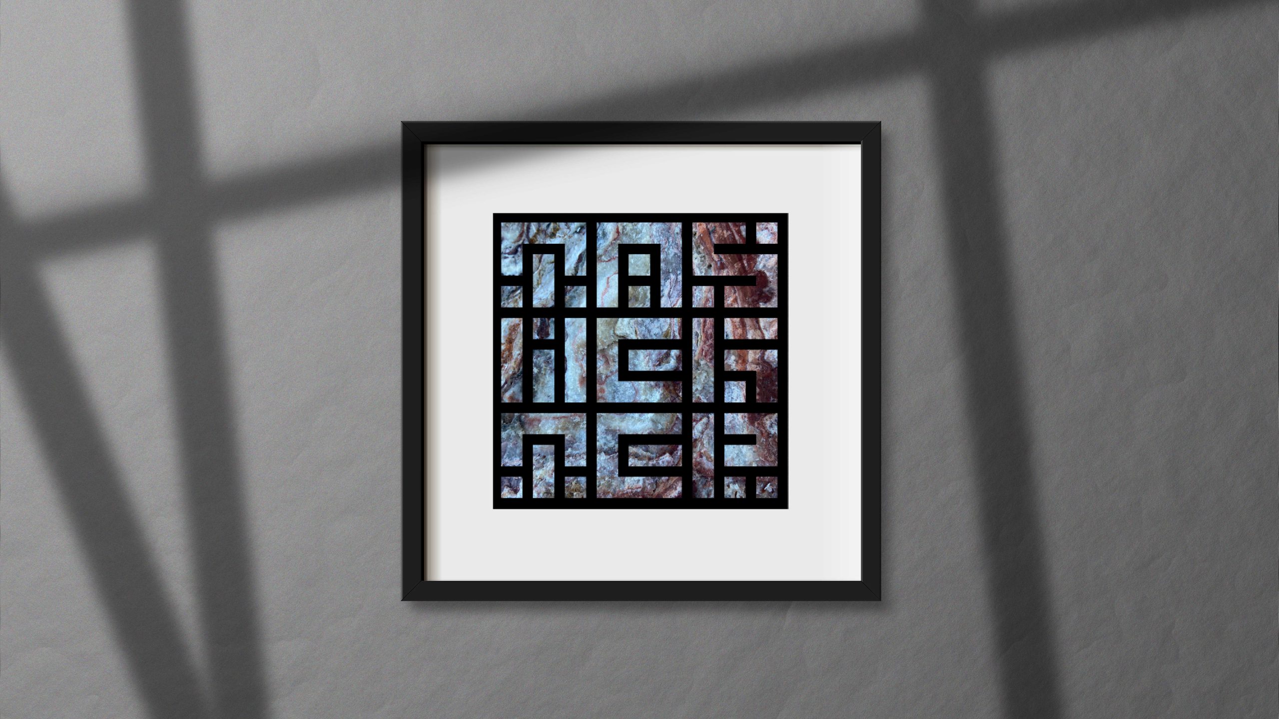
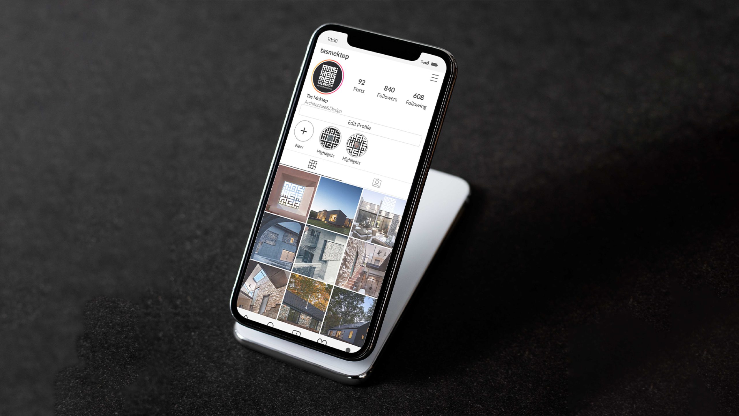
When designing Taş Mektep's logo, we aimed to create a strong and timeless visual identity that reflects the essence of stone architecture. By transforming the name "Taş Mektep" into an emblem with the form of a stone wall and a block stone feel, we sought to express the brand's solidity and texture.


