fbpx
LOADING, PLEASE WAIT..
Visual Identity

Ulaş Alüminyum

THE NEW IDENTITY NOT ONLY INCREASES BRAND RECOGNITION BUT ALSO STRENGTHENS ULAŞ ALÜMİNYUM’S LEADING POSITION IN THE ALUMINUM INDUSTRY.

BRAND STRATEGY
DESIGN PROCESS
BRANDING

Ulaş Alüminyum, which specializes in window joinery and other aluminum works, approached our agency with a request for a strong and modern logo redesign. The goal was to create a visual identity that reflects their expertise in the aluminum industry and their innovative approaches.

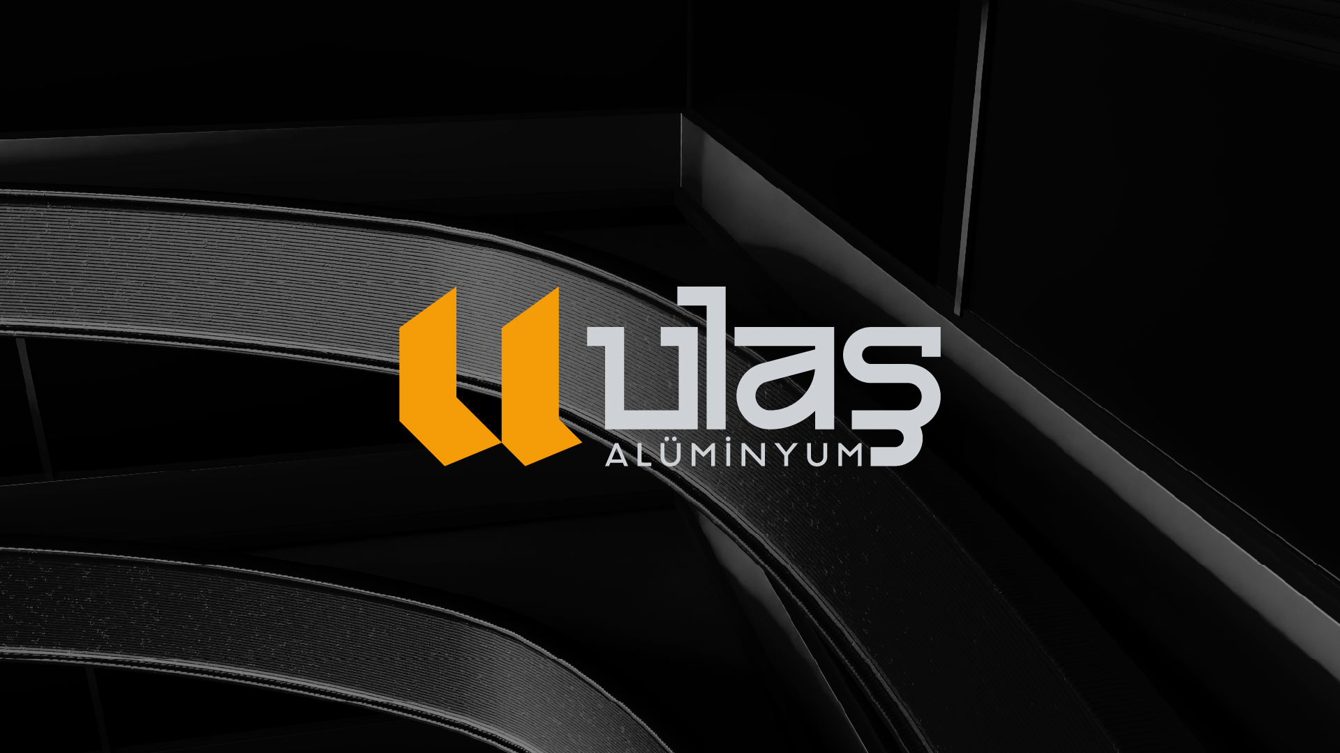
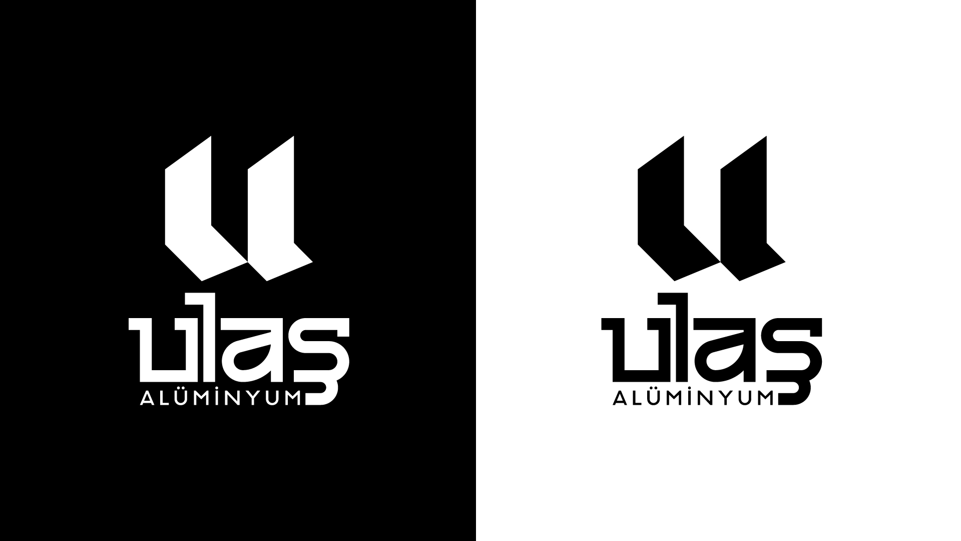
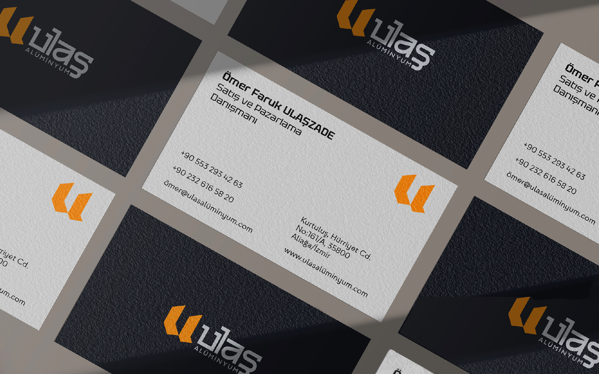
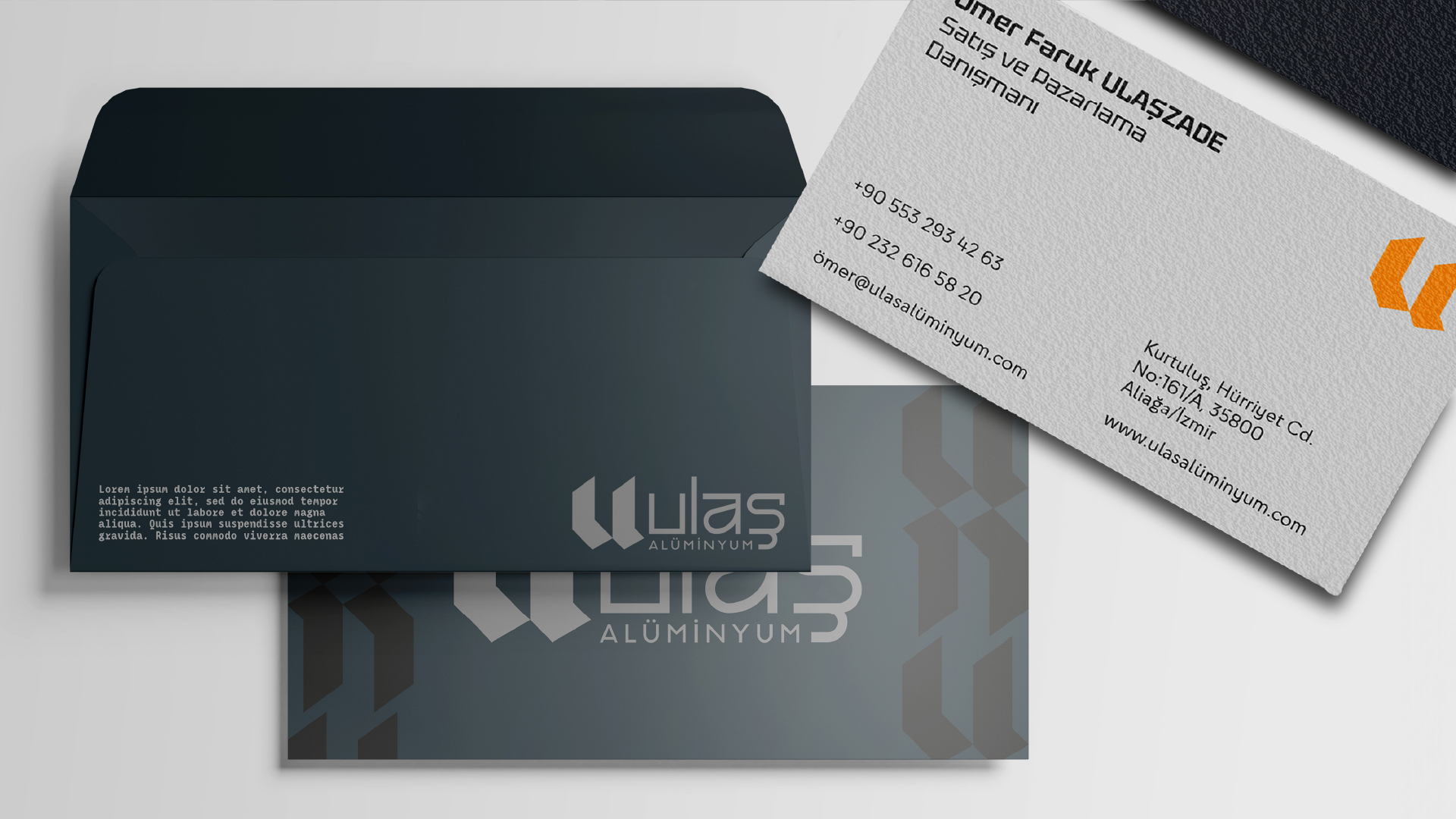
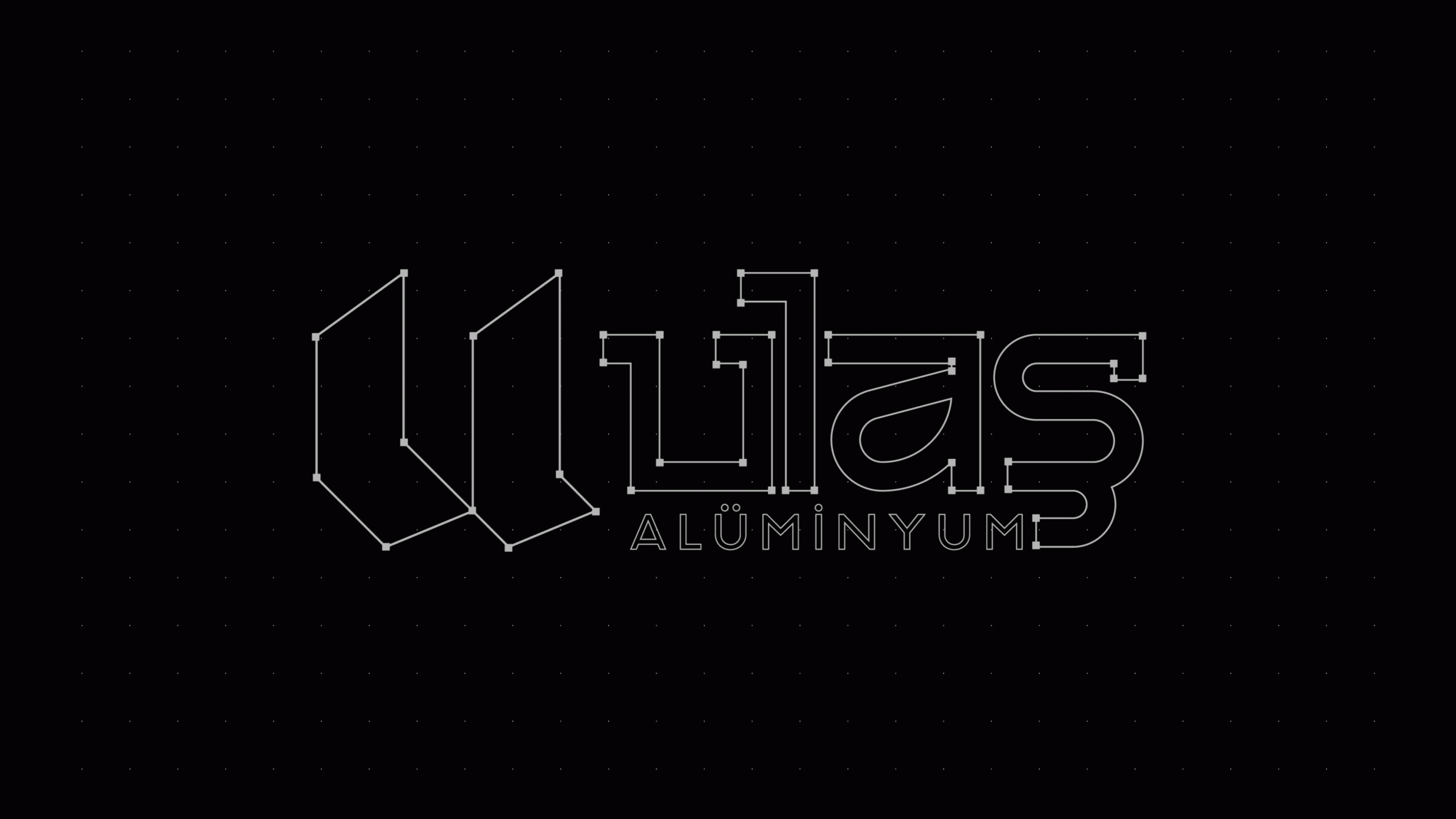
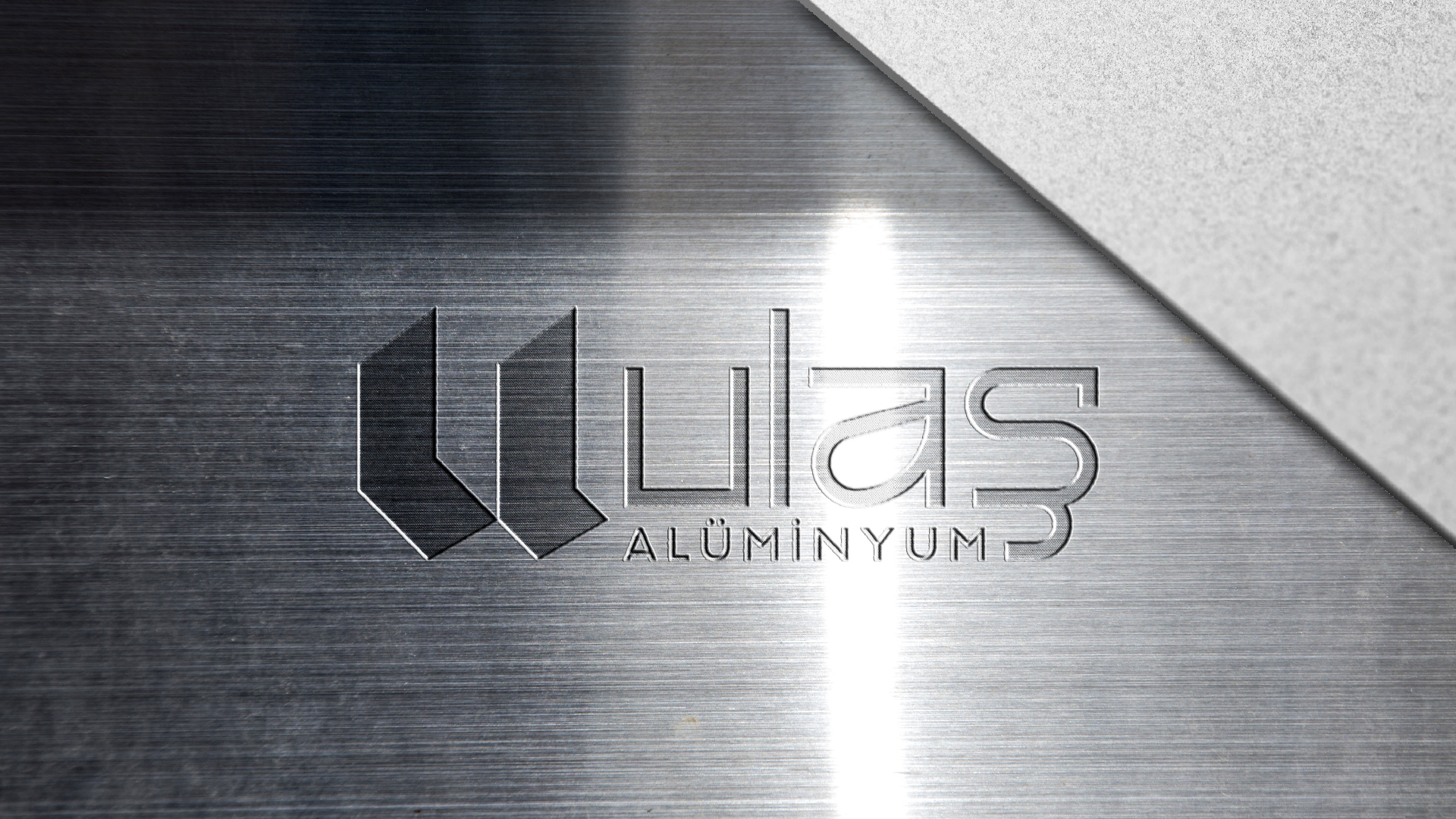
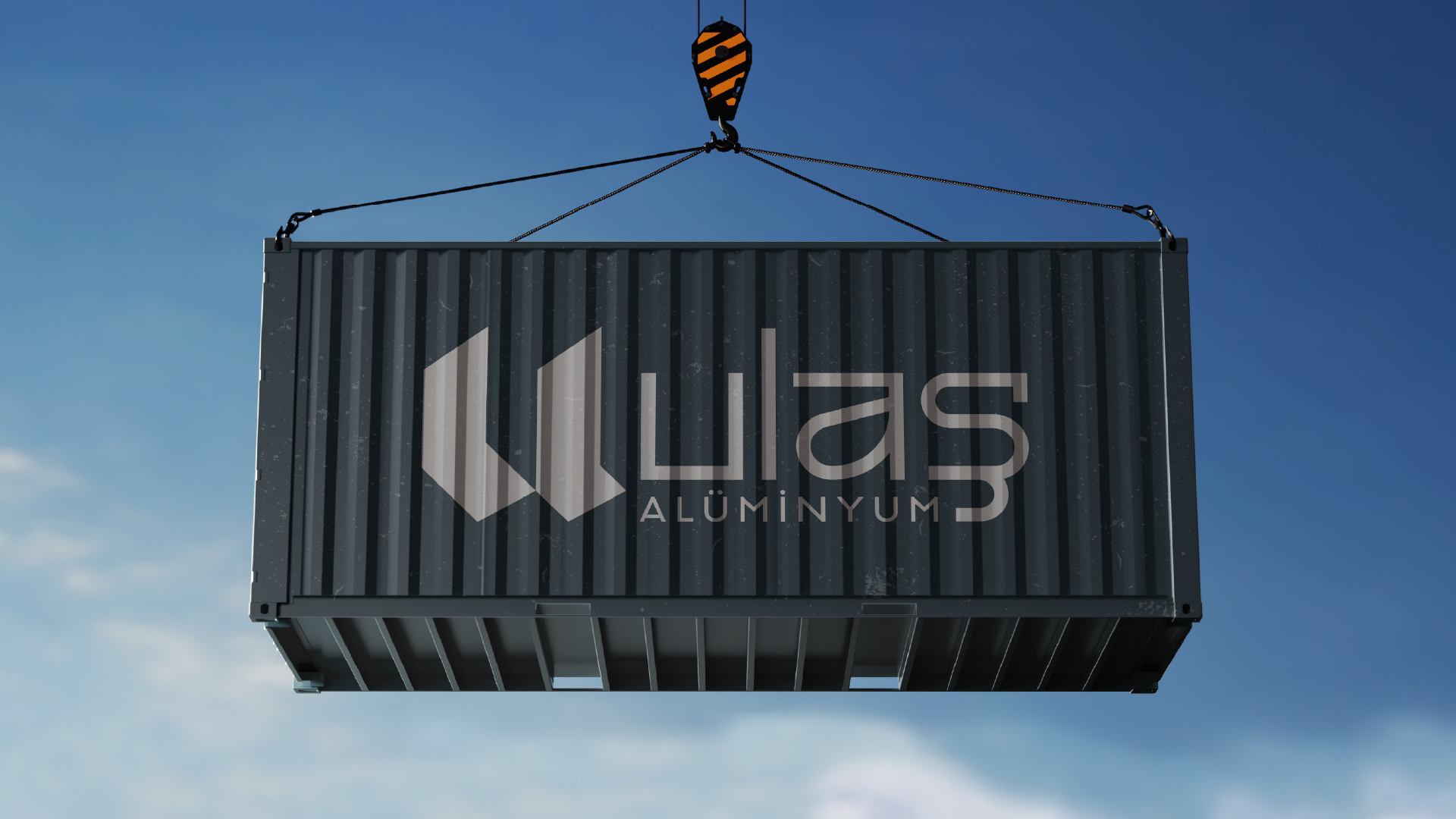
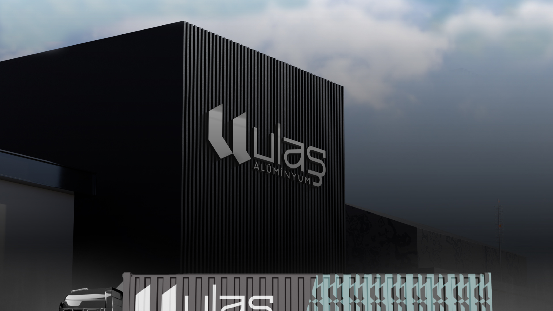
To develop a strong and contemporary logo, we focused on the letter "U," which is central to the company's name. The design was inspired by the window sill form, symbolizing the essence of their work. As a result, a robust and modern logo emerged that represents the company's name and core services.

Typography:

For the logo text, we chose the "REROSS-Quadratic" font, which offers a modern and geometric aesthetic. For the corporate identity, we used the "TEKTUR" family in various weights to provide versatility and consistency across all brand materials.

Design Process:

bold orange and sleek gray, representing the dynamic nature of the company and the industrial aspect of its services.

Application: The new logo and corporate identity were applied to various brand materials, including business cards, signage, and digital platforms. This new identity not only enhances brand recognition but also reinforces Ulaş Alüminyum’s leading position in the aluminum industry.

Result:

Ulaş Alüminyum, which specializes in window joinery and other aluminum works, approached our agency with a request for a strong and modern logo redesign. The goal was to create a visual identity that reflects their expertise and innovative approaches in the aluminum industry.