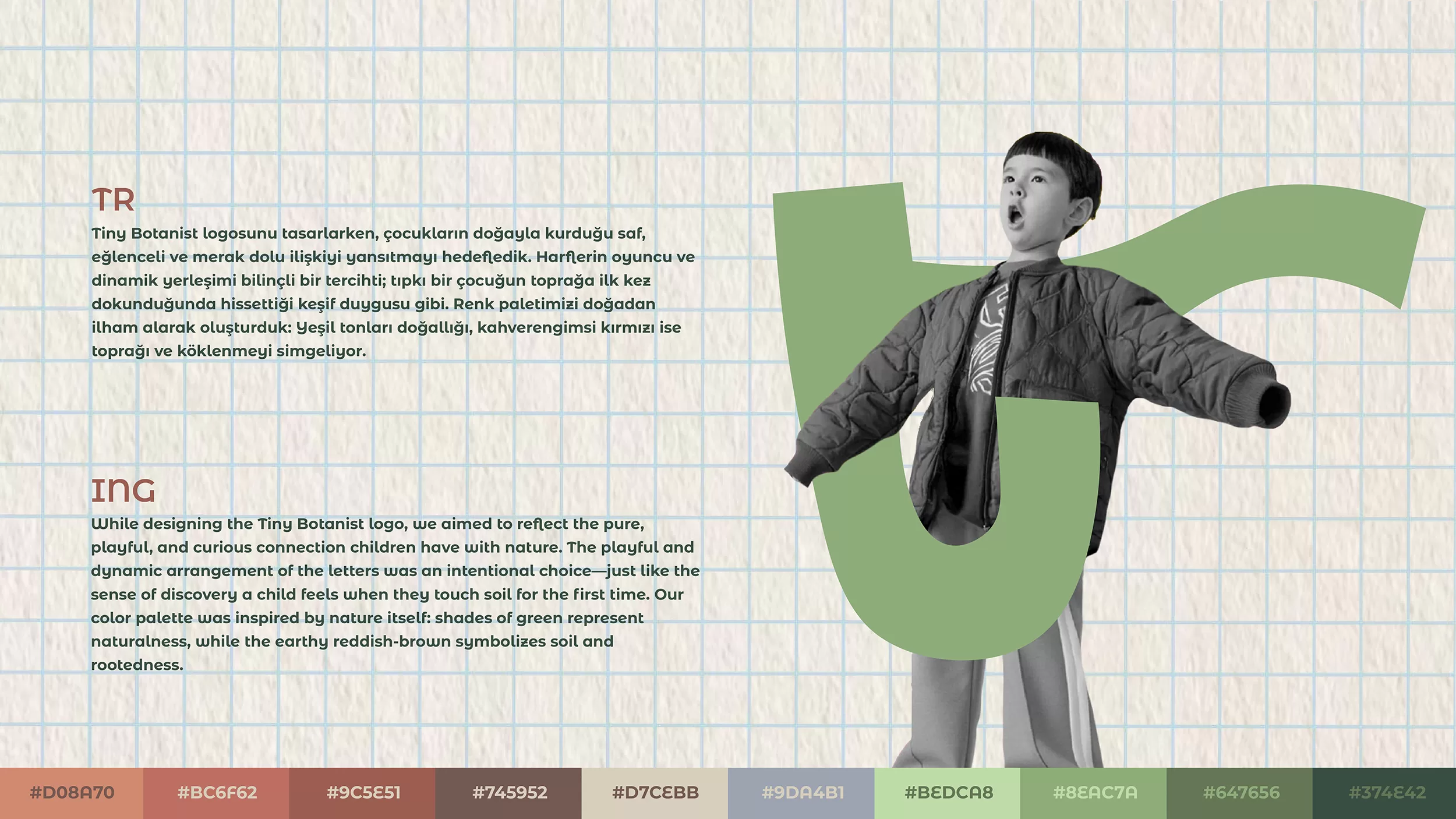
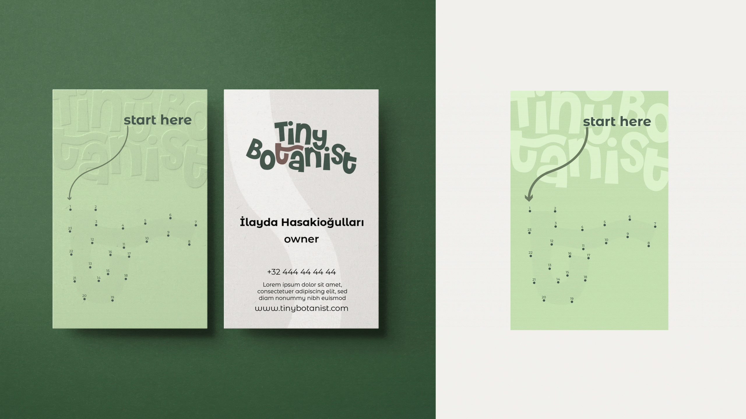
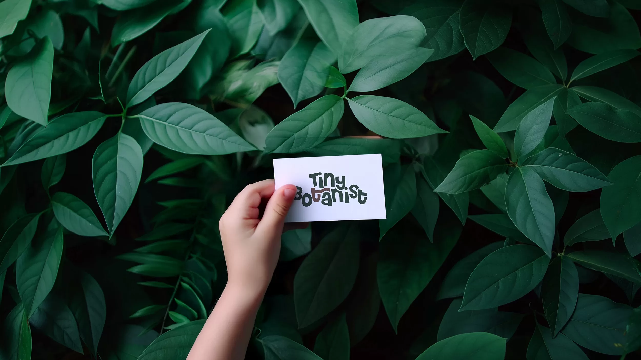
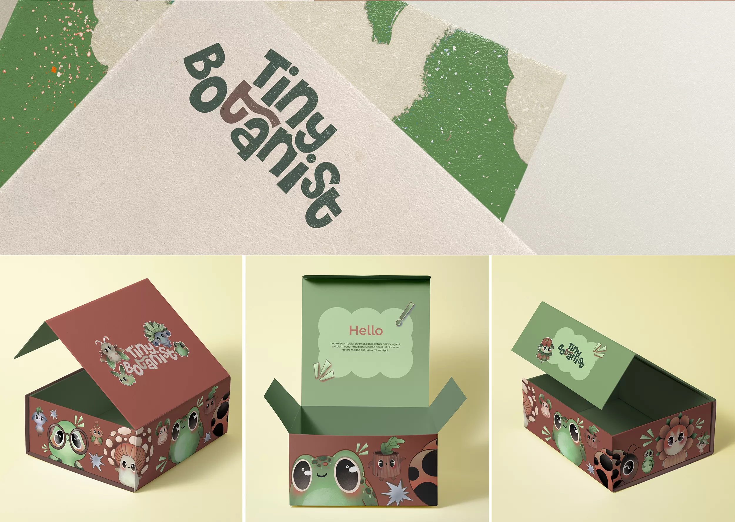
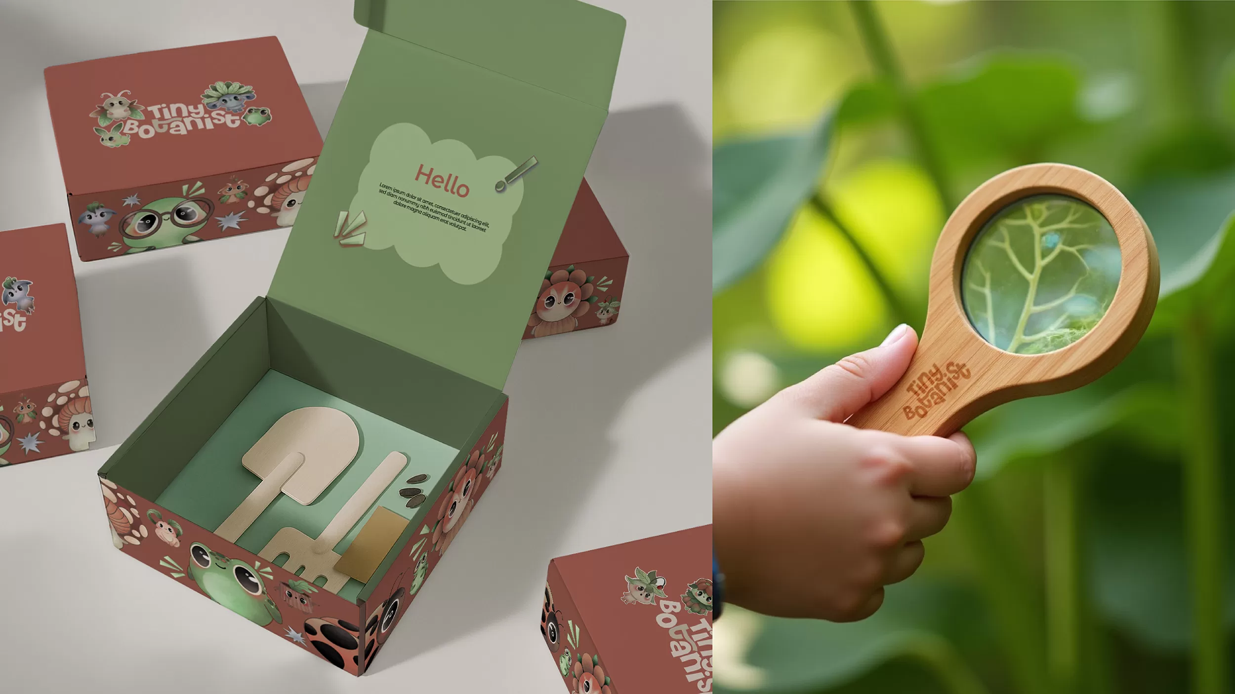
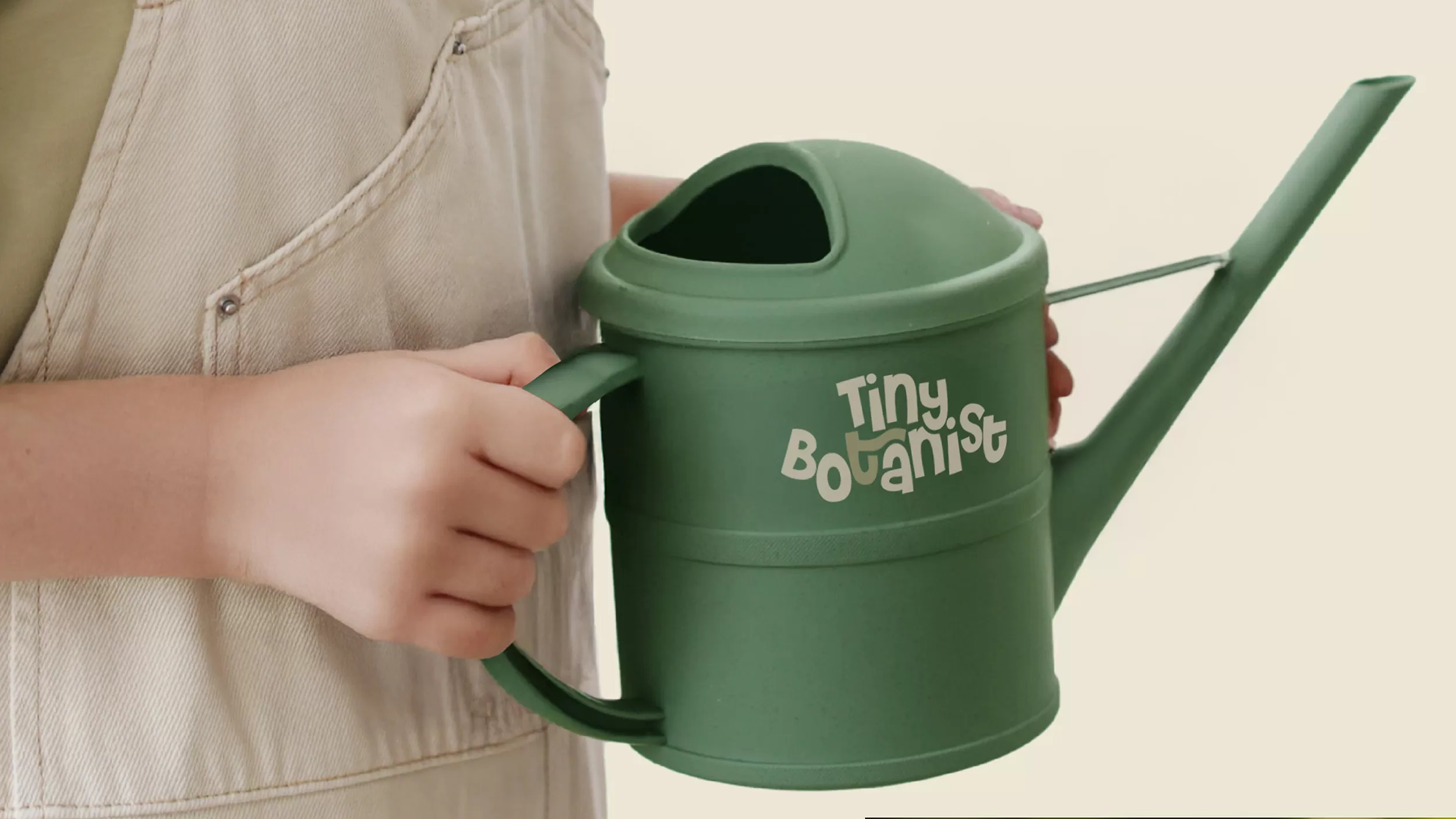
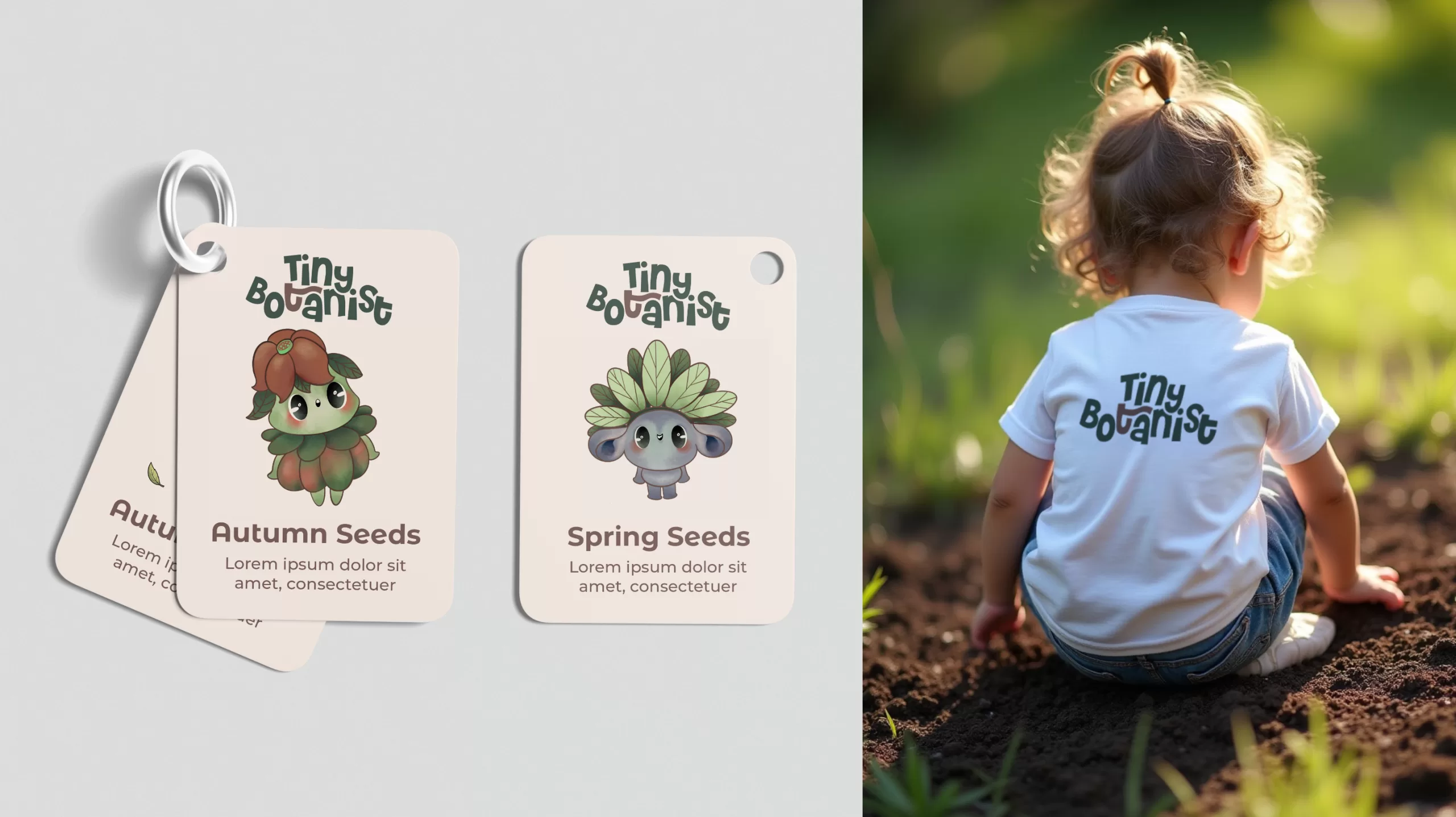
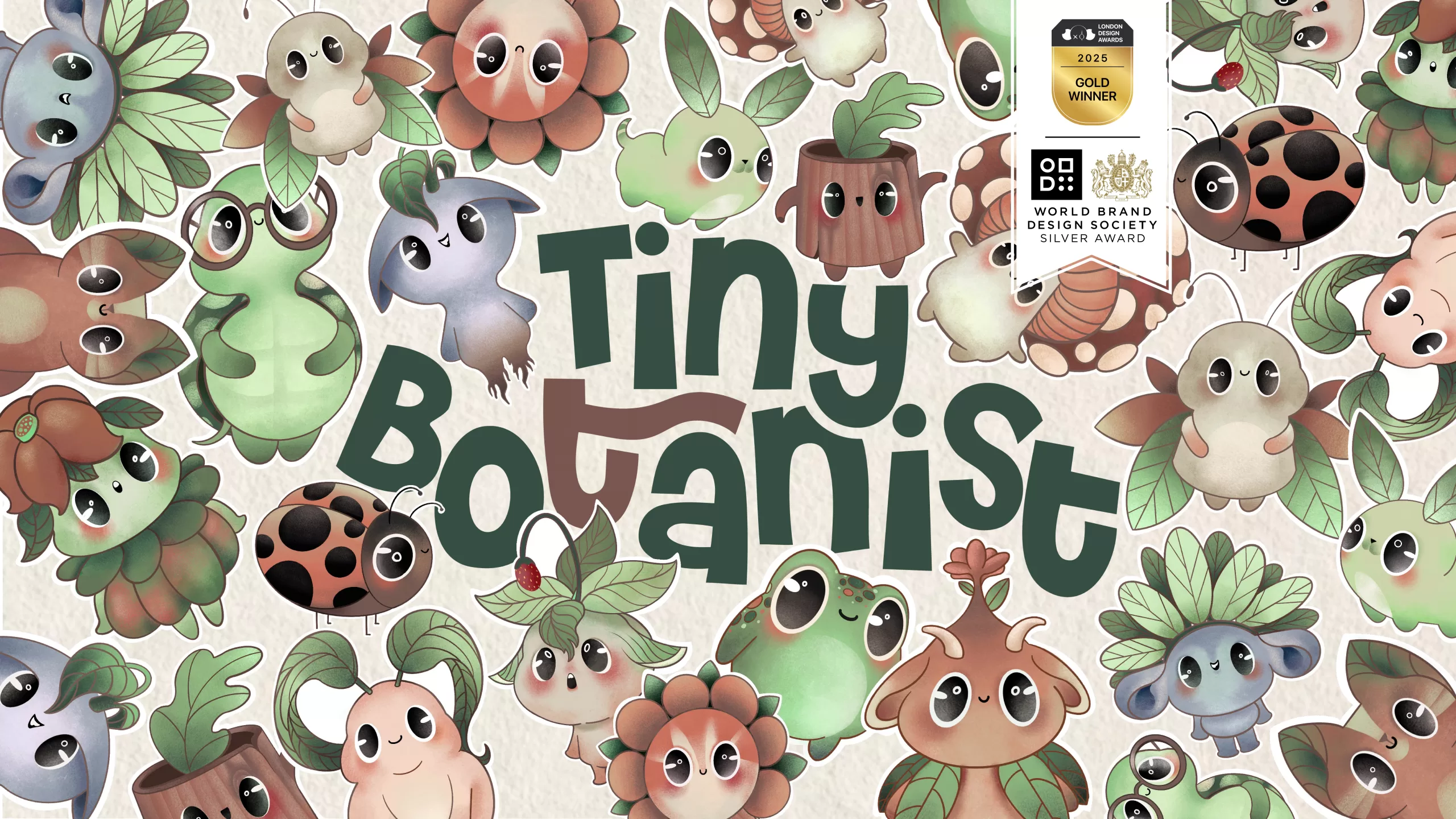
WHILE DESIGNING THE TINY BOTANIST LOGO, WE AIMED TO REFLECT THE PURE, PLAYFUL, AND CURIOUS CONNECTION CHILDREN HAVE WITH NATURE. THE PLAYFUL AND DYNAMIC ARRANGEMENT OF THE LETTERS WAS AN INTENTIONAL CHOICE—JUST LIKE THE SENSE OF DISCOVERY A CHILD FEELS WHEN THEY TOUCH SOIL FOR THE FIRST TIME. OUR COLOR PALETTE WAS INSPIRED BY NATURE ITSELF: SHADES OF GREEN REPRESENT NATURALNESS, WHILE THE EARTHY REDDISH-BROWN SYMBOLIZES SOIL AND ROOTEDNESS.
BRAND STRATEGY
DESIGN PROCESS
BRANDING
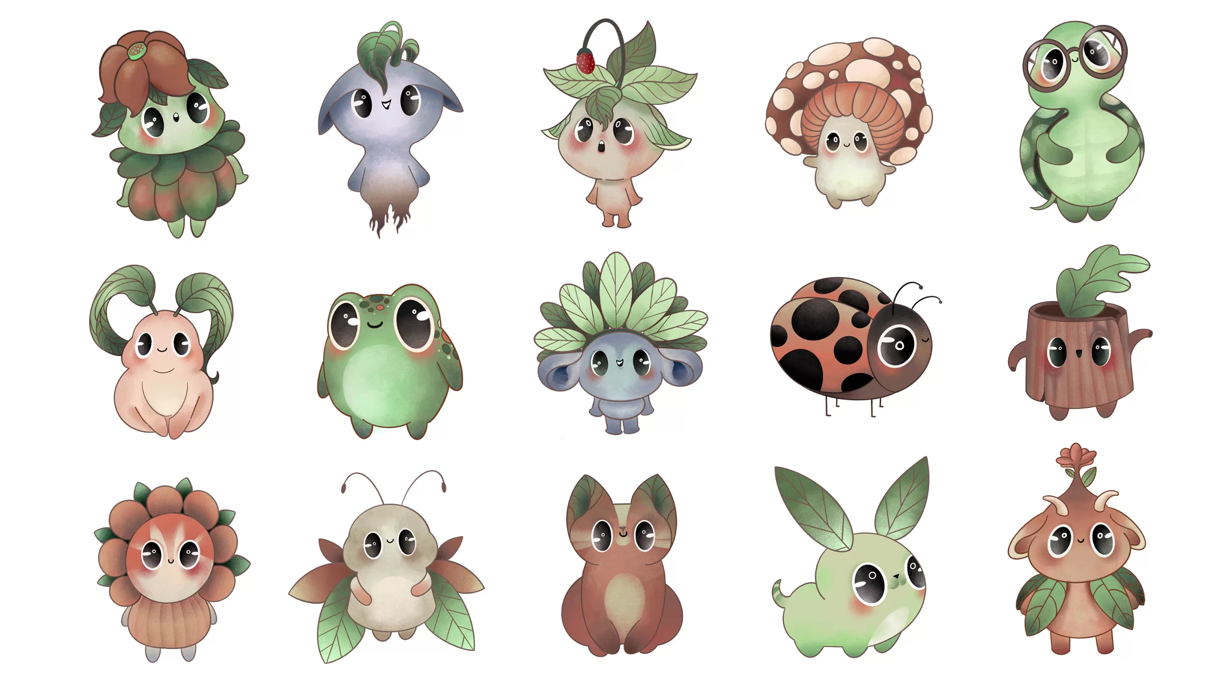
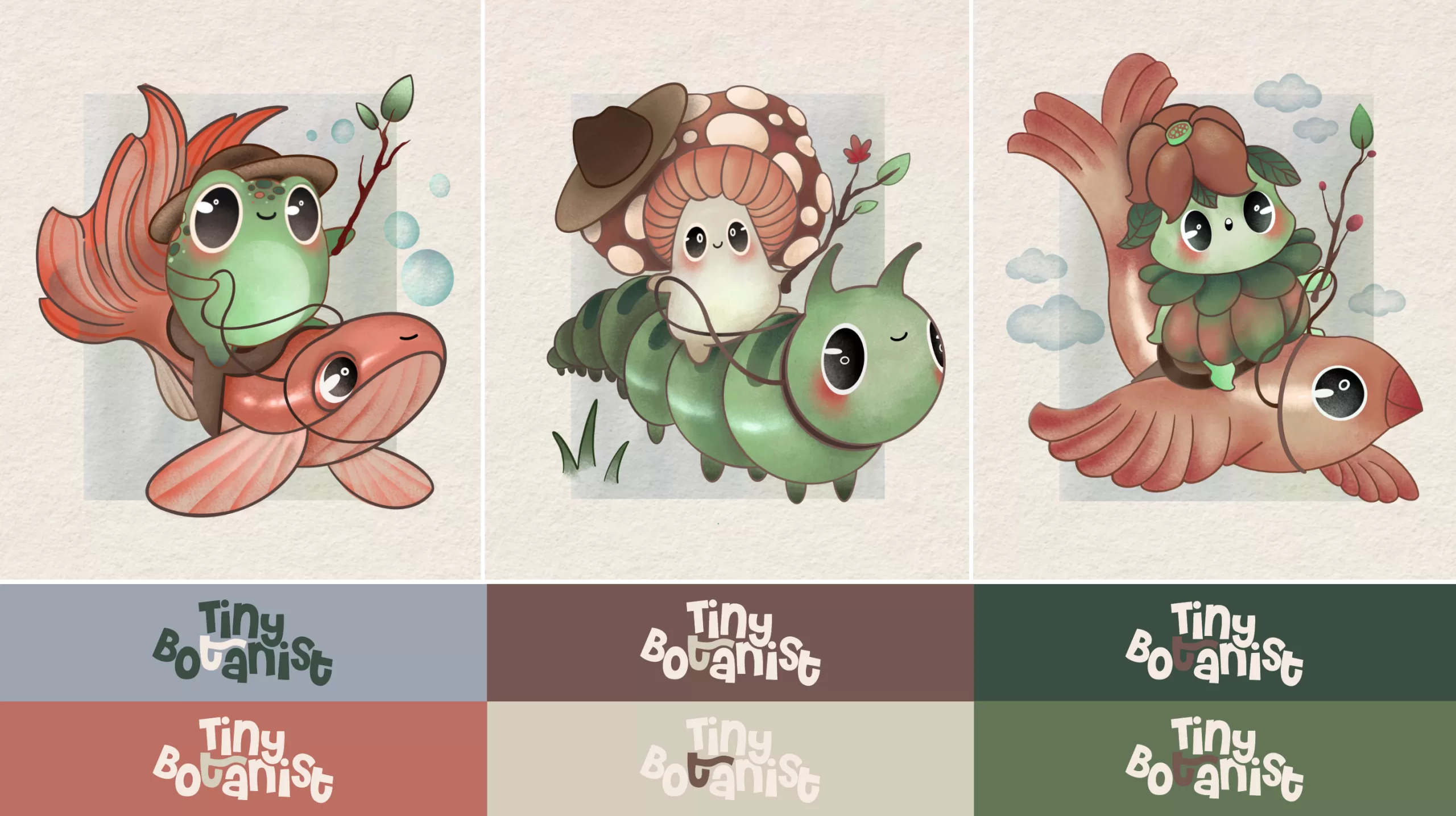
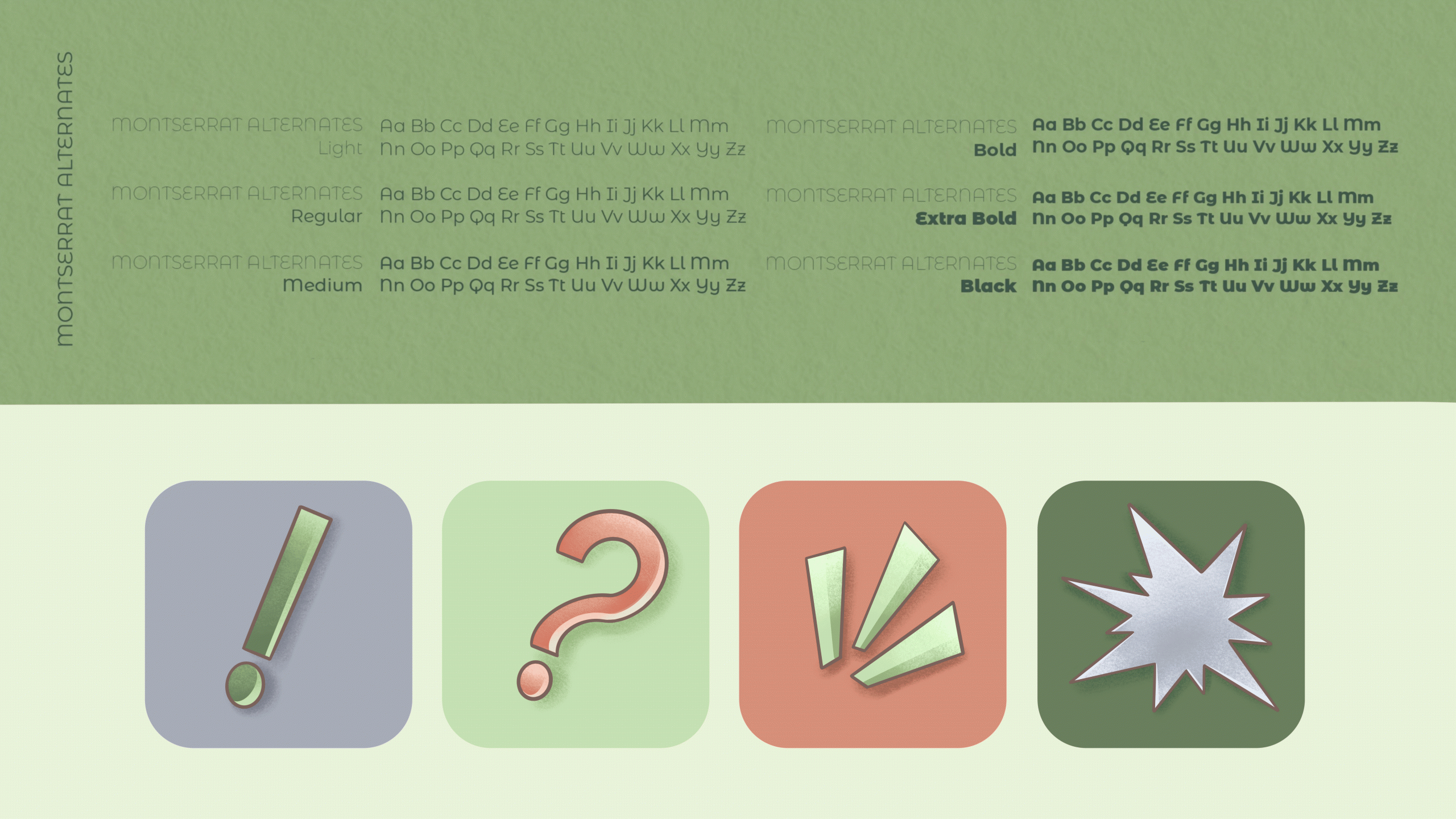
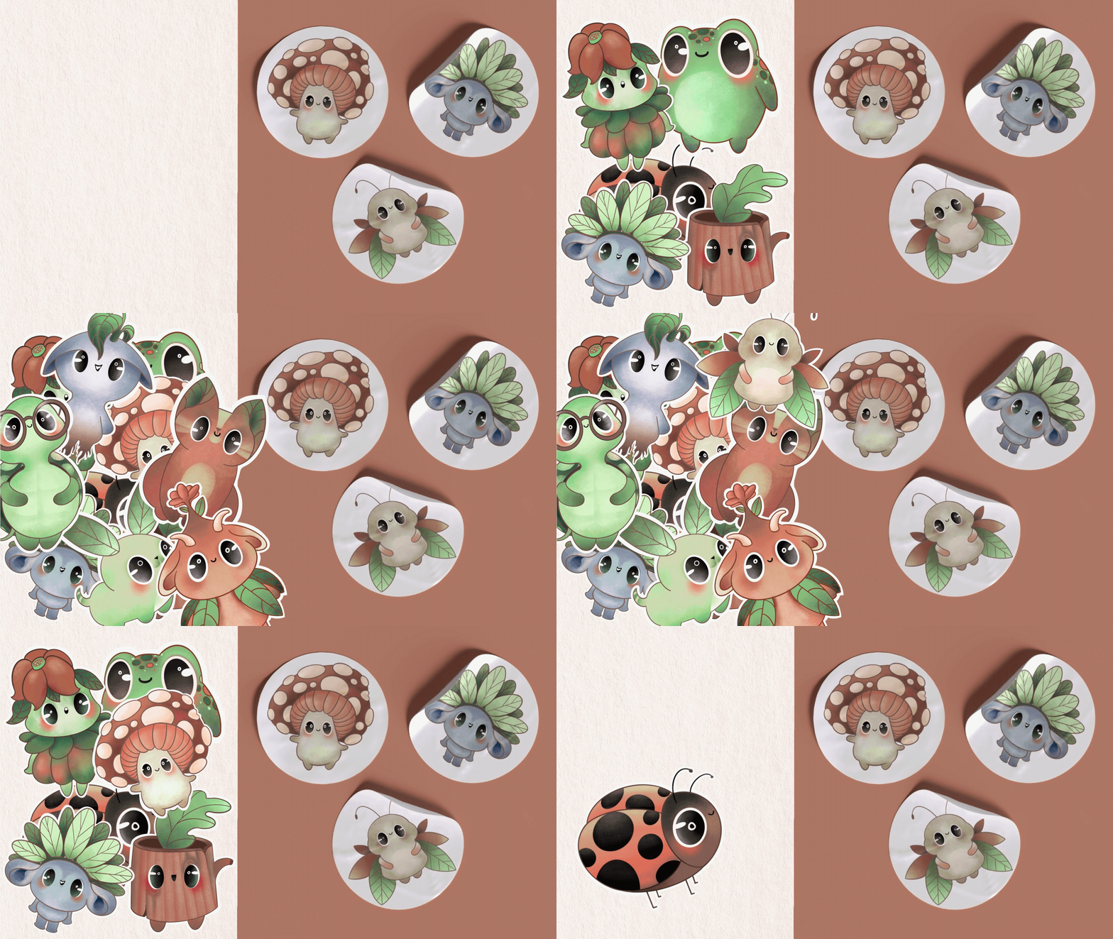
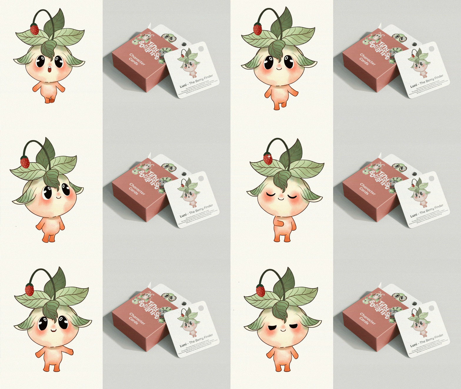
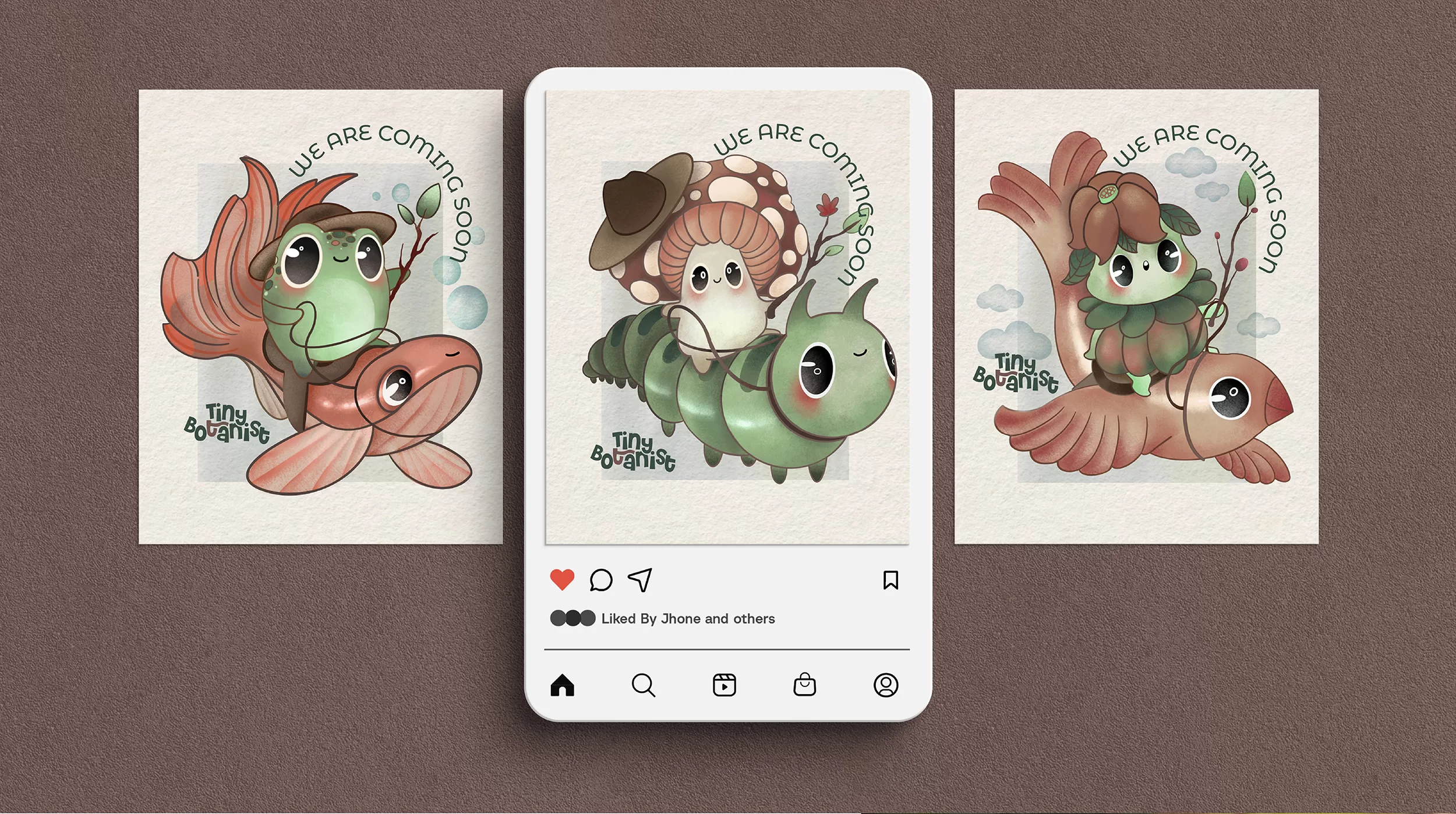
The Tiny Botanist brand draws inspiration from a world that visualizes the pure, curious, and joyful bond children form with nature. Its design language combines the colors of nature, organic forms, and charming characters to offer an experience that is both engaging and educational.
The playful and dynamic arrangement of the logo’s letters carries a spontaneous and cheerful energy—much like the sense of discovery a child feels when touching soil for the first time. The color palette presents the fresh vitality of green and the warm tones of earthy brown symbolizing soil and rootedness, softened with pastel color transitions.

