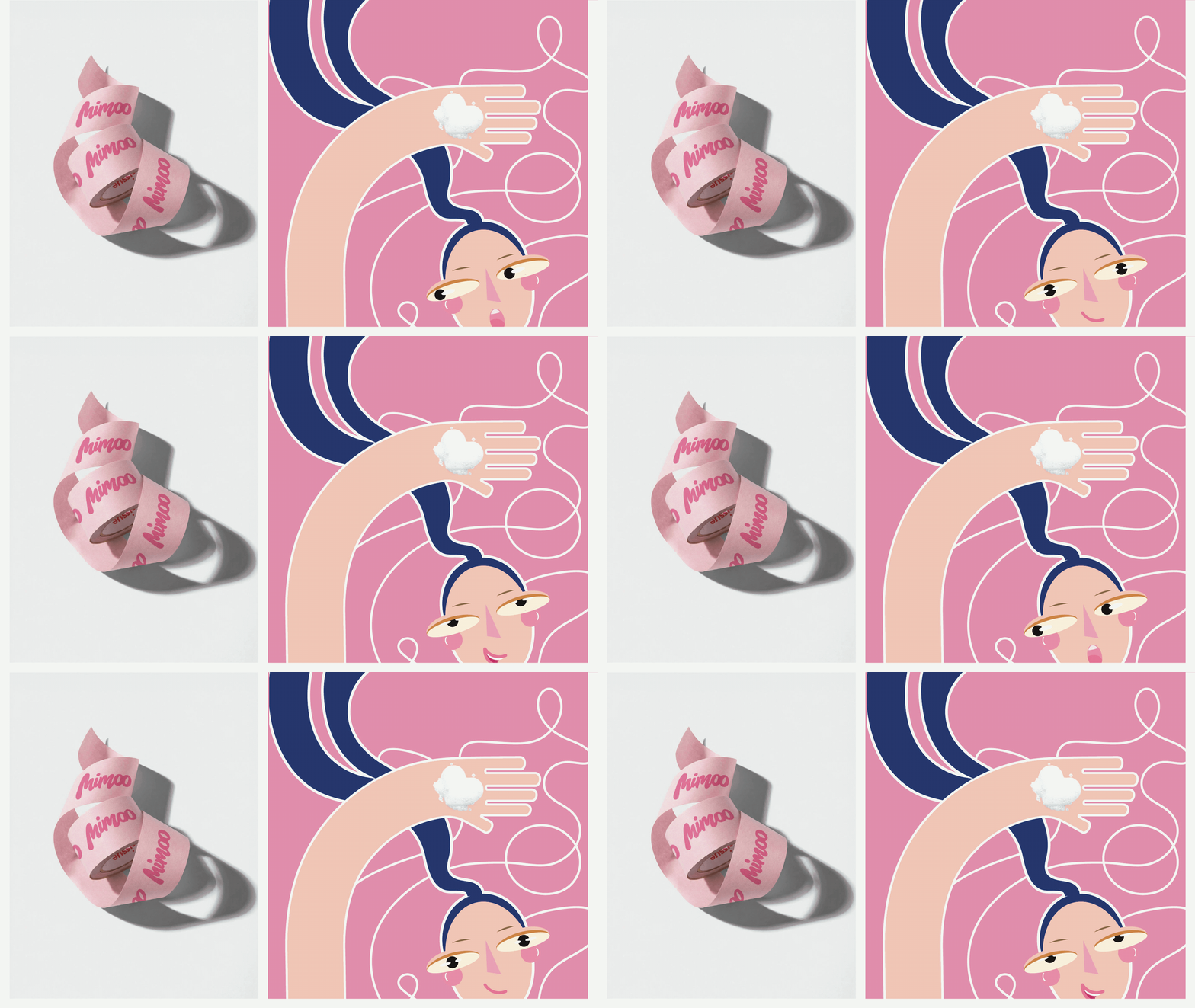
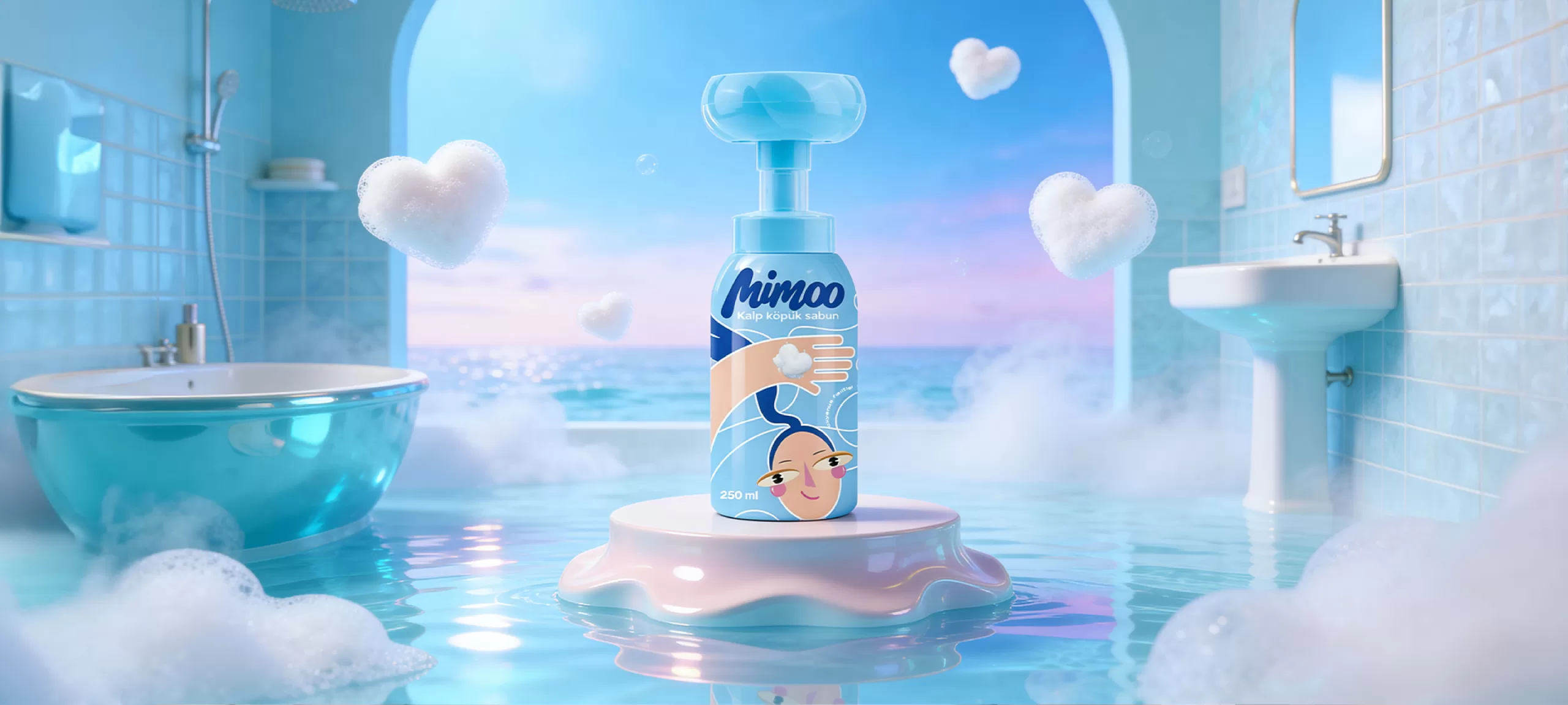
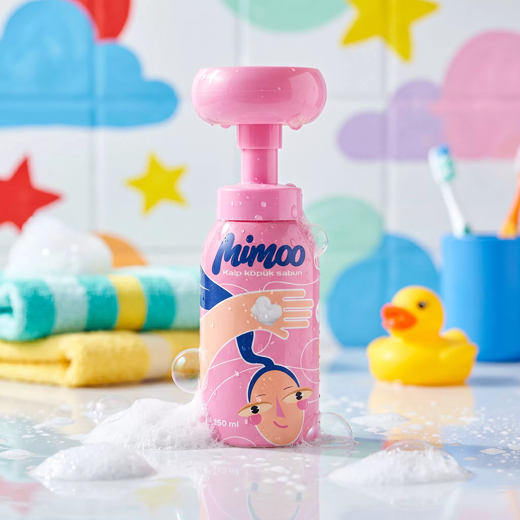
EVERY DESIGN ELEMENT HAS BEEN CAREFULLY SELECTED AND APPLIED IN LINE WITH THE BRAND'S PHILOSOPHY.
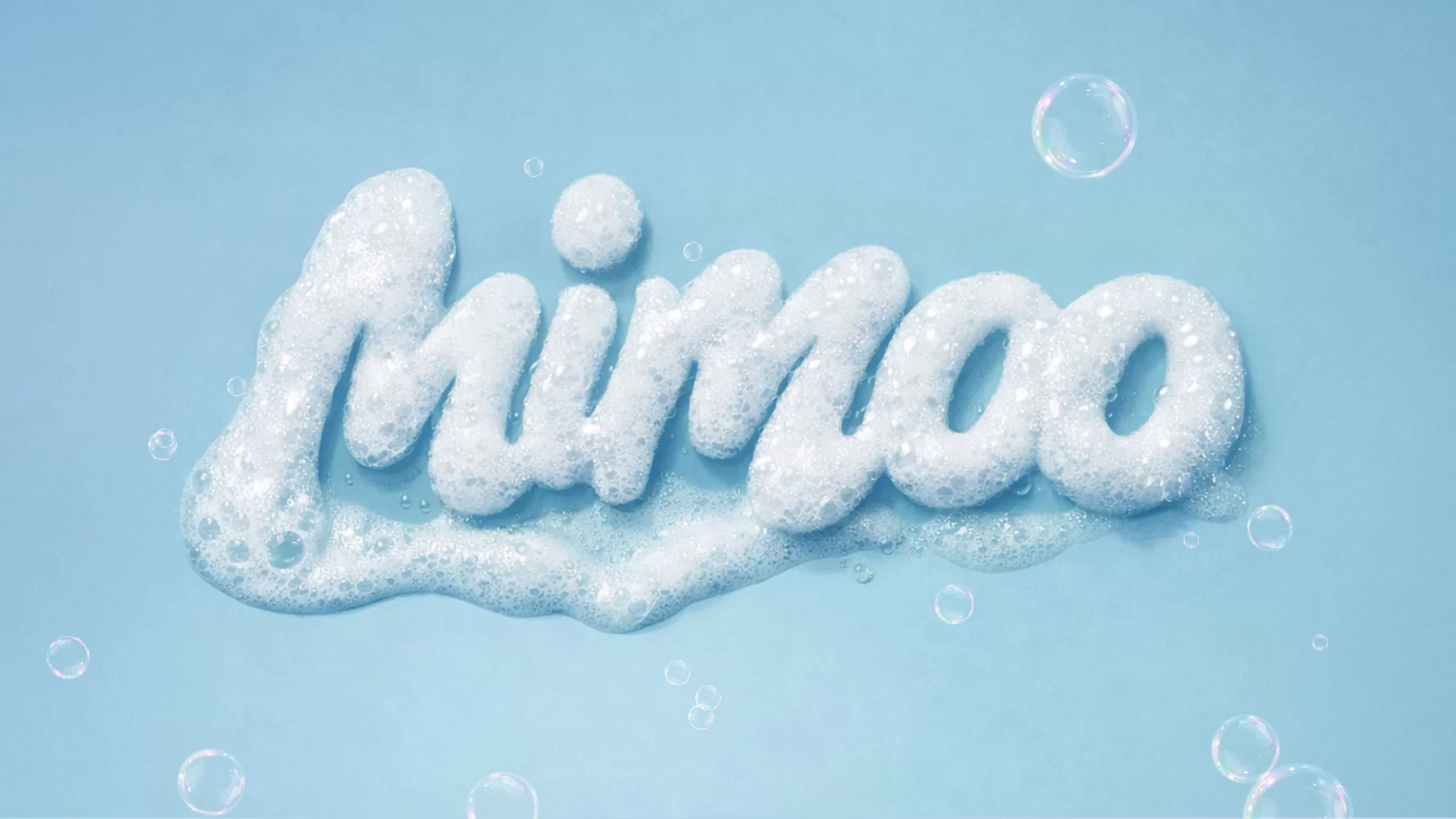
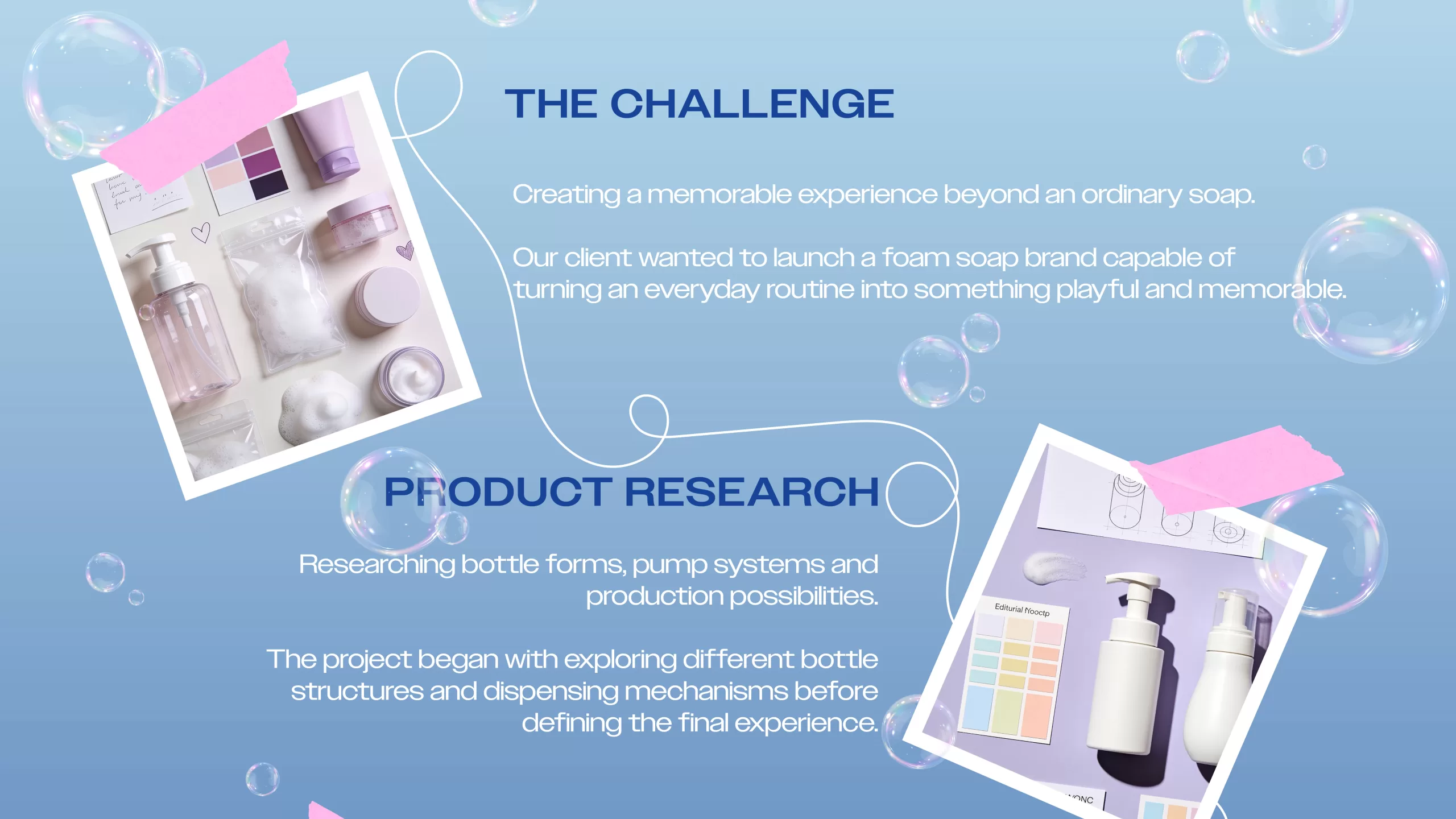
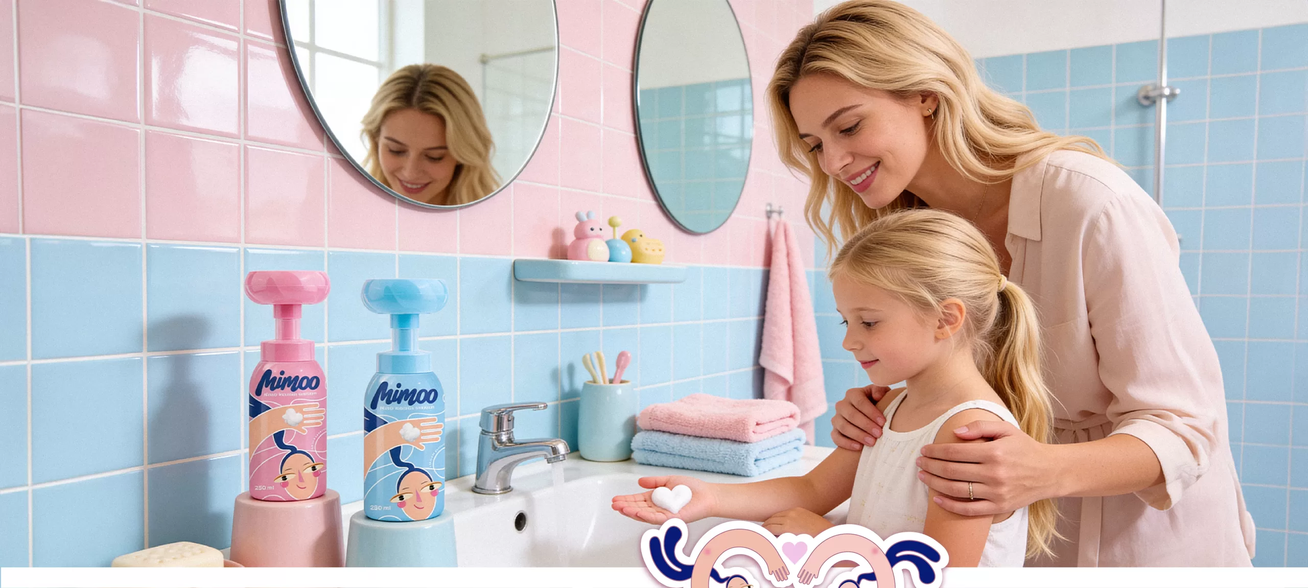
Mimoo was born as a playful foam hand soap brand designed to make children enjoy washing their hands. The starting point of the project was to transform an ordinary hygiene routine into a joyful, memorable, and curiosity-driven experience for children.
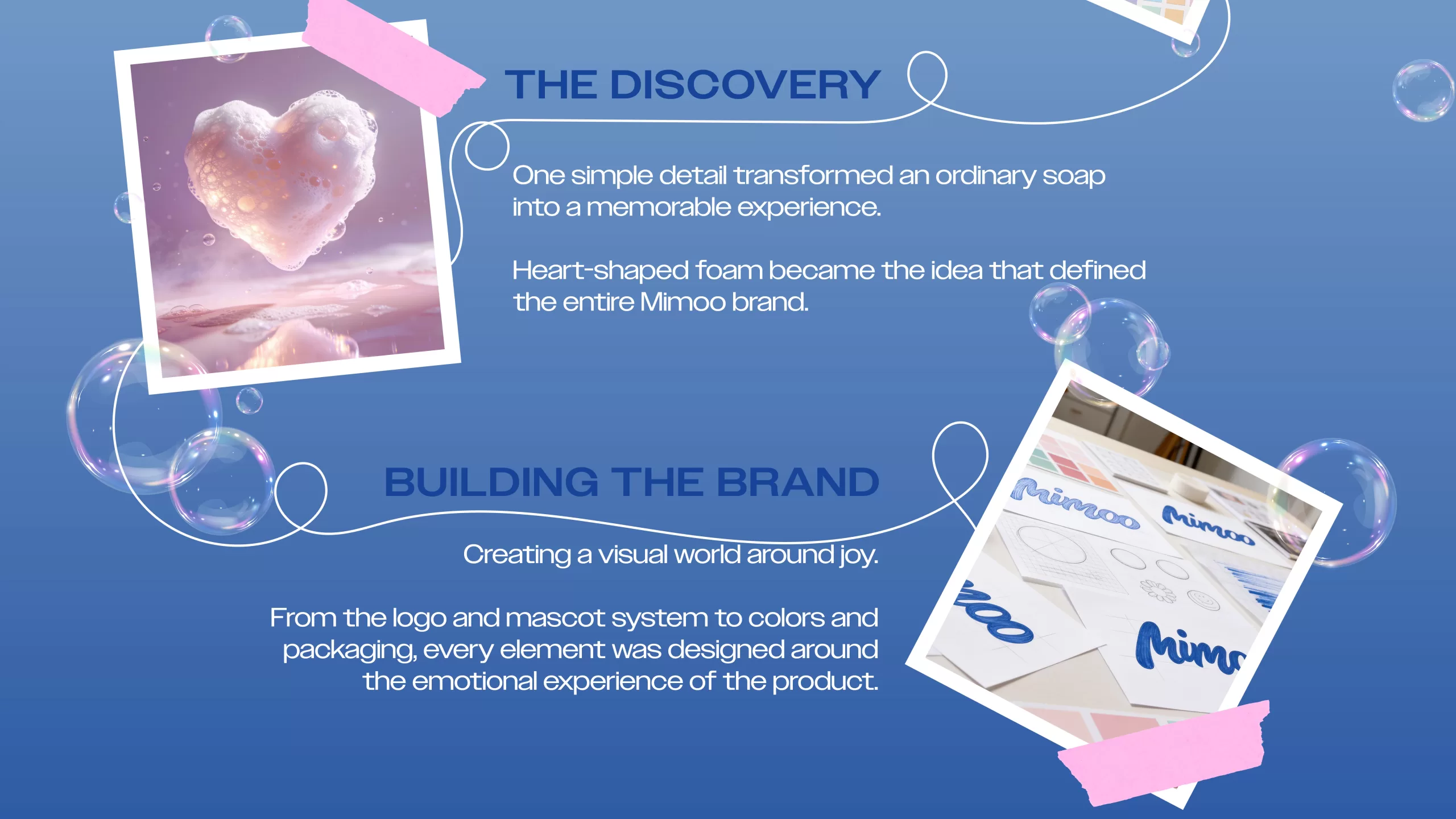
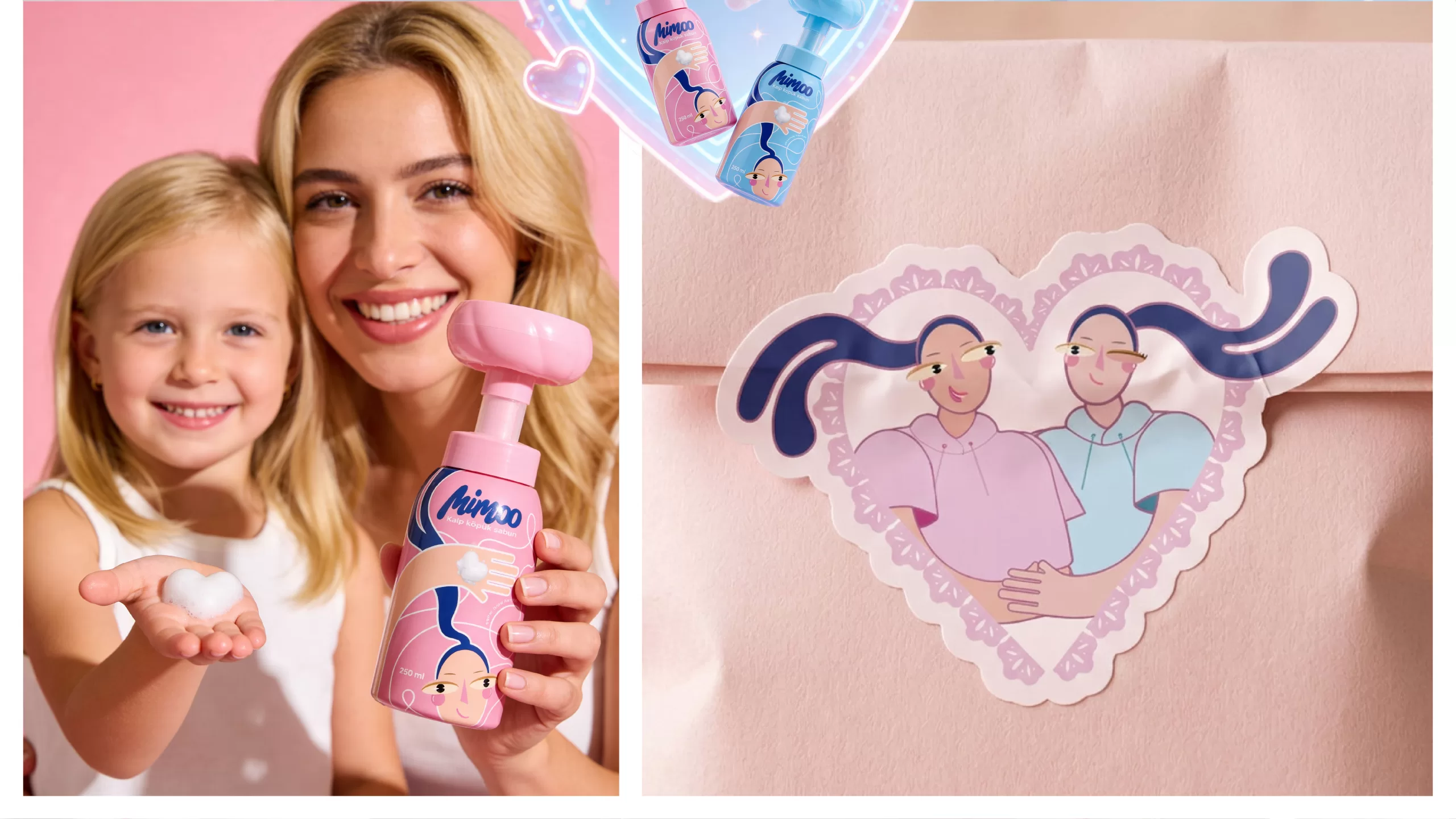
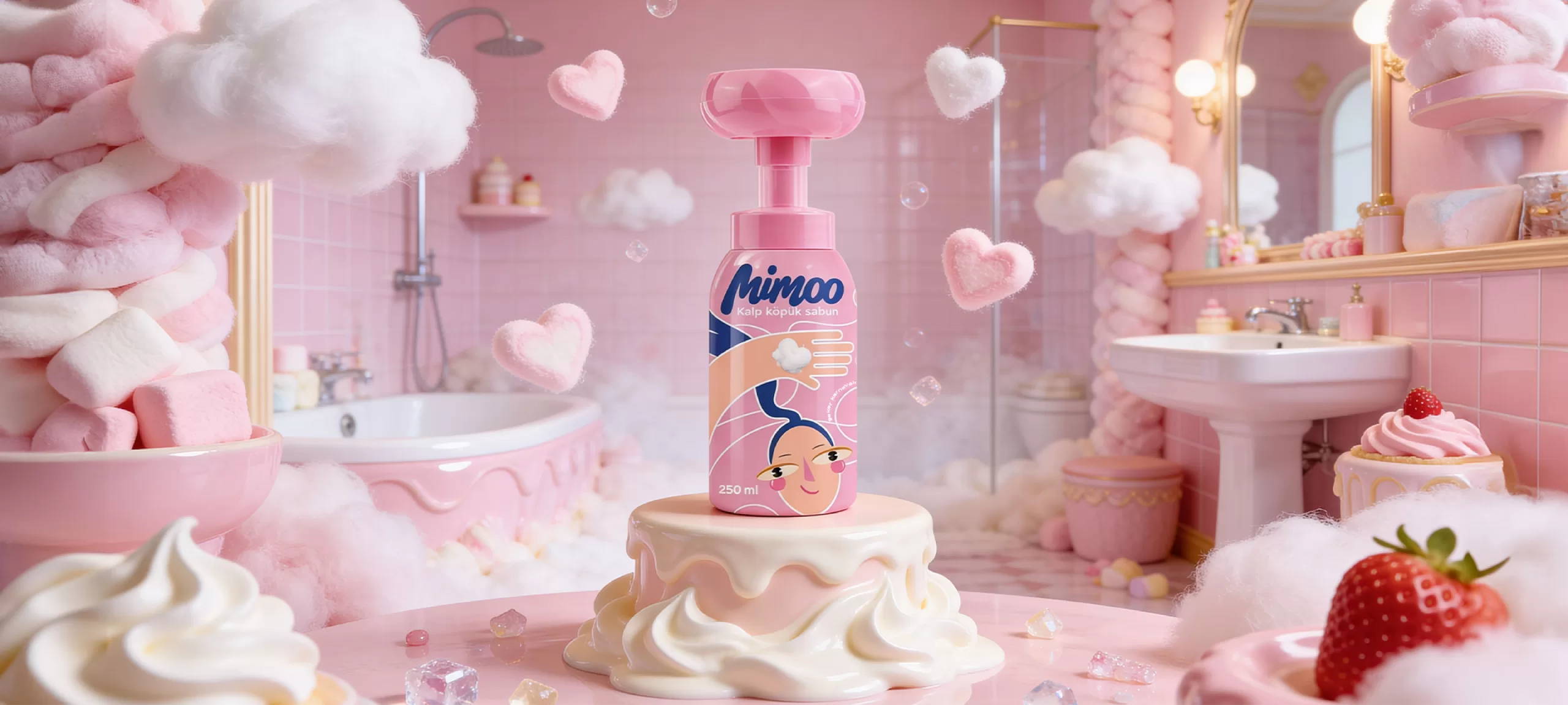
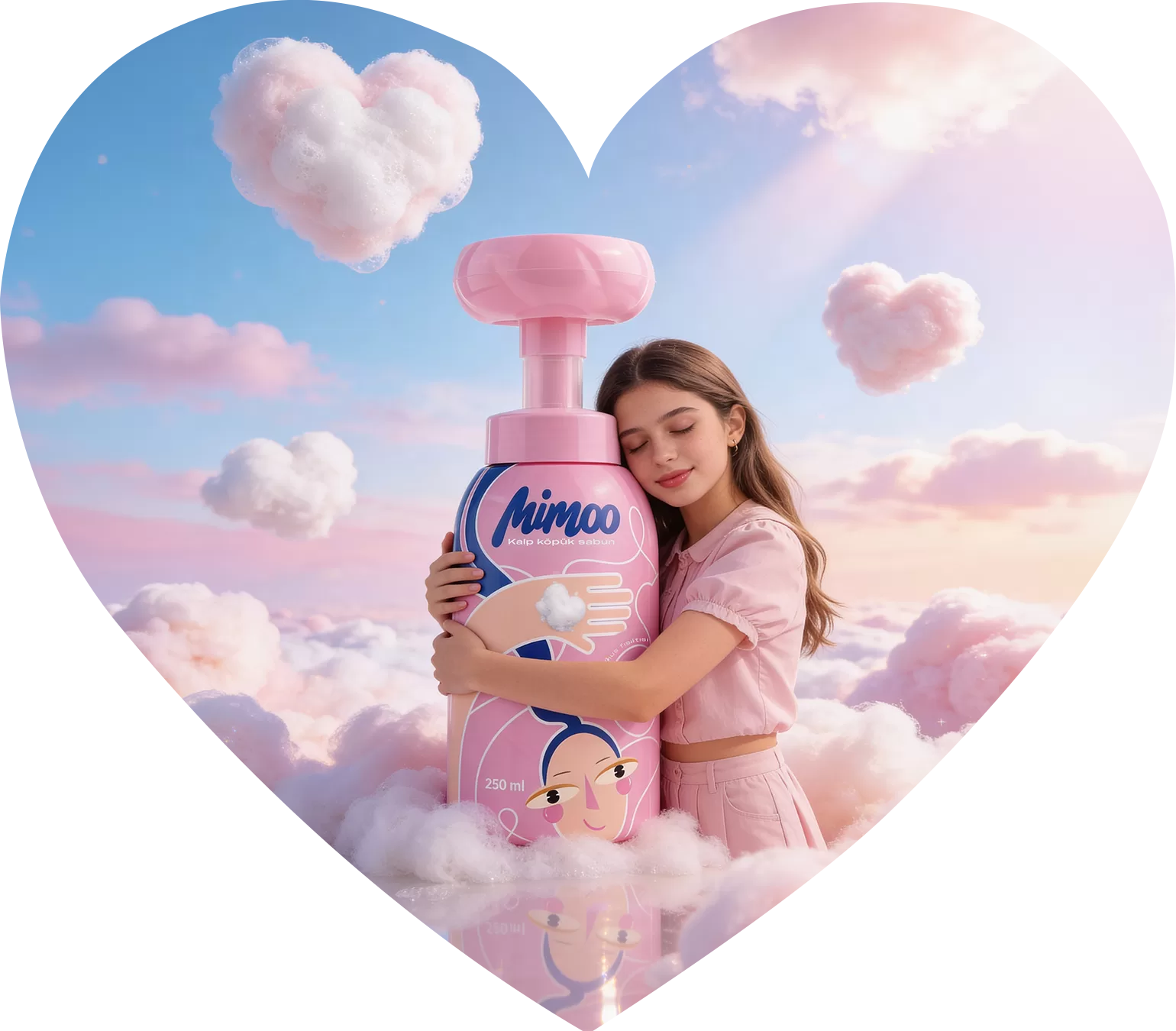
For Mimoo, we created more than just a product identity—we built a colorful, positive, and emotionally engaging brand world centered around the heart-shaped foam concept. From the logo design and color palette to the mascot system and packaging language, every detail was crafted to capture children's attention while inspiring trust and confidence in parents.

DESIGN PROCESS
Mimoo’s visual identity was built around soft shapes, vibrant colors, and charming characters that resonate with the world of children. We aimed to create a joyful, trustworthy, and instantly recognizable brand expression across every touchpoint.
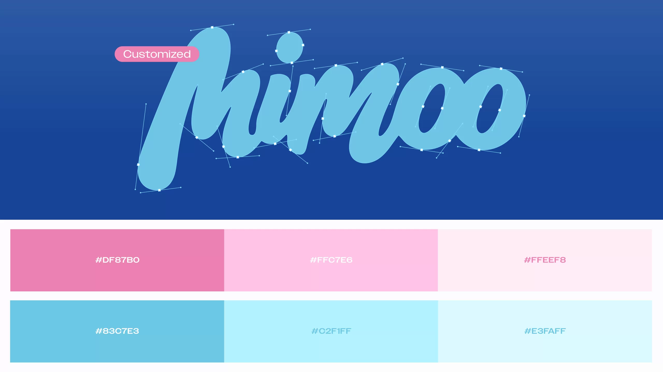
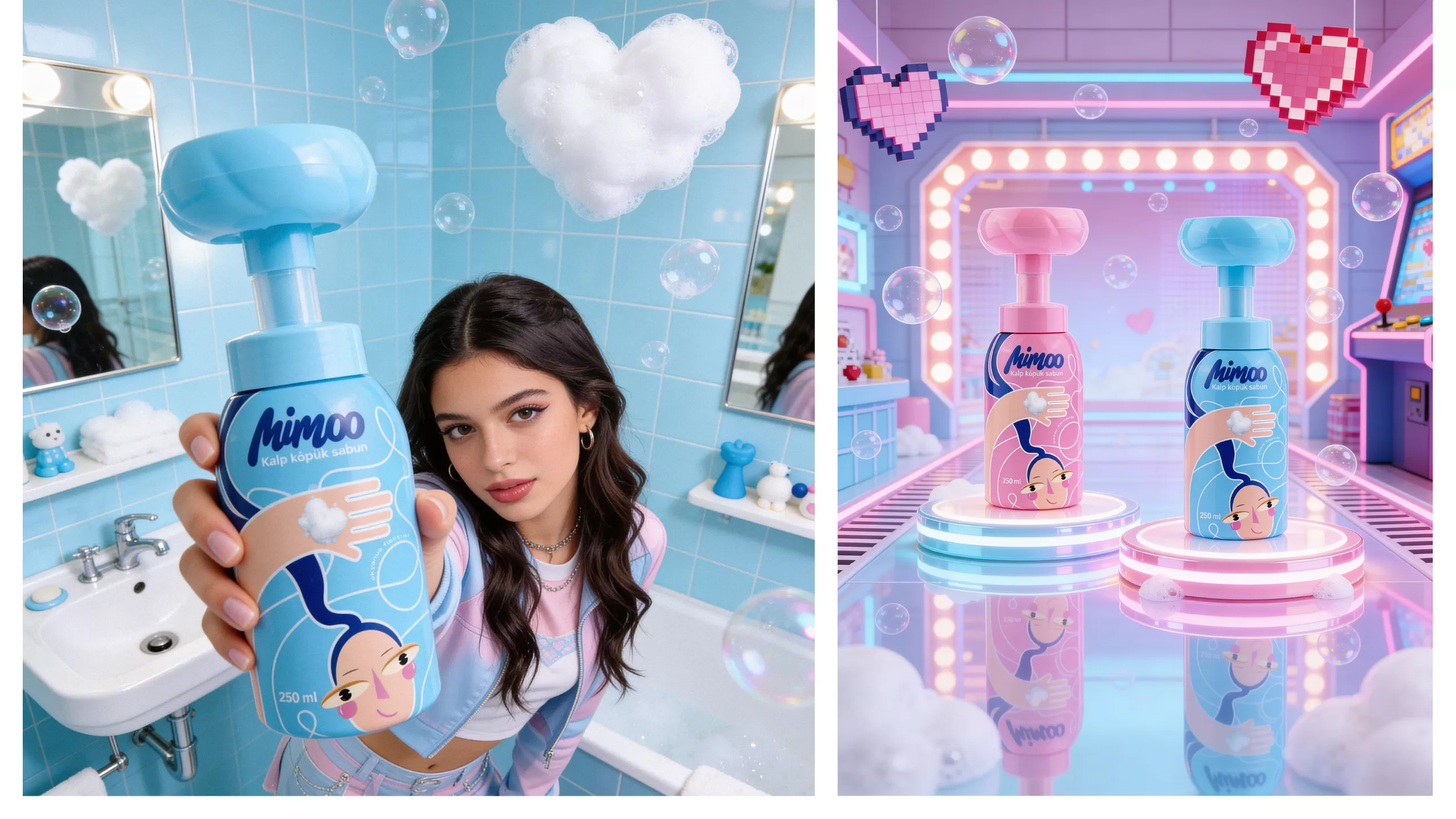
The logo was designed with a fluid and playful structure, while a palette of pink, blue, and pastel tones reinforces the brand’s positive energy. Centered around the heart-shaped foam experience, the packaging and communication system bring Mimoo’s warm, fun, and lovable personality to life.
PACKAGING DESIGN
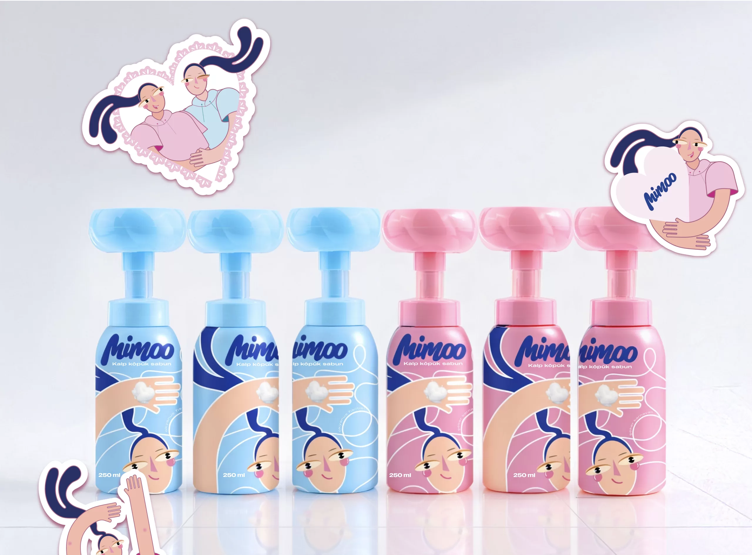
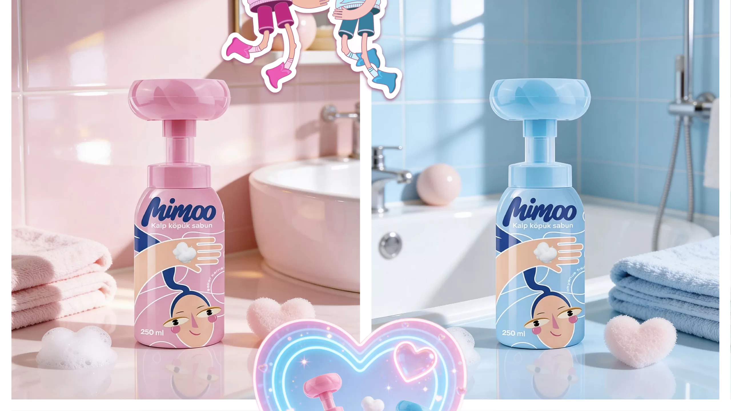
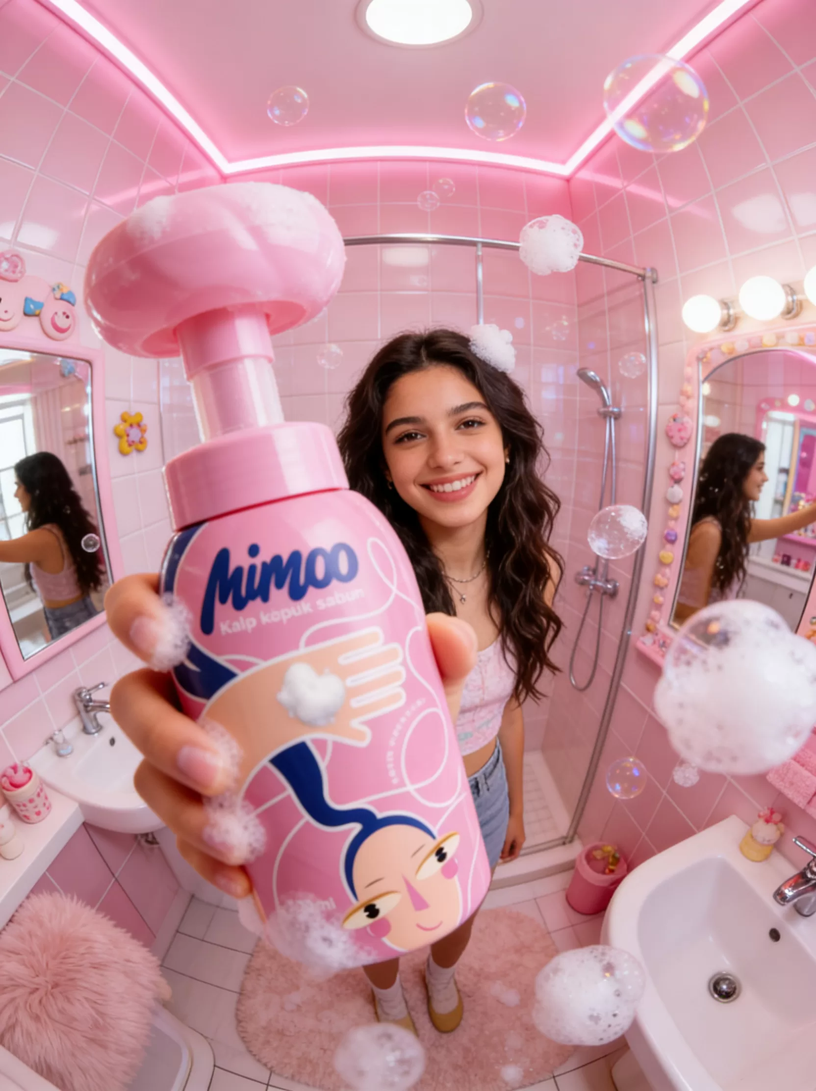
We built Mimoo’s packaging concept around the idea of turning handwashing into a small game for children. The heart-shaped foam became more than just a functional product feature—it evolved into the brand’s signature experience.
We brought this concept to life through vibrant colors, soft shapes, charming characters, and visual details inspired by children’s world. As a result, Mimoo became more than a foam soap that stands out on the shelf; it became a product that sparks curiosity, encourages use, and makes children want to come back to it again and again.
VISUAL IDENTITY
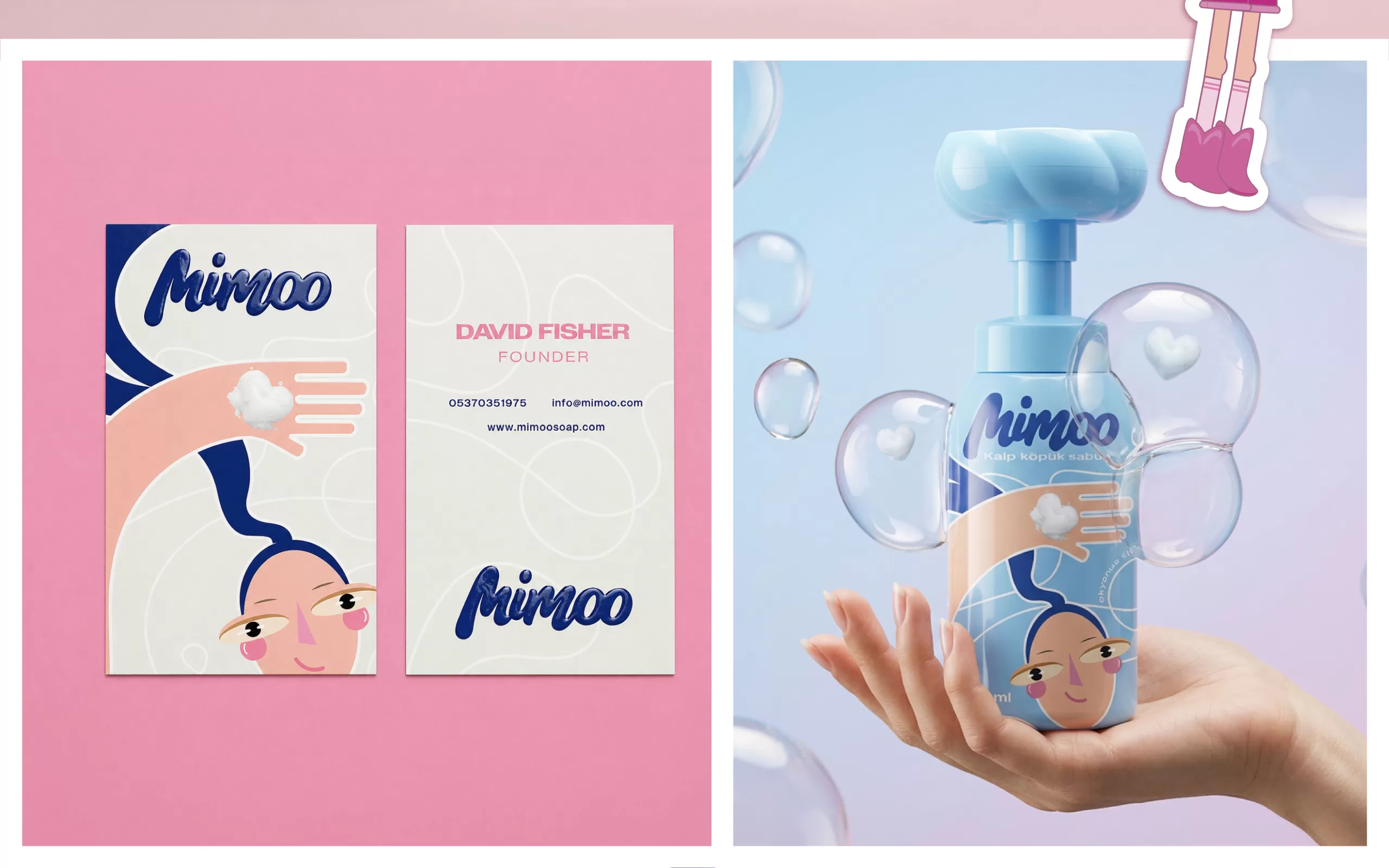
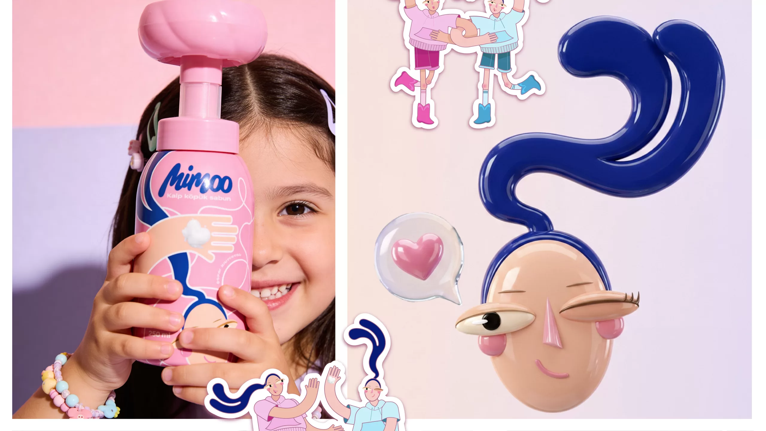
We built Mimoo’s visual identity around soft shapes and vibrant colors that naturally capture children's attention. The logo’s fluid form reflects the lightness of the foam and the brand’s playful personality, while a palette of pink, blue, and pastel tones creates a cheerful and positive world.
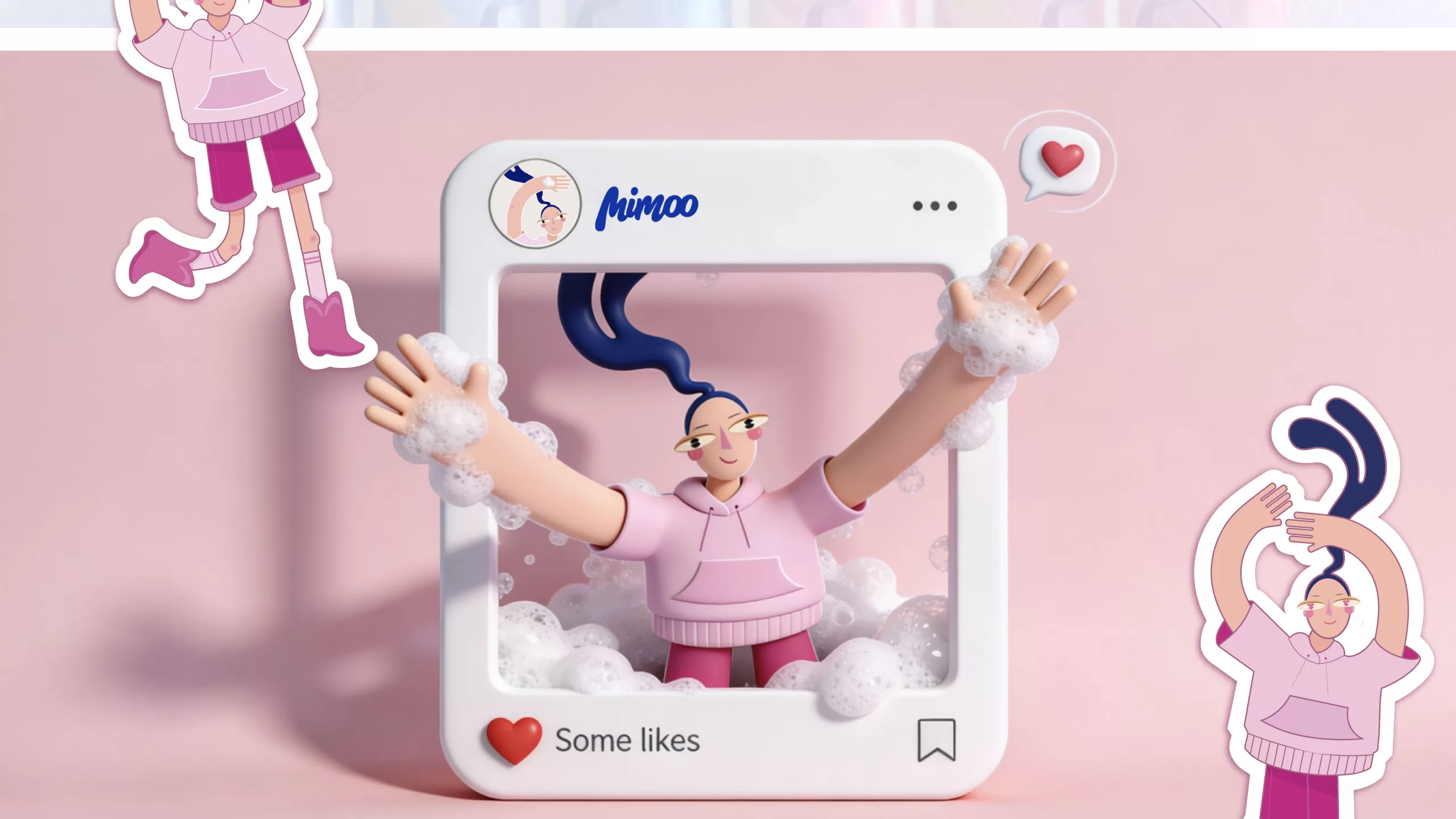
The mascot system, illustration style, and graphic details across the packaging were carefully designed to reinforce the brand’s warm, lovable, and memorable identity. As a result, Mimoo gained a distinctive visual language that transforms hygiene into a fun experience children can easily connect with.