fbpx
LOADING, PLEASE WAIT..
Visual Identity

Furkan Gedik Architecture

THE DESIGN PROCESS WAS BASED ON A LOGO CREATED FROM THE LETTERS "F" AND "G." THIS LOGO CONSISTS OF MINIMALIST AND MODERN LINES THAT SYMBOLIZE THE BRAND'S NAME AND ARCHITECTURAL VISION.

BRAND STRATEGY
DESIGN PROCESS
BRANDING

Furkan Gedik Architecture is an architecture firm that offers creative and functional architectural solutions. They approached our agency seeking a unique and professional corporate identity design to best represent themselves. In this project, we aimed to create a strong and recognizable brand image by developing the brand's visual identity.

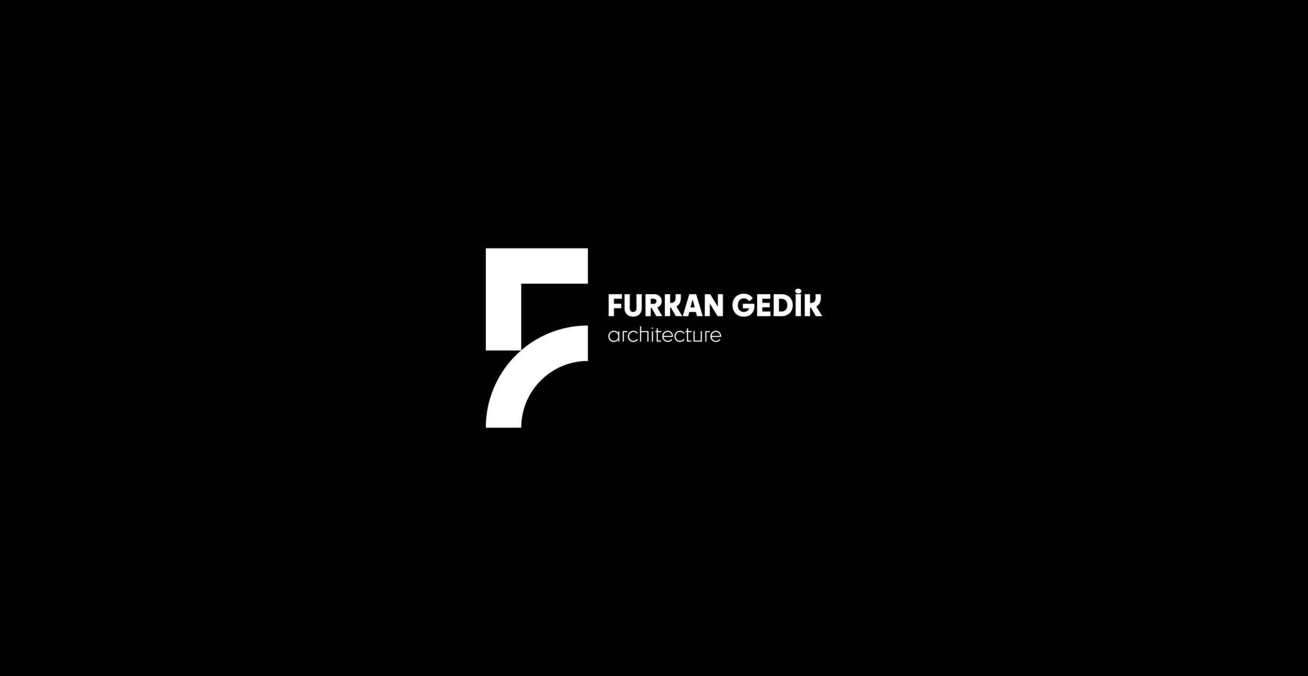
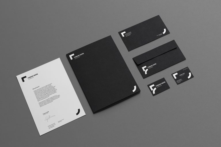
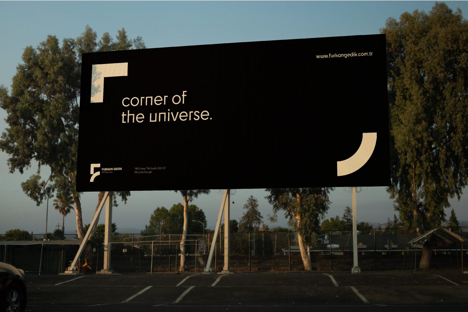
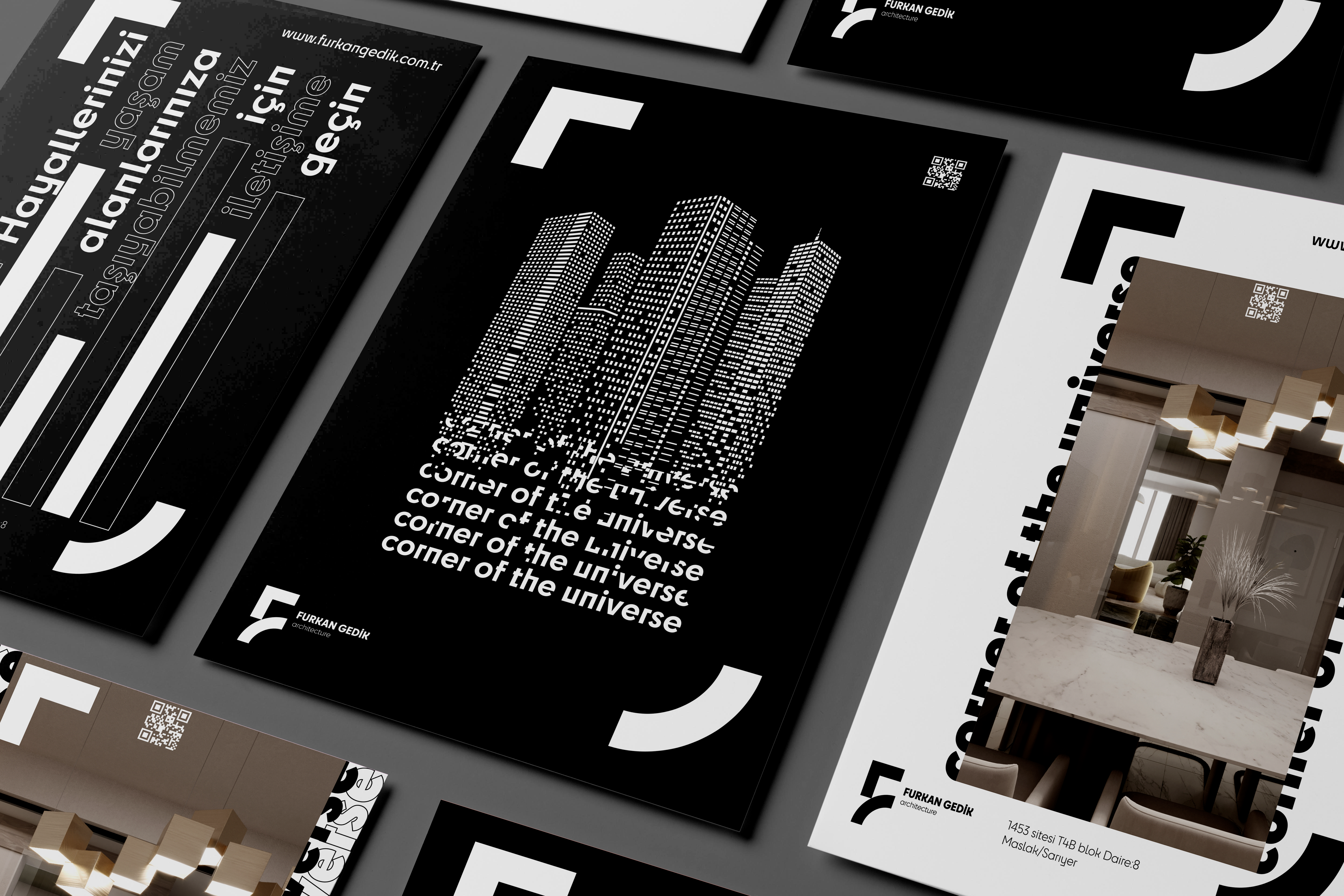
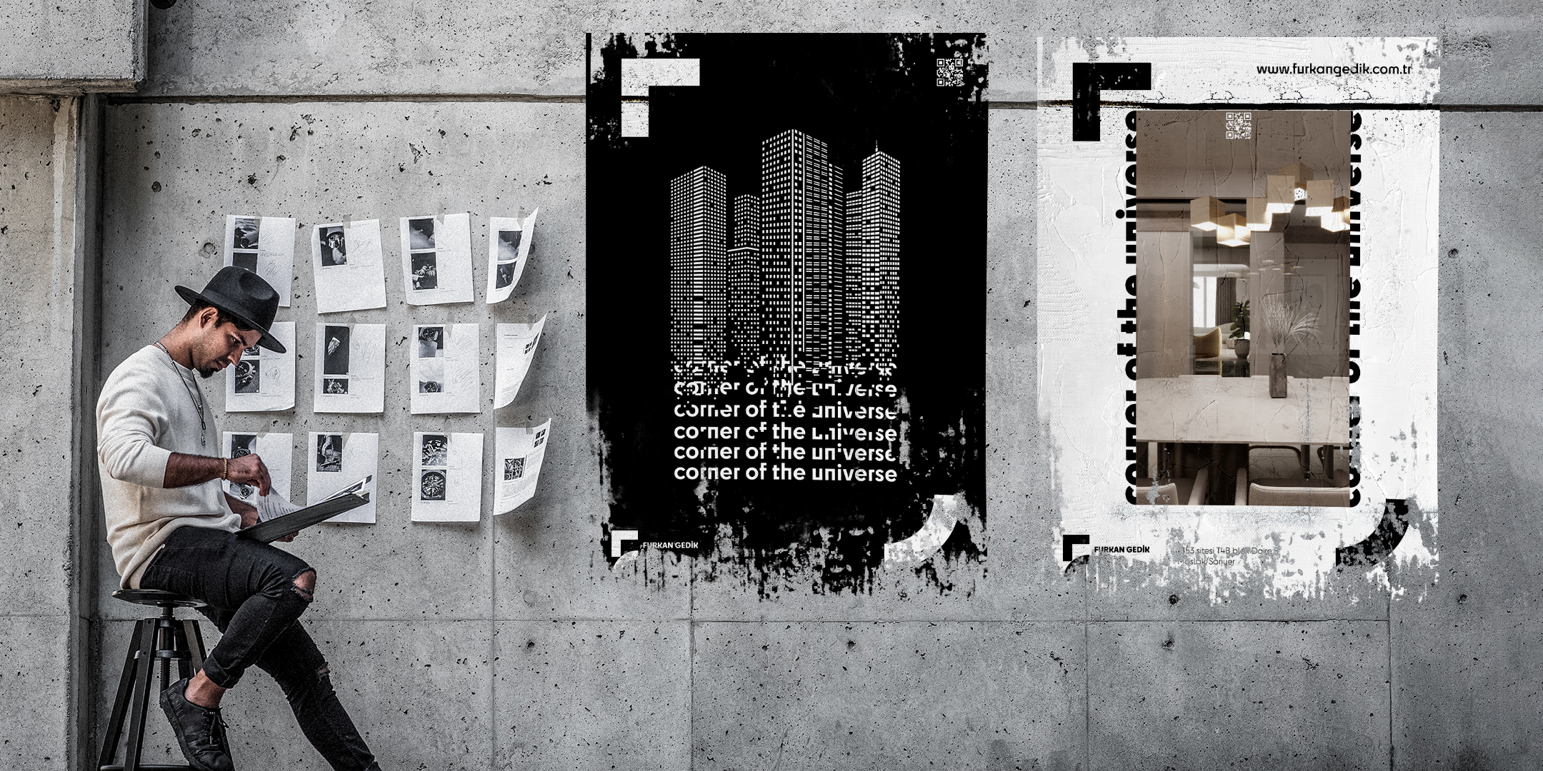
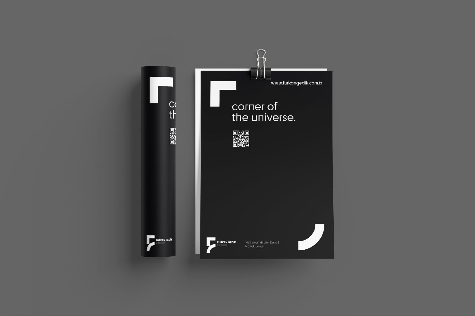
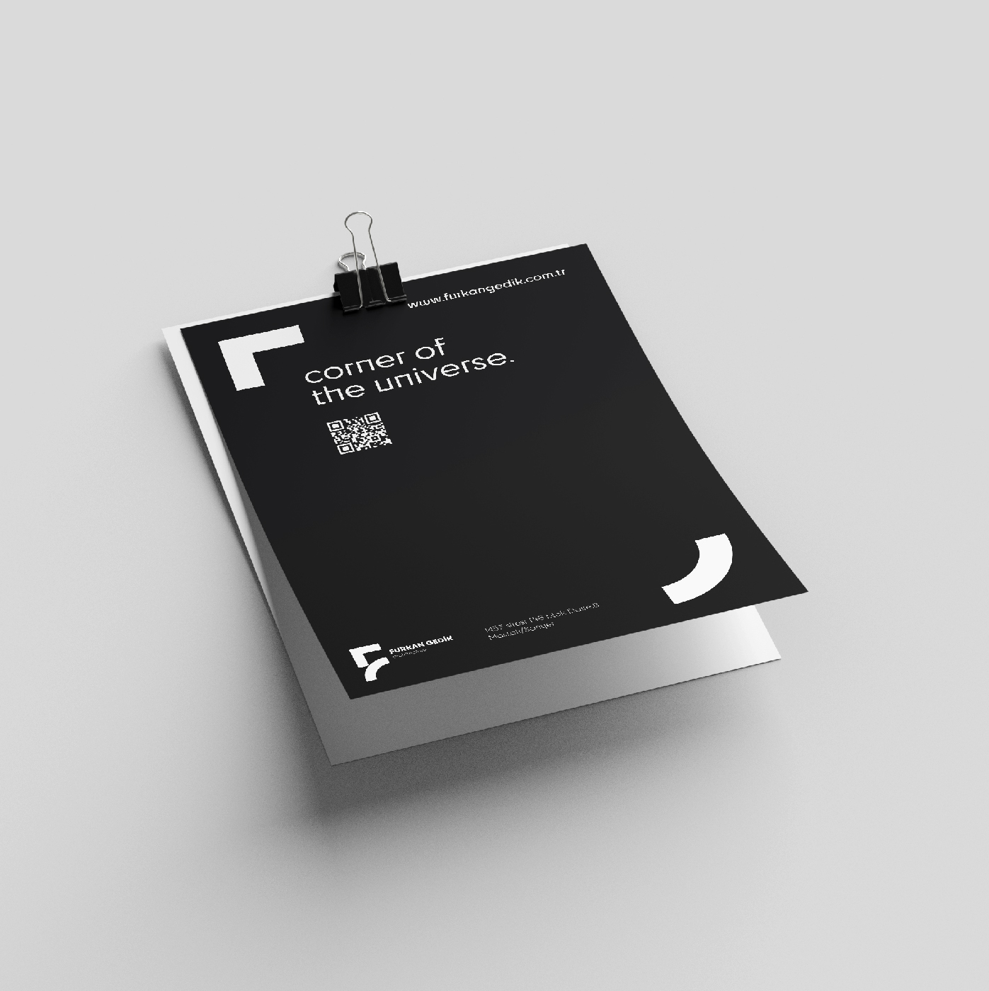
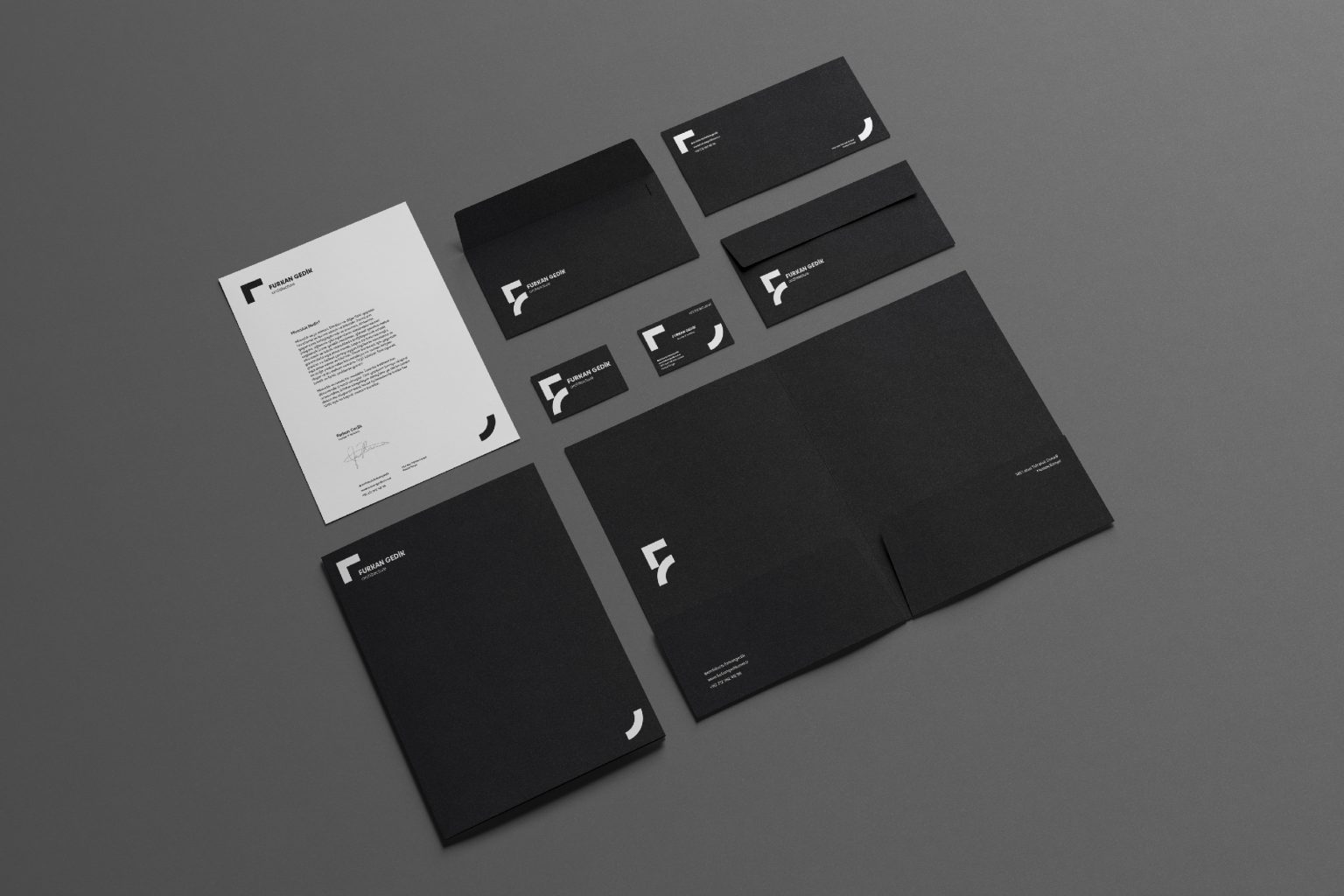
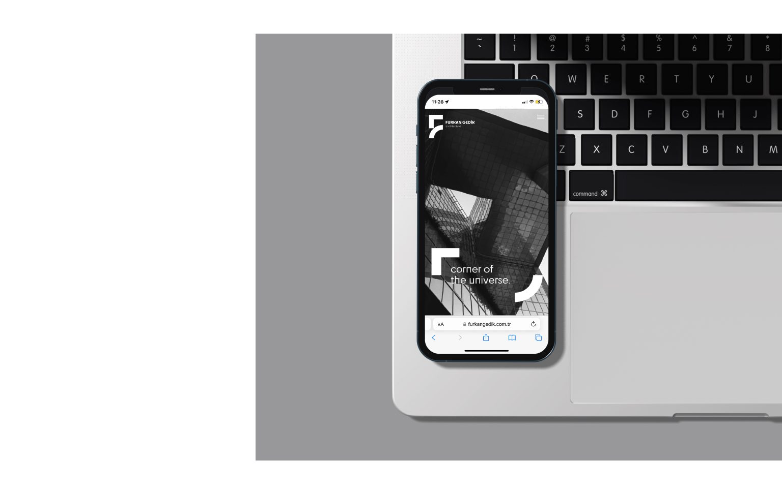
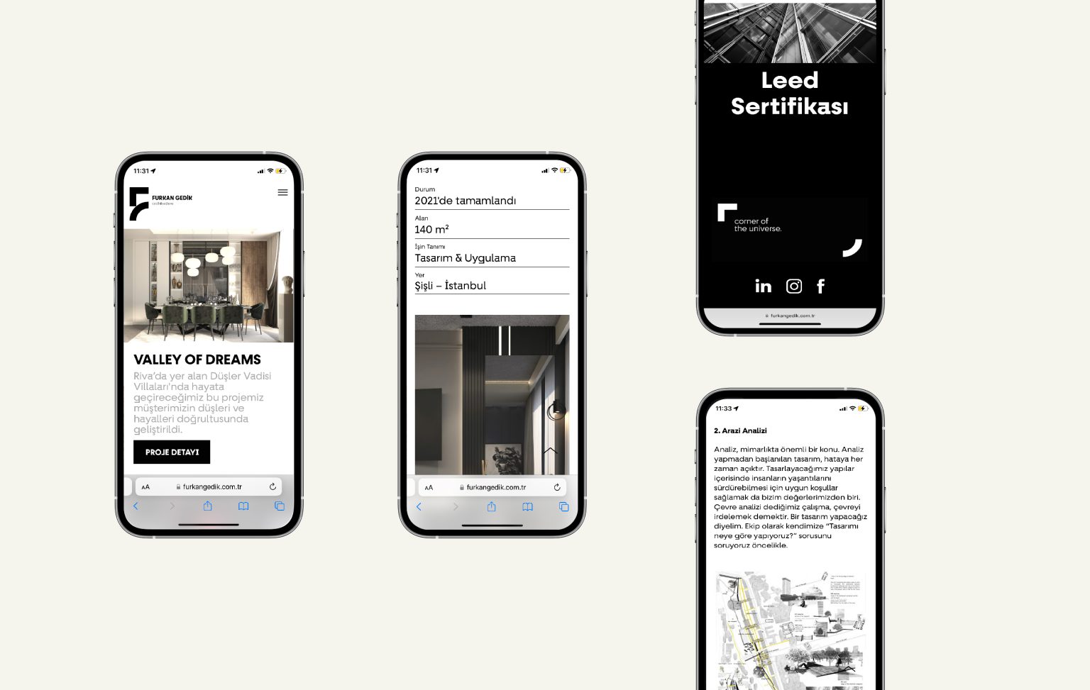
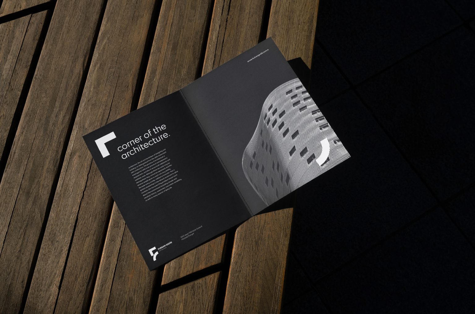
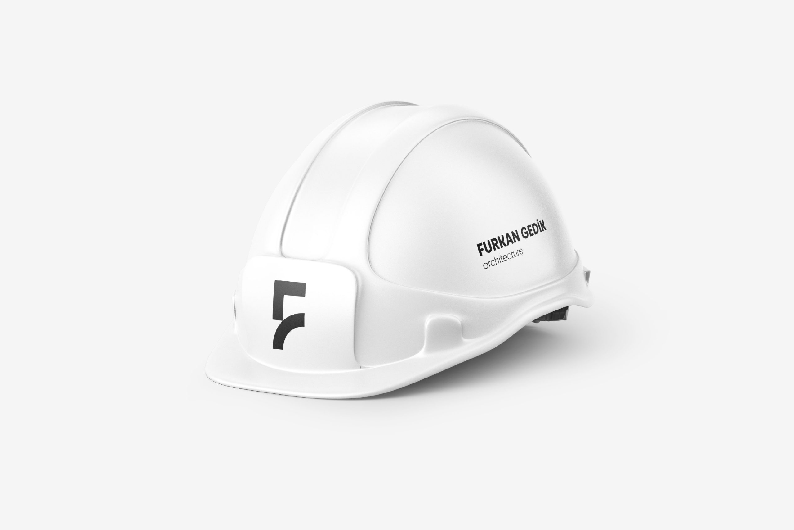
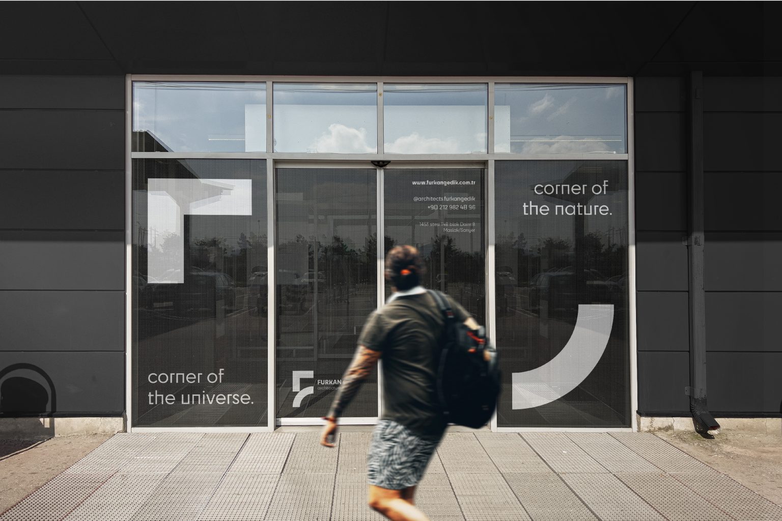
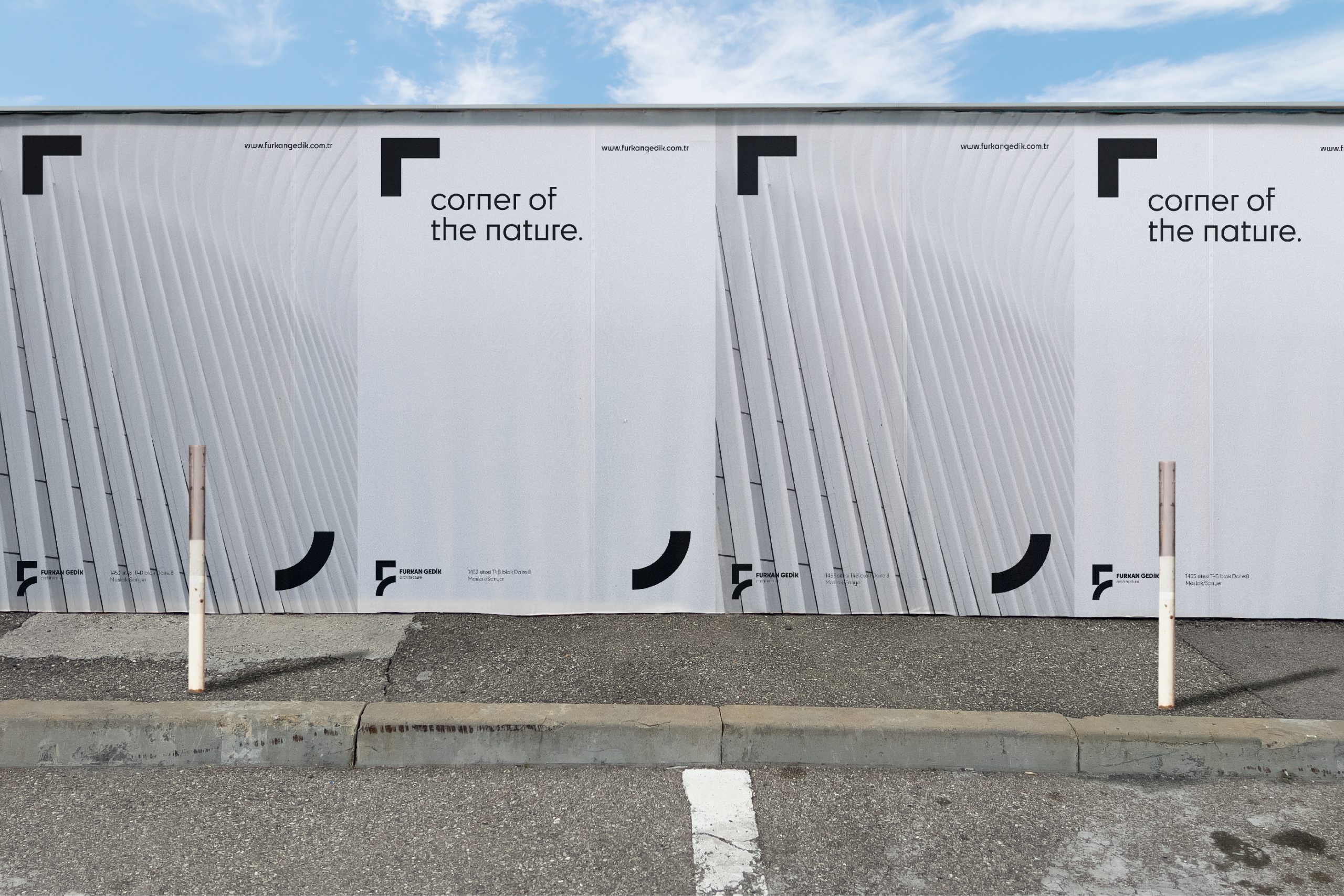
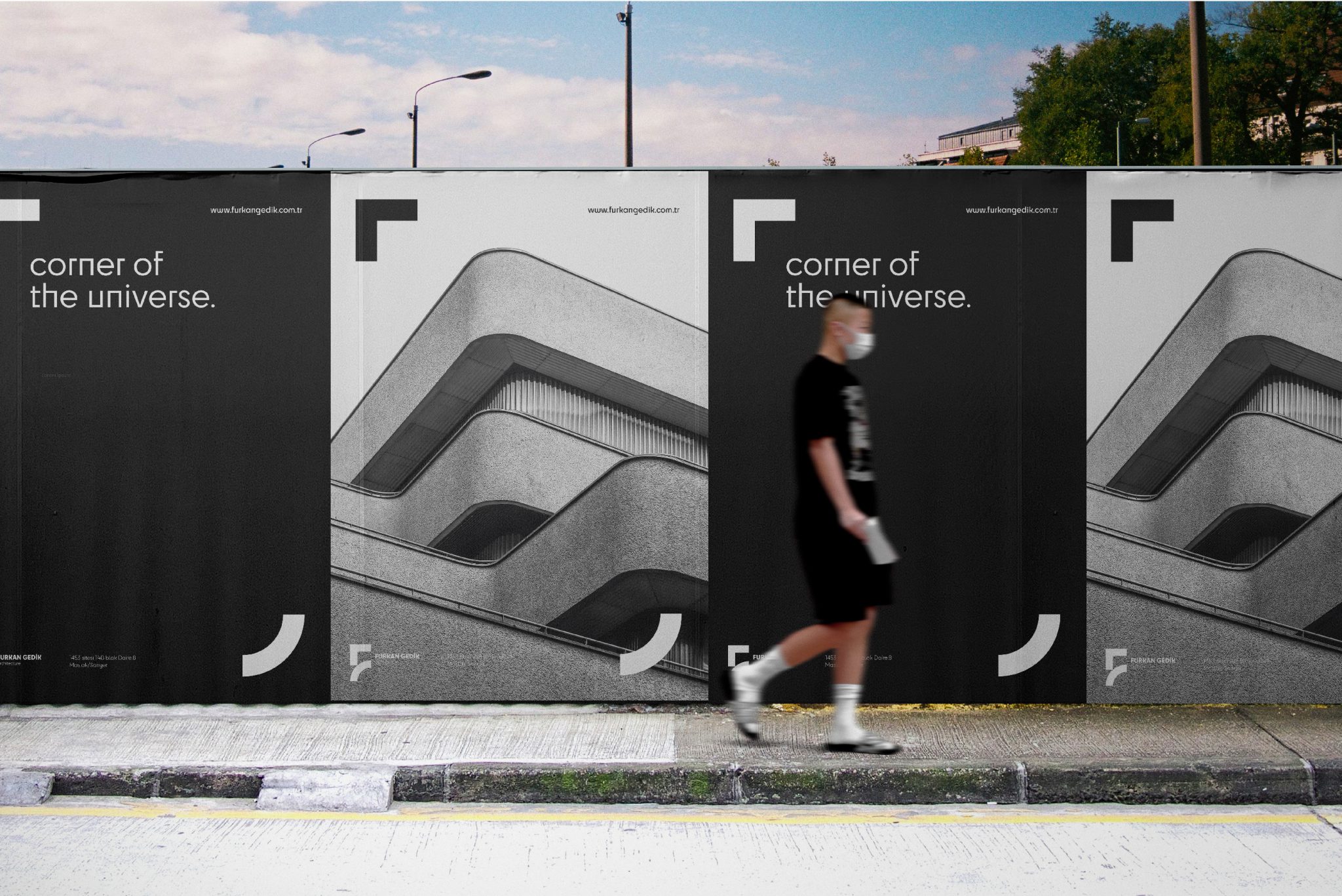
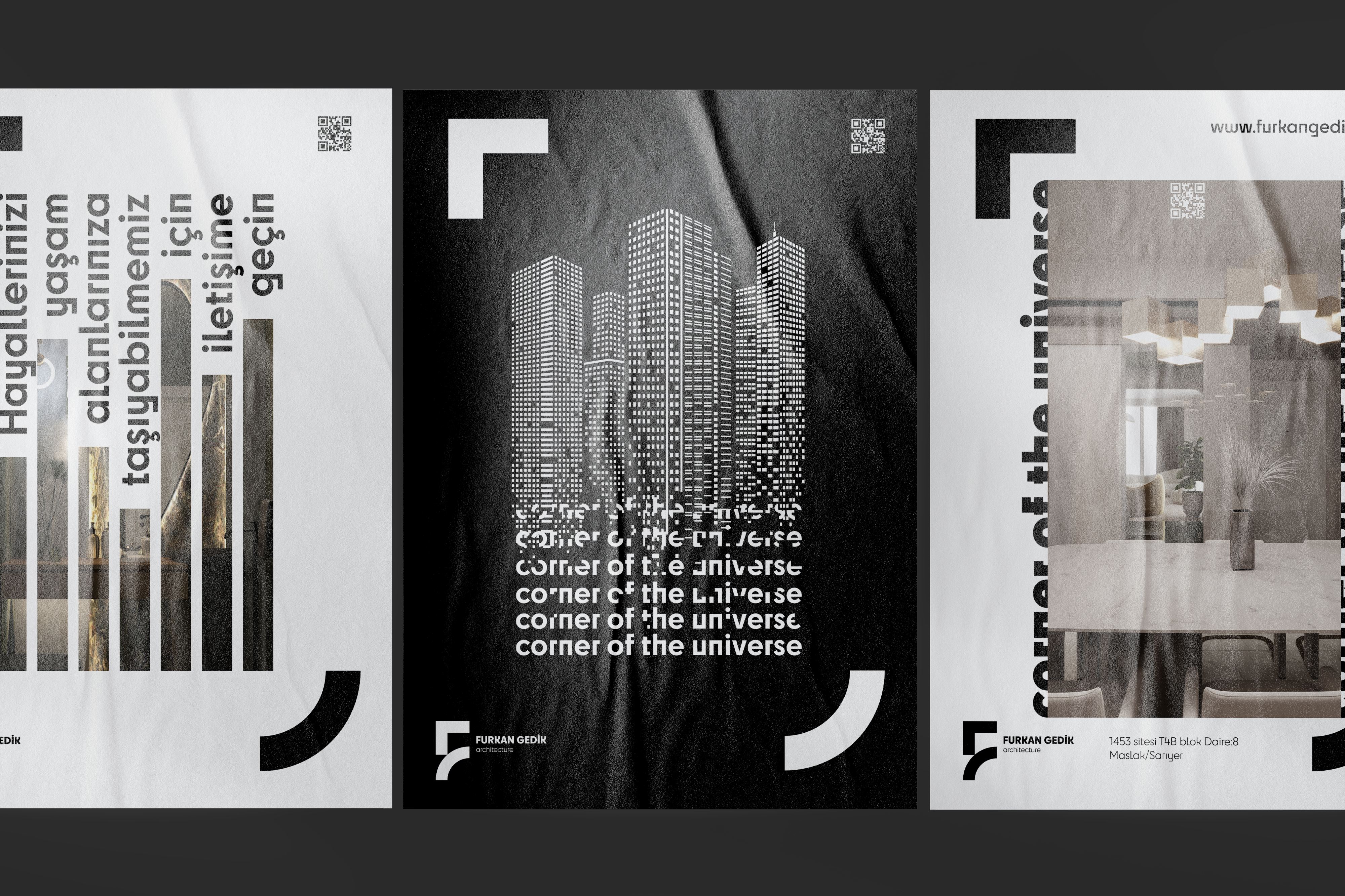
The design process was centered around a logo inspired by the letters "F" and "G." This logo features minimalist and modern lines that symbolize the brand's name and architectural vision. The geometric structure of the logo reflects the fundamental principles of architecture: balance, harmony, and aesthetic elements.

VISUAL IDENTITY

Logo Design:
The logo, formed from the combination of the letters "F" and "G," features a simple and elegant structure. The contrast between black and white provides the logo with a modern and professional appearance.

Color Palette:
The dominant black and white color palette emphasizes the seriousness and professionalism of the brand. These colors also add a sophisticated touch to the designs.

Typography:
The chosen typography strikes a perfect balance between readability and aesthetics. Modern and clean lines represent the brand's reliability and innovation.

Applications:

Business Cards:
Minimalist and elegant business cards containing the company's contact information create a strong first impression in professional relationships.

Envelopes and Letterheads:
Envelopes and letterheads featuring the logo and company information provide a consistent brand identity in corporate correspondence.

Posters and Brochures:
Posters and brochures that showcase the company's projects and services stand out with their simple and impactful designs.

Website:
The mobile-responsive website design, with its user-friendly interface and aesthetic structure, strengthens the brand’s digital presence.

Font Used

The updated logo uses the "New Science" font. We worked with its Light, Medium, and Bold Extended variations. The linear and geometric structure of each letter reinforced the logo's modern and innovative appearance.

THE DESIGN PROCESS WAS BASED ON A LOGO CREATED FROM THE LETTERS "F" AND "G." THIS LOGO CONSISTS OF MINIMALIST AND MODERN LINES THAT SYMBOLIZE THE BRAND'S NAME AND ARCHITECTURAL VISION.