fbpx
LOADING, PLEASE WAIT..
Visual Identity
THE MAIN LOGO INCLUDES VARIOUS 'N' FORMS, DEMONSTRATING ITS APPLICABILITY IN DIFFERENT CONTEXTS.

Nuence

THIS PROJECT WAS TO CREATE A DYNAMIC AND COLORFUL LOGO THAT REFLECTS THE STUDIO'S INNOVATIVE APPROACH AND FLEXIBILITY.

CONCEPT AND DESIGN
LOGO VARIATIONS

The logo design for Nuance is inspired by the letter 'N' and integrates with furniture and architectural structures. This approach highlights the studio's focus on interior solutions while also emphasizing its ability to harmonize and innovate.

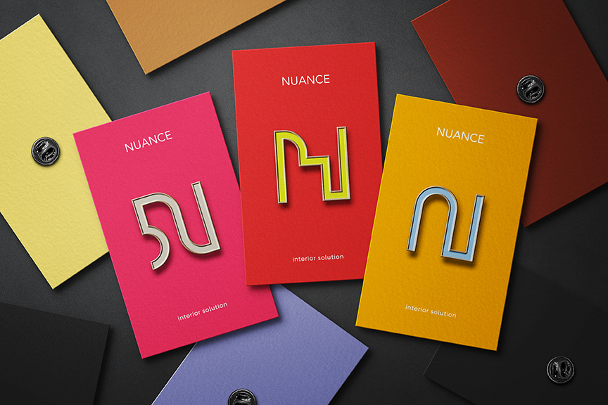
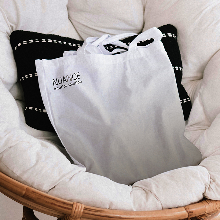
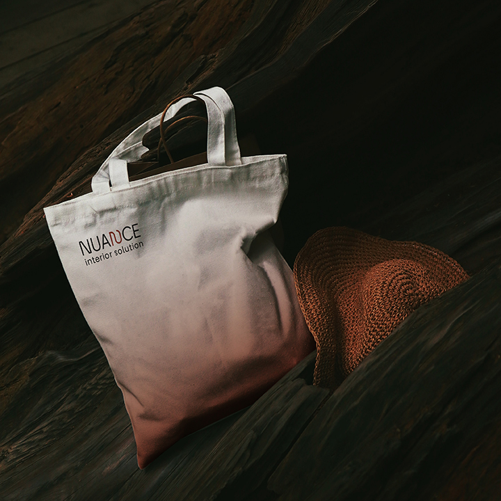
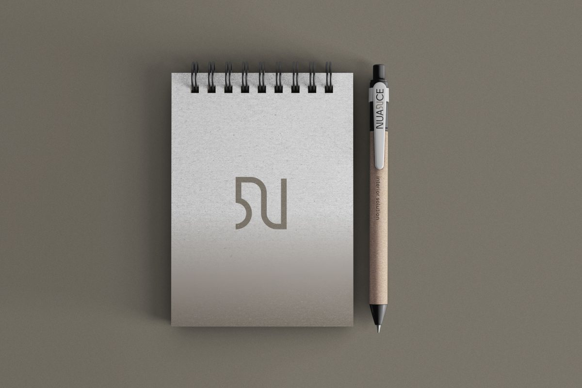
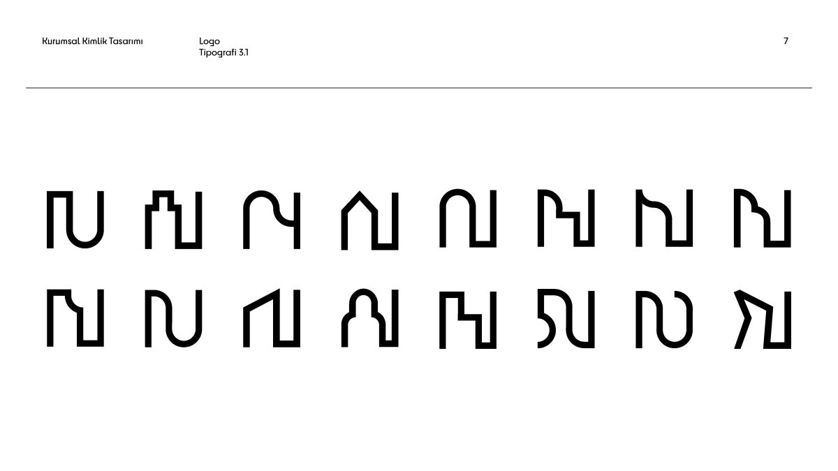
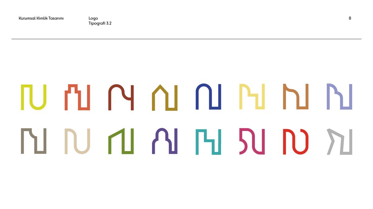
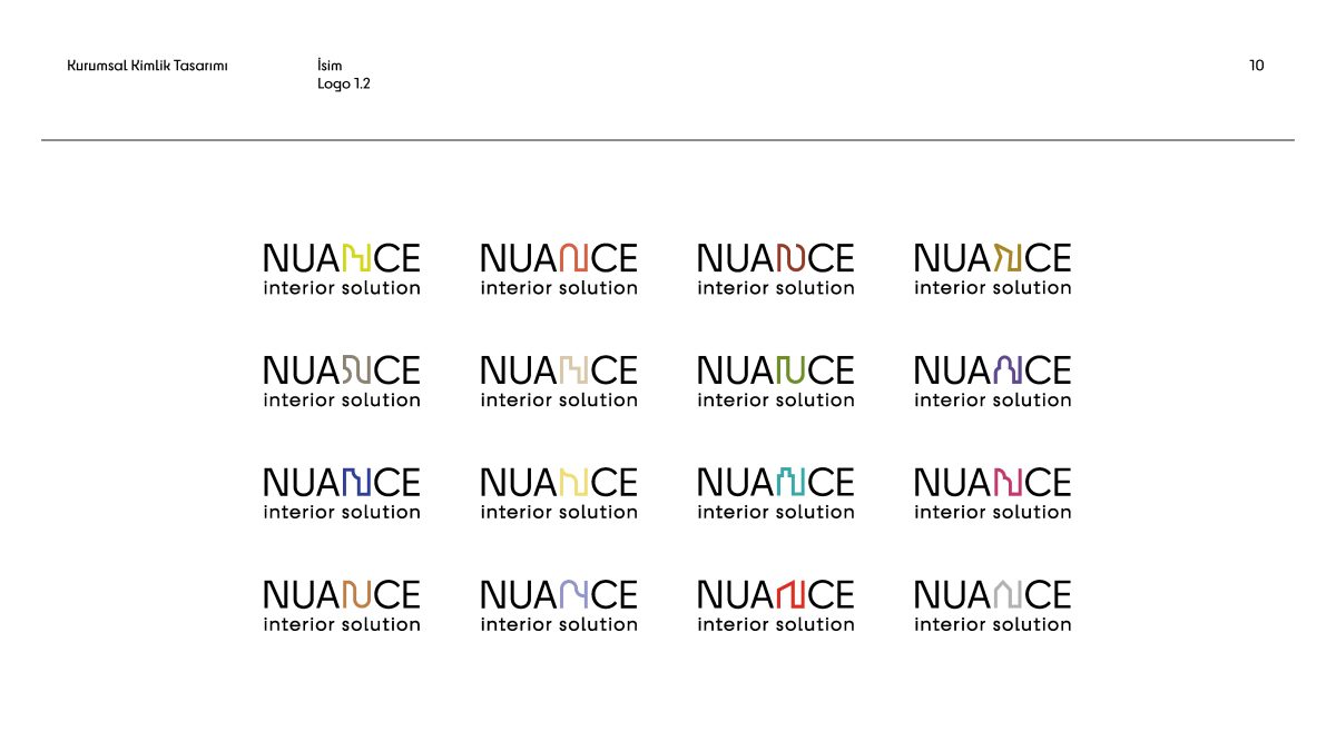
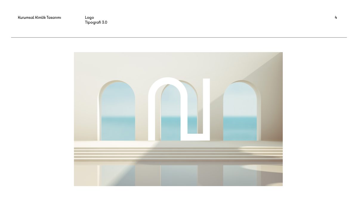
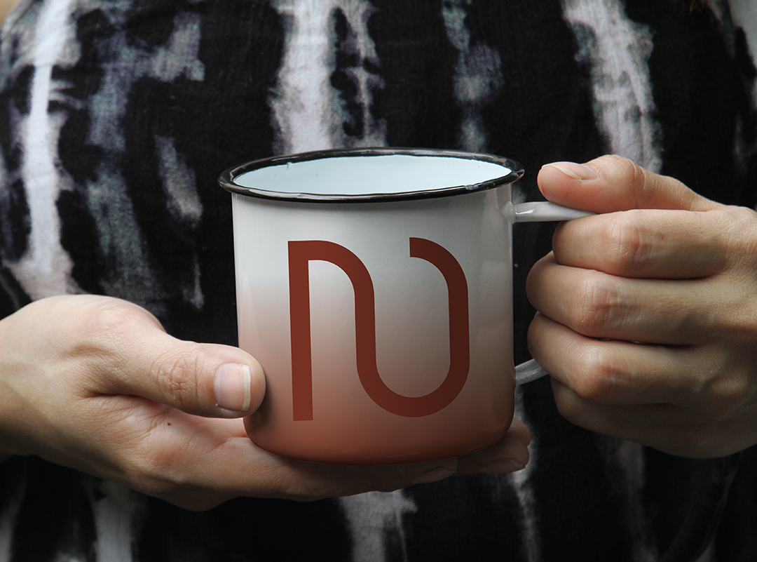
Logo Variations: The main logo includes various forms of the letter 'N' that demonstrate its applicability in different contexts.

Typography: The chosen font is designed with different weights (light, regular, bold, black) to ensure consistency and readability across various media.

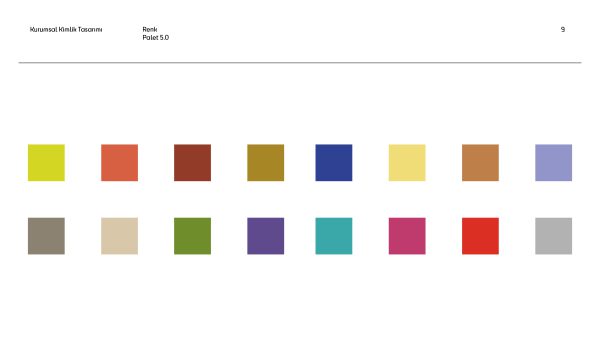
Color Palette: A range of colors has been used to reflect the studio's vibrant and innovative spirit, making the logo visually appealing and versatile.

Applications:

The Nuance logo and brand elements are designed for application across various materials such as business cards, stationery, and promotional items. The use of different colors and forms ensures that the logo remains distinctive and recognizable in every context.

Project Gallery:

BUSINESS CARDS: THE BUSINESS CARDS FEATURE DIFFERENT COLOR VARIATIONS OF THE LOGO, ENHANCING THE STUDIO'S VISUAL IDENTITY.

RESULT:

The corporate identity design created for nuance successfully captures the essence of the studio's interior design solutions services. the flexible and colorful logo, along with the coordinated typography and color palette, combines to form a strong and memorable brand identity that stands out in the industry.