THE PACKAGING DESIGN FOR ONKA FARMA SUCCESSFULLY COMBINES LUXURY AND NATURAL ELEMENTS, CREATING AN ELEGANT AND APPEALING LOOK THAT ALIGNS WITH THE BRAND'S TARGET AUDIENCE.
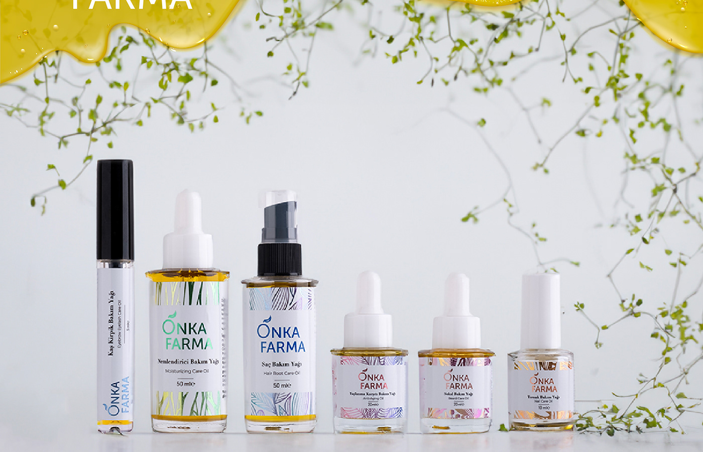
Project Scope: Packaging design for the new care oil series, including logo design, label illustrations, and overall packaging aesthetics.
Project Process: When Onka Farma approached us for the packaging design of their new care oil series, they emphasized their desire for a luxurious and natural appearance. Our goal was to reflect the natural essence of the products in the packaging while ensuring a high-quality look.
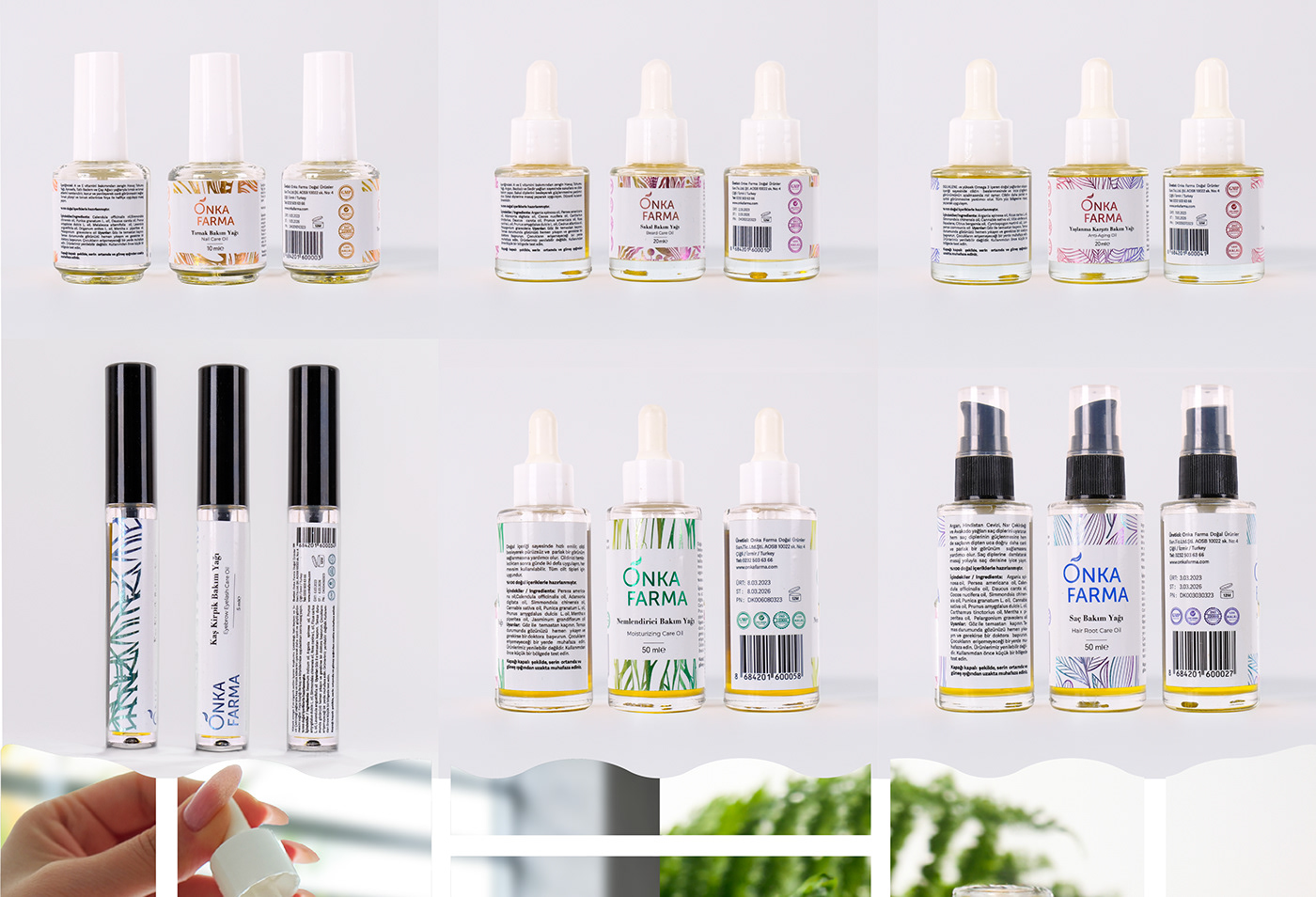
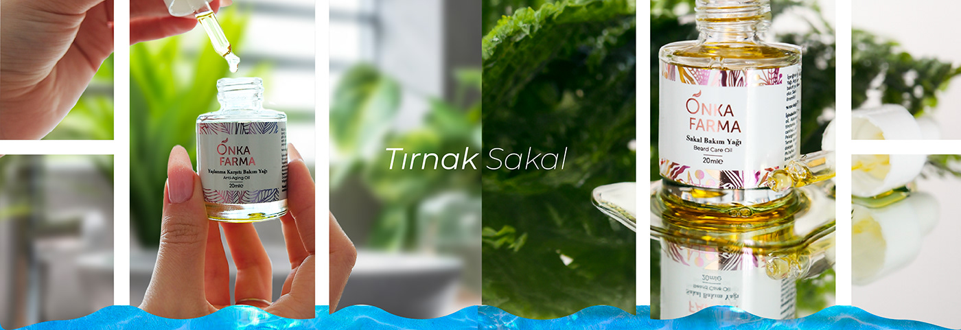
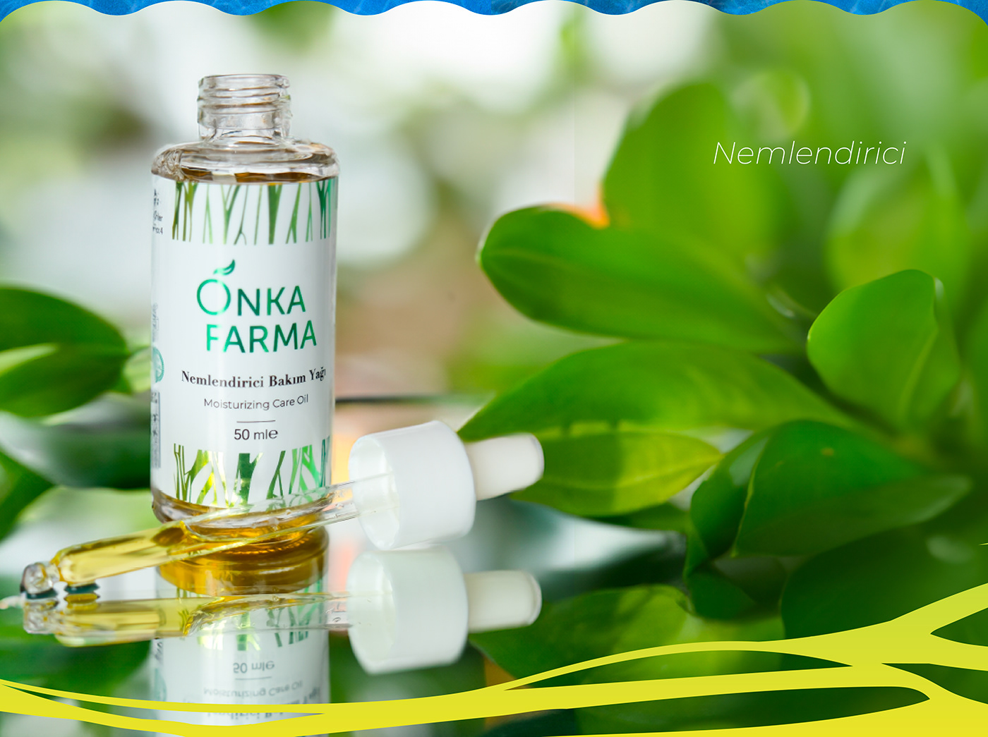
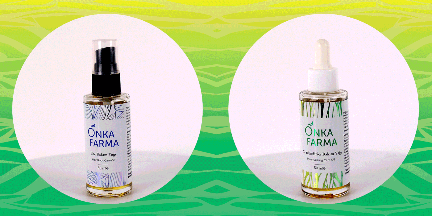
A stylish and modern logo design was created, aligning with the brand's identity. For each care oil, detailed illustrations of the plant ingredients were incorporated into the labels, visually highlighting the natural components.
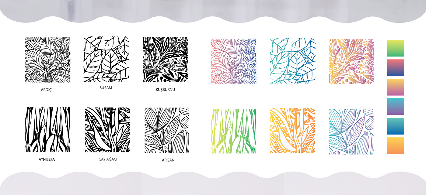
Illustrations:
Detailed botanical illustrations were created for plants used in products such as juniper, sesame, rosehip, calendula, tea tree, and argan. These illustrations were included on the labels to visually represent the natural components of the products.
COLOR SELECTION
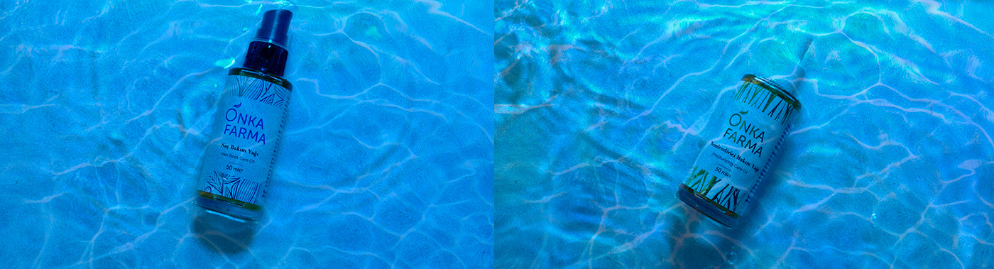
A vibrant and calming color palette was chosen, reflecting the natural and pure essence of the products. each product has a unique color scheme that provides a coherent look within the series while also being easily distinctive.
RESULT:
The packaging design created for Onka Farma successfully combines luxurious and natural elements, resulting in an elegant and appealing look that aligns with the brand’s target audience. Detailed botanical illustrations and a carefully selected color palette highlight the purity and high quality of the products, while the overall design presents a chic and modern aesthetic.