fbpx
LOADING, PLEASE WAIT..
Visual Identity

Septima Architecture

WITH THIS PROJECT, THE ARCHITECTURE FIRM "SEPTIMA" AIMS TO ACHIEVE A STRONG AND MEANINGFUL BRAND IDENTITY, SETTING ITSELF APART IN THE INDUSTRY.

BRAND STRATEGY
DESIGN PROCESS
BRANDING

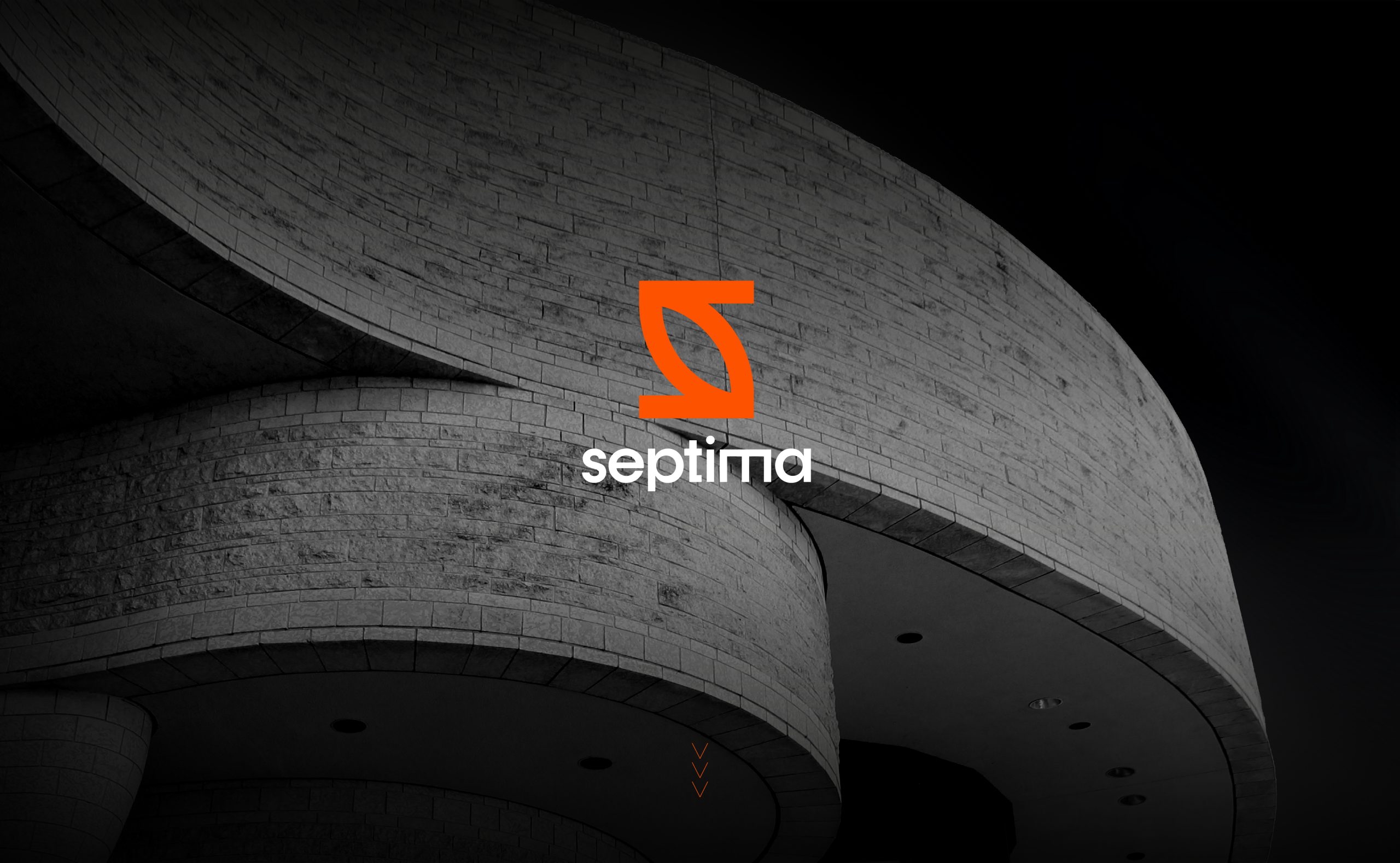
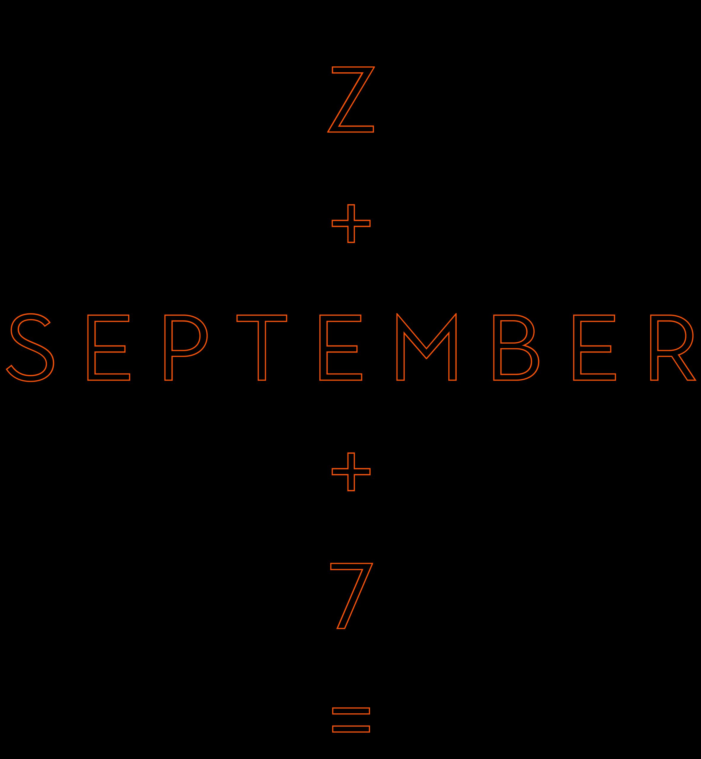
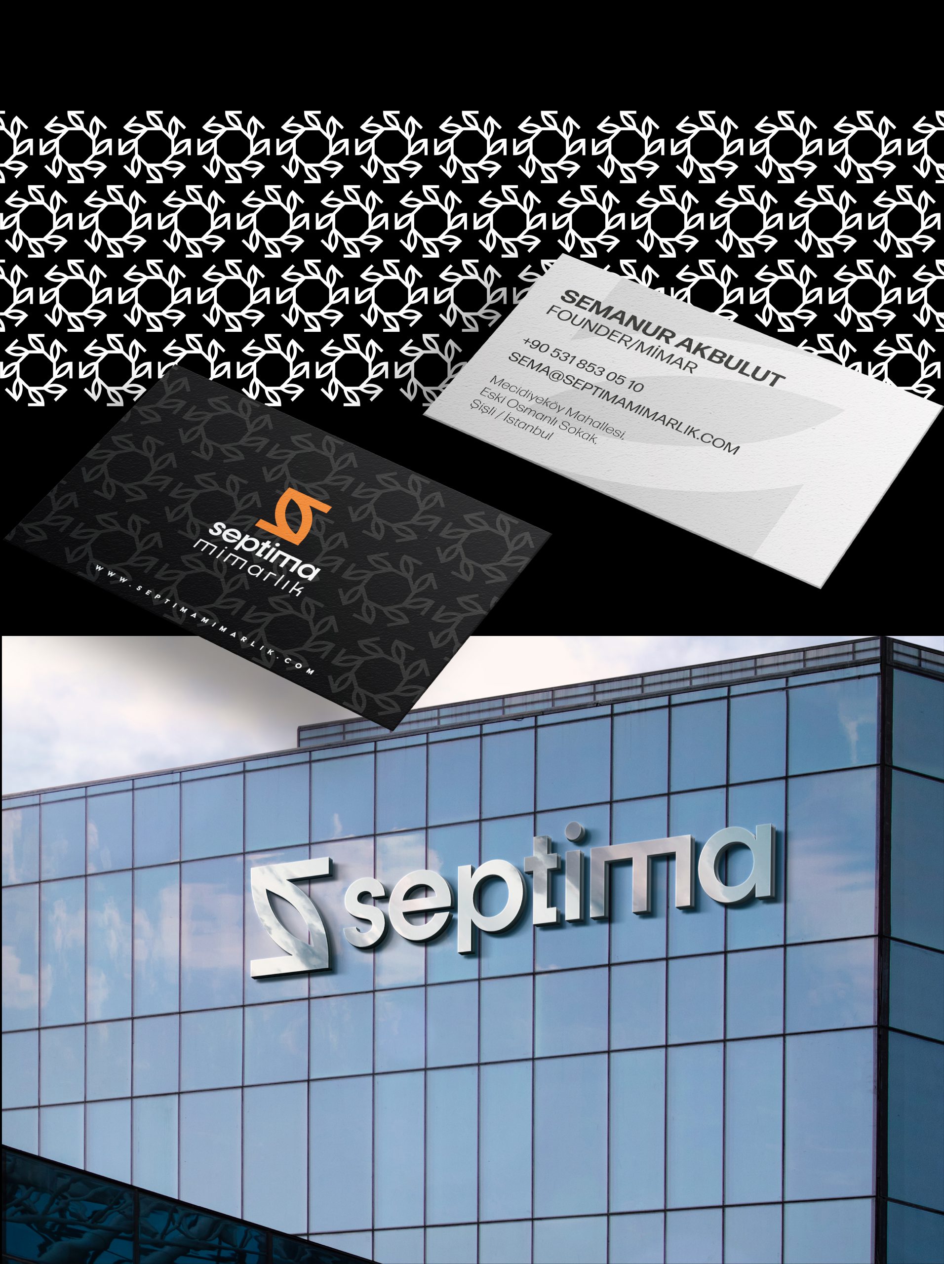
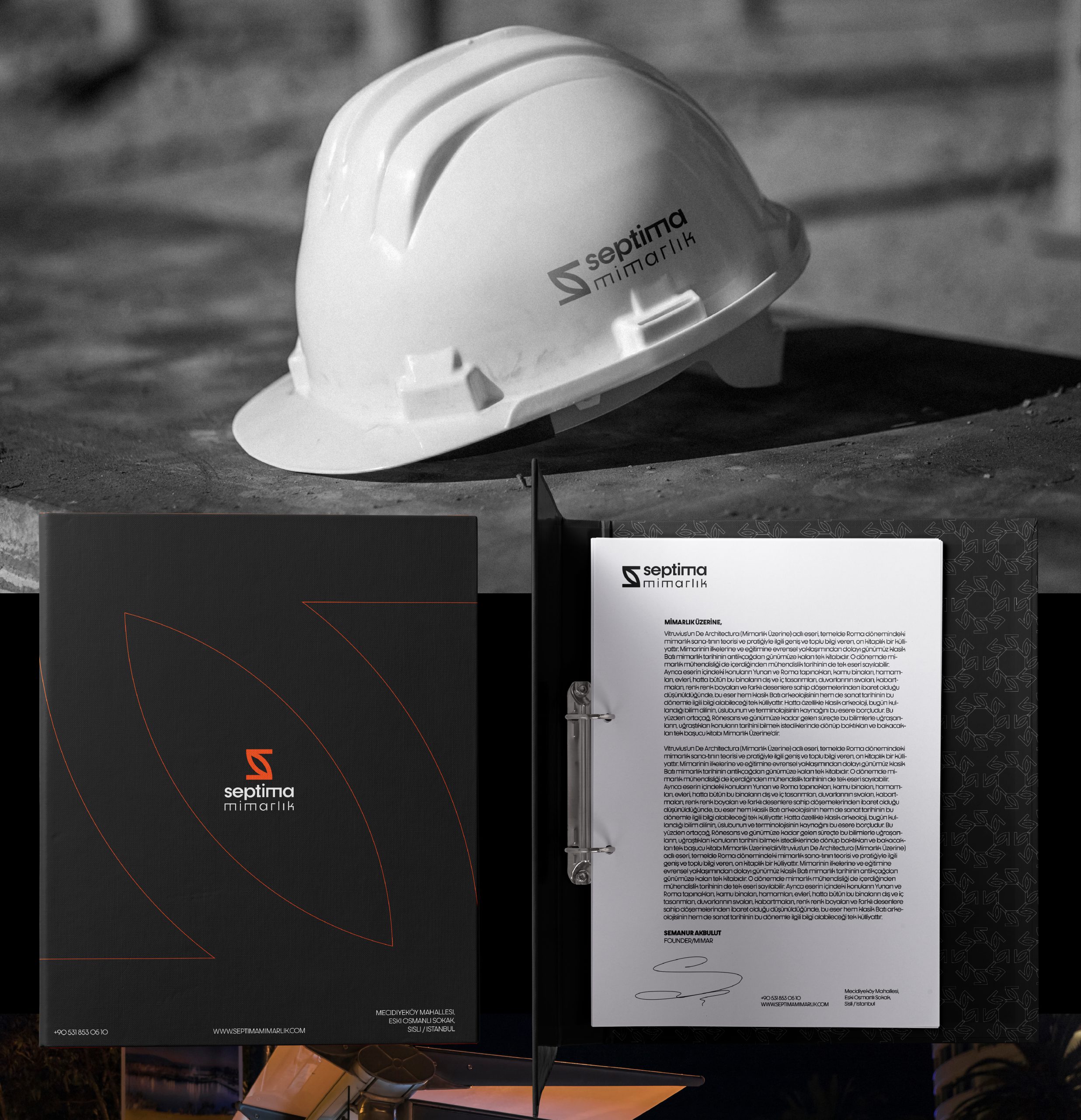
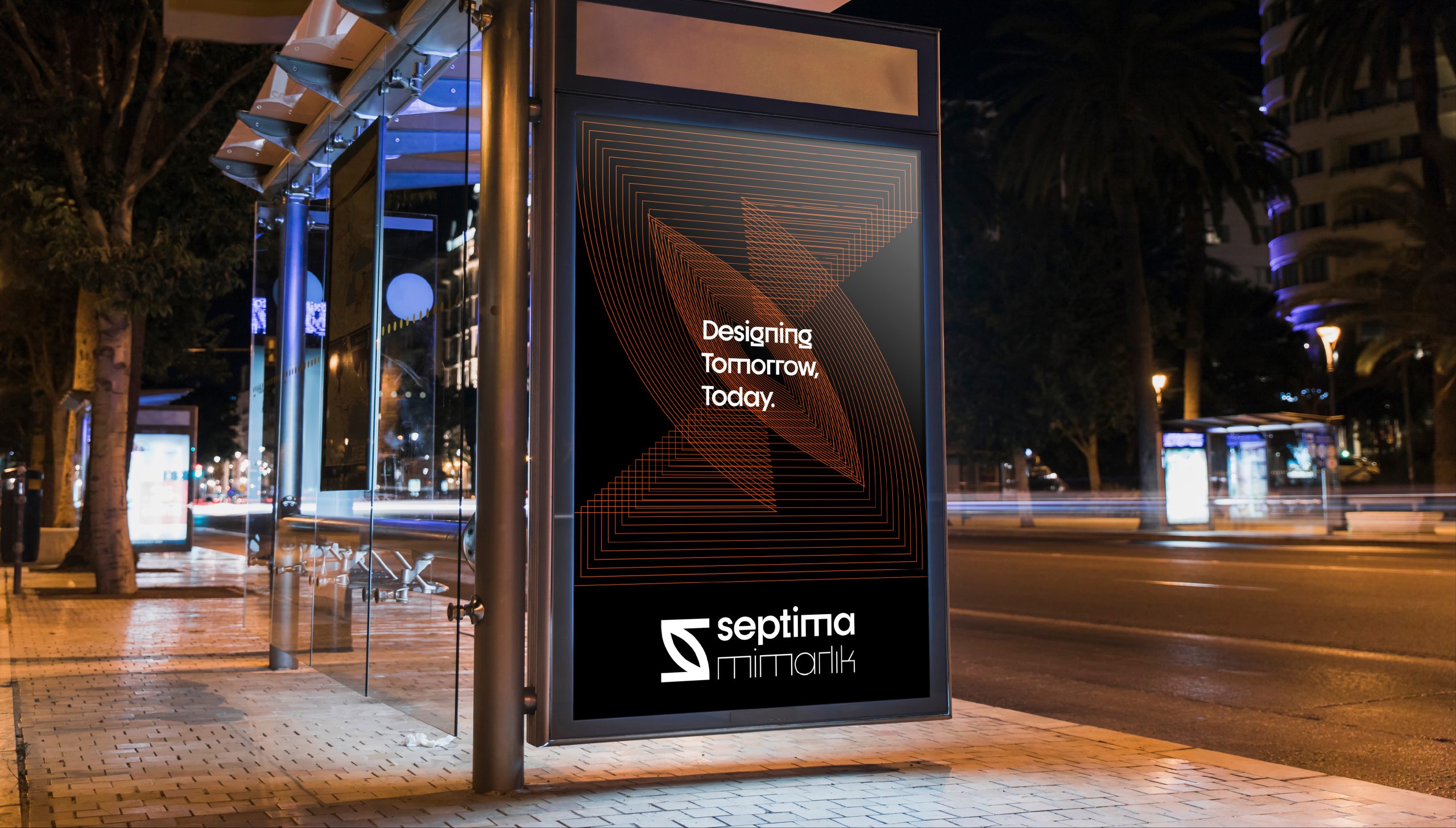
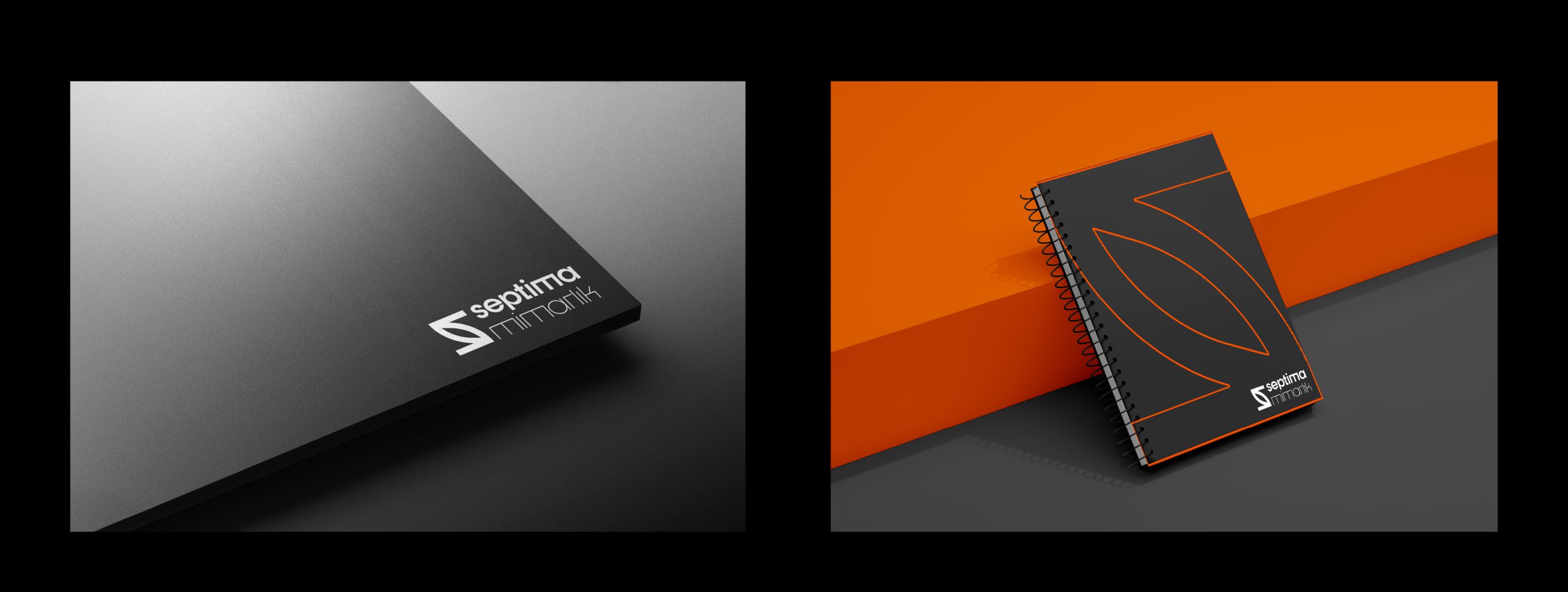
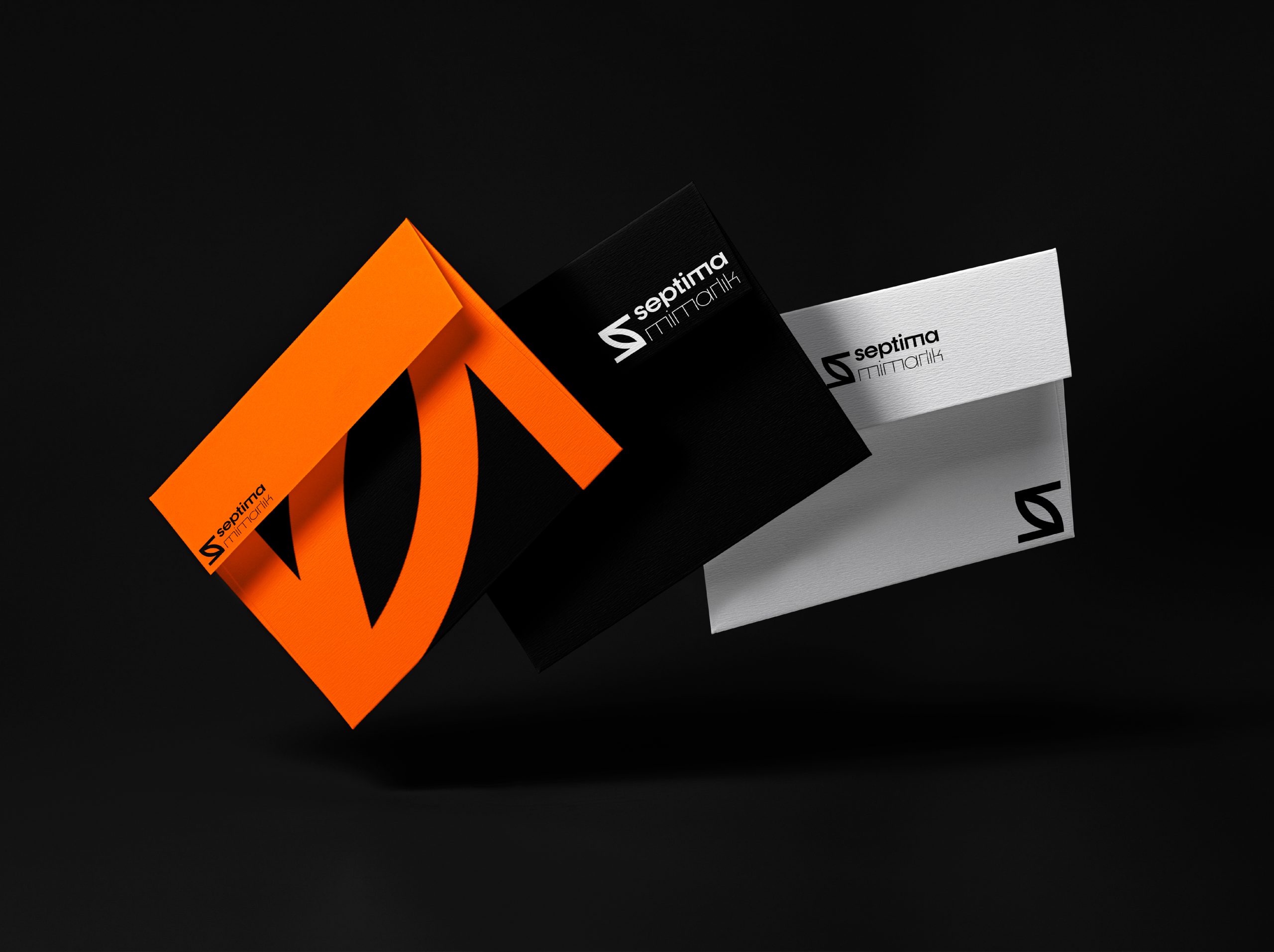
As a new architecture firm, "Septima" approached our agency for assistance with both naming and visual identity design. In the client's brief, there was a strong emphasis on the love for the number 7 and the month of September. Therefore, we aimed to reflect this sentiment in both the name and the logo we designed.

Logo Design
We combined the number 7 and the letter 'S' into a leaf shape in the emblem, offering a design that is both harmonious with nature and aesthetically pleasing. The orange color was chosen for its strong and energetic qualities, a color often favored by architecture firms.

Name

The firm's name, "Septima," was inspired by the month of September and the number 7. This name reflects the company's vision and values, aiming to create an emotional connection with clients.

Typography

The font chosen for the project, "Dystopian," represents a modern and minimalistic approach. This typography supports the brand's professional and innovative stance.

Result

With this project, the architecture firm "Septima" aims to achieve a strong and meaningful brand identity, setting itself apart in the industry.