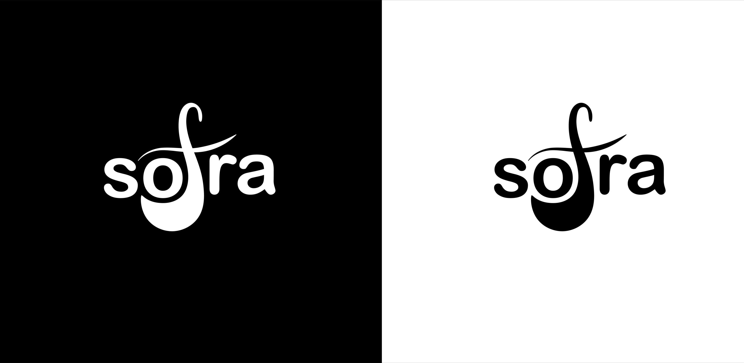
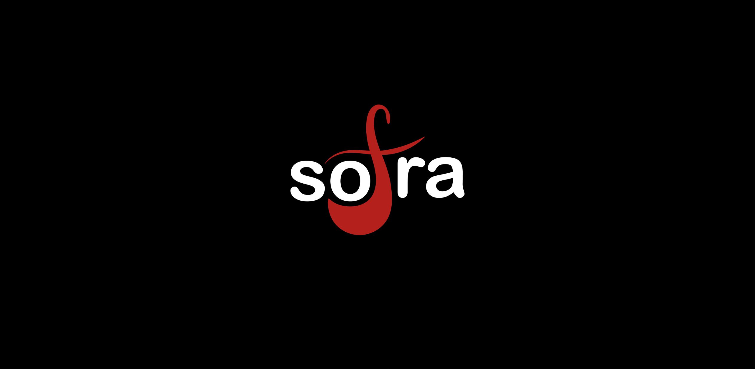
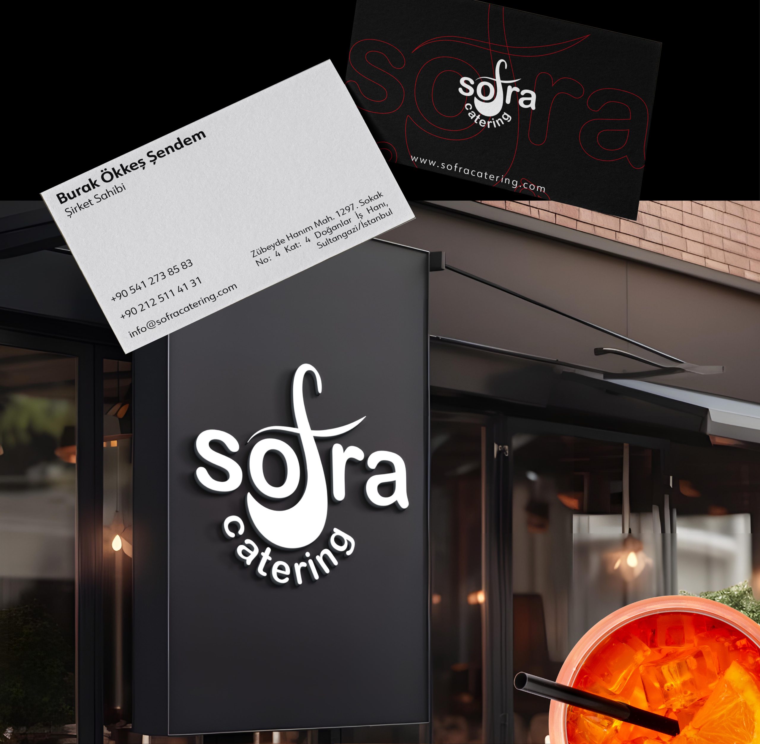
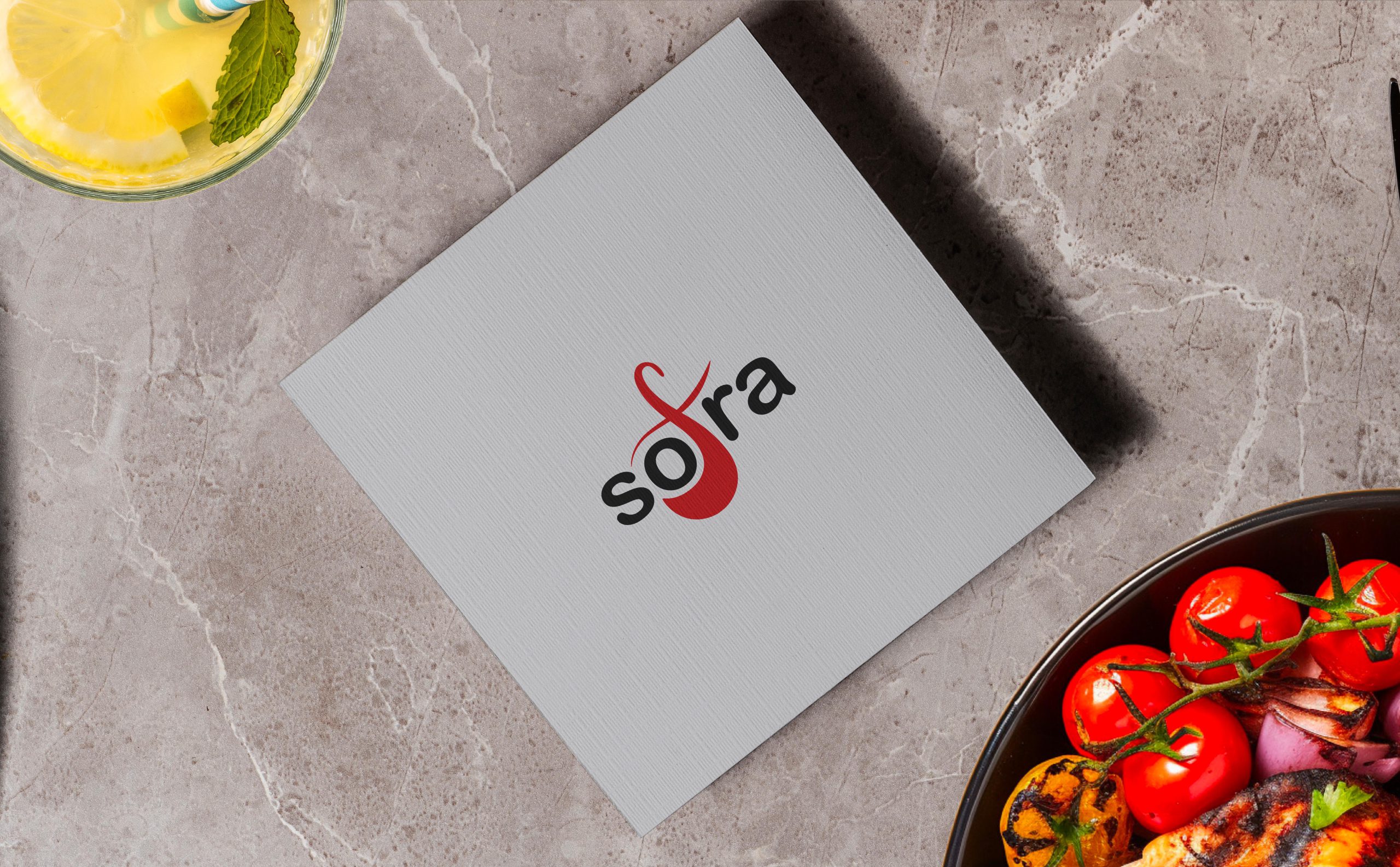
fbpx
LOADING, PLEASE WAIT..
Visual Identity

Sofra Catering

THE LETTER "F" WAS SHAPED INTO A SPOON FORM, REFERENCING THE CATERING INDUSTRY. THE COLOR PALETTE USED IN THE LOGO DESIGN CONSISTS OF RED, GRAY TONES, AND YELLOW.

BRAND STRATEGY
DESIGN PROCESS
BRANDING

Sofra, a catering company, requested corporate identity and website design from us. Based on the client's requirements, we designed a creative logo and visual identity that highlights the emphasis on catering.

The logo was designed to represent the company's name while also emphasizing its catering services. The letter "f" was shaped into a spoon, referencing the catering industry. The color palette used in the logo design consists of red, gray tones, and yellow. These colors evoke themes of food and hospitality, further strengthening the brand's identity.

Typography:

The Arial Rounded font family was chosen to reflect the friendly and approachable nature of the logo and the company.

The typography was used in various weights (Light, Regular, Extra Bold) to ensure consistency across different media.

Color Selection

Red:
Passion and energy
Light Gray:
Professionalism and modernity
Dark Gray:
Reliability and seriousness
Yellow:
Joy and positivity

The color palette for the logo design includes red, gray tones, and yellow. These colors were chosen to evoke themes of food and hospitality, aligning with the brand’s identity. Red symbolizes passion and energy, gray tones add a touch of professionalism, and yellow brings warmth and friendliness, reinforcing the welcoming nature of the brand.

Website Design

A user-friendly, modern, and stylish website was designed. The website is mobile-responsive and easy to navigate, ensuring that customers can access services quickly and easily.