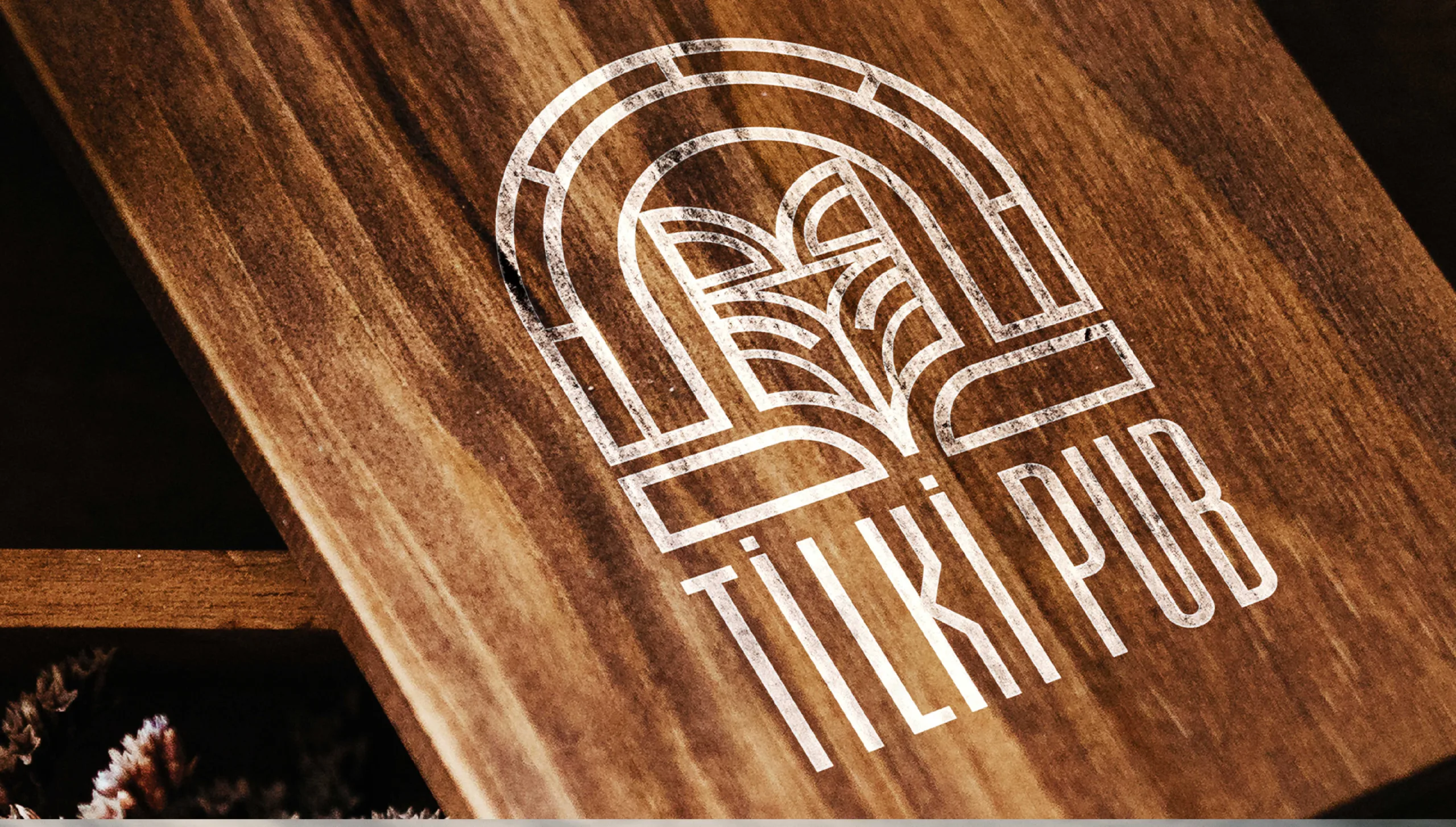
THE BRAND IDENTITY DEVELOPED FOR TİLKİ PUB SUCCESSFULLY REFLECTED THE PUB'S ETHNIC AND WARM ATMOSPHERE. THE COMBINATION OF A STYLIZED FOX, AN EARTH-TONED COLOR PALETTE, AND TRADITIONAL TYPOGRAPHY CREATED A STRONG AND DISTINCTIVE VISUAL IDENTITY THAT ENHANCED THE BRAND'S PRESENCE AND APPEAL.
BRAND STRATEGY
DESIGN PROCESS
BRANDING
Tilki Pub, a new pub set to open, approached our agency requesting a visual identity featuring a fox image. They desired an ethnic feel in both the colors and overall design language. As a result, we created a distinctive and culturally rich logo that Tilki Pub is now proudly using.
Design Concept:
Our goal was to create a logo that reflects the name "Tilki Pub" while incorporating an ethnic and rustic aesthetic. We focused on achieving this unique visual identity by blending traditional elements with a modern design approach.
Logo Design
Logo:
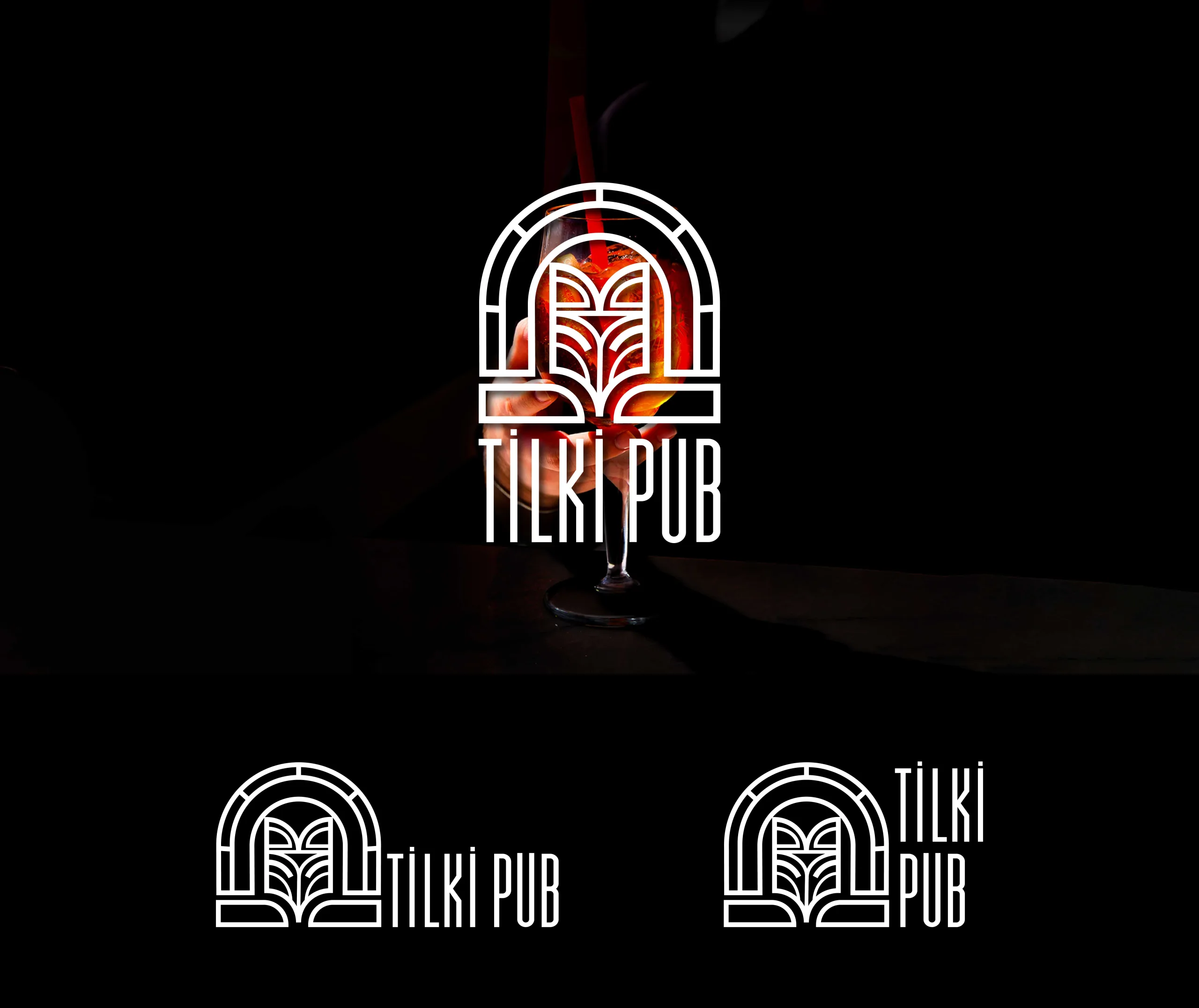
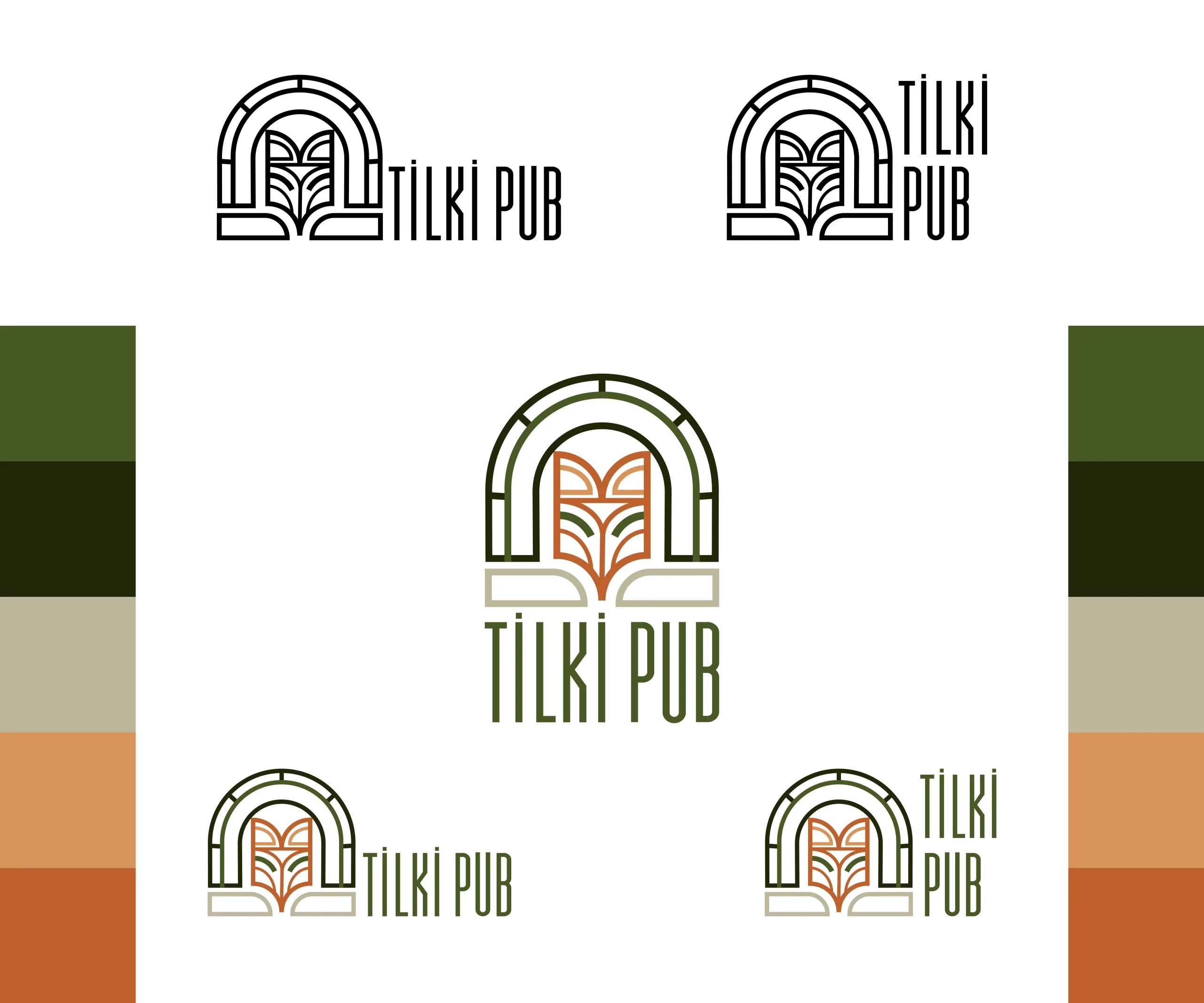
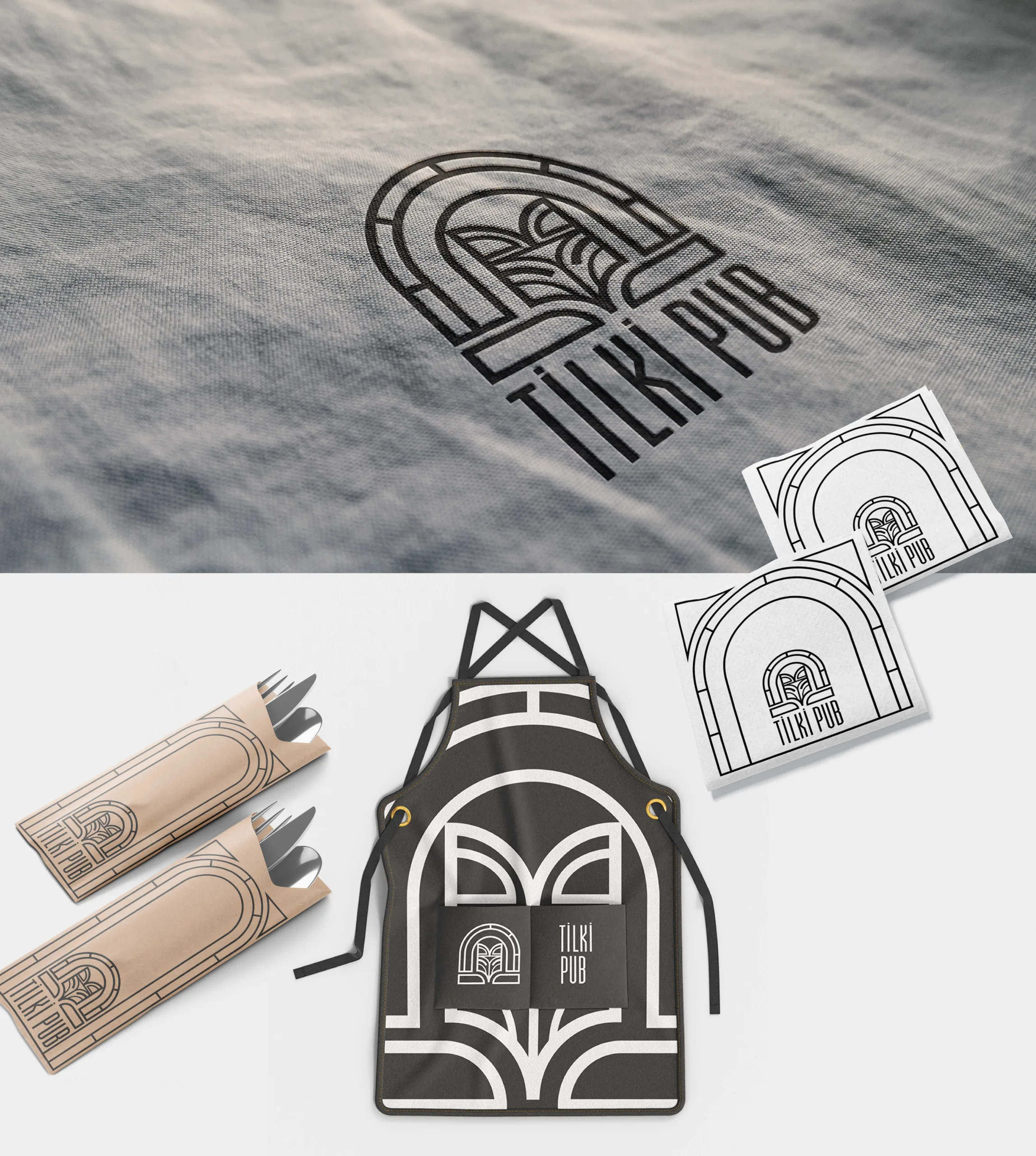
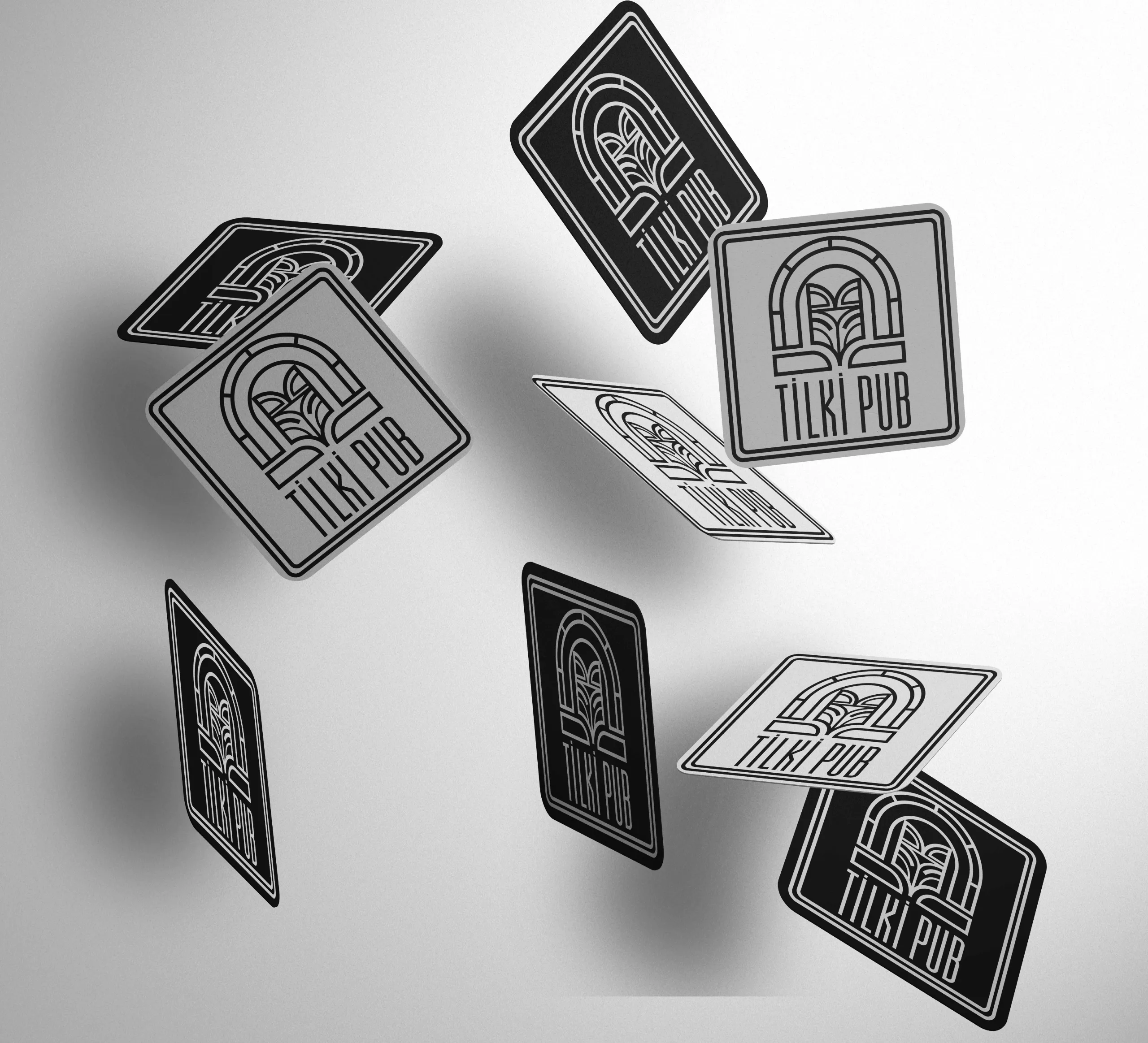
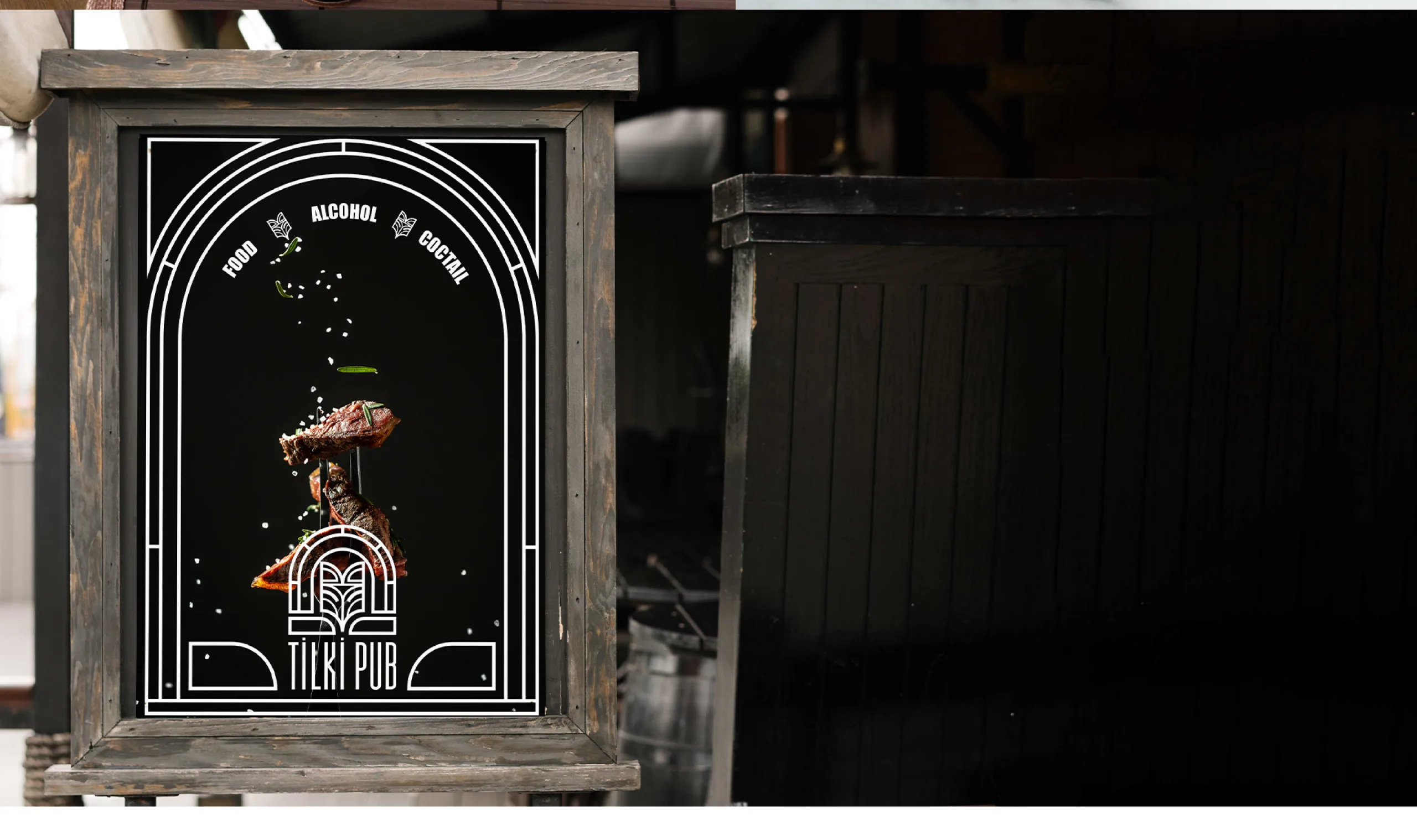
The logo integrates a stylized fox image within an arch, inviting guests into a warm and culturally rich pub environment.
Typography:
The font chosen for "Tilki Pub" strikes a balance between modernity and a slightly traditional feel, complementing the ethnic theme of the logo. The letters are clean and readable, ensuring that the brand name stands out.
Color Palette:
A color palette of earth tones, including shades of green, brown, and beige, was selected to create a natural and warm atmosphere. This palette aligns with the desired aesthetic of the pub.
Symbolism:
The arch in the logo represents a door inviting guests into the welcoming and cultural ambiance of Tilki Pub. The fox, depicted with fine lines and patterns, enhances the ethnic feel and serves as a memorable brand icon.
Application:
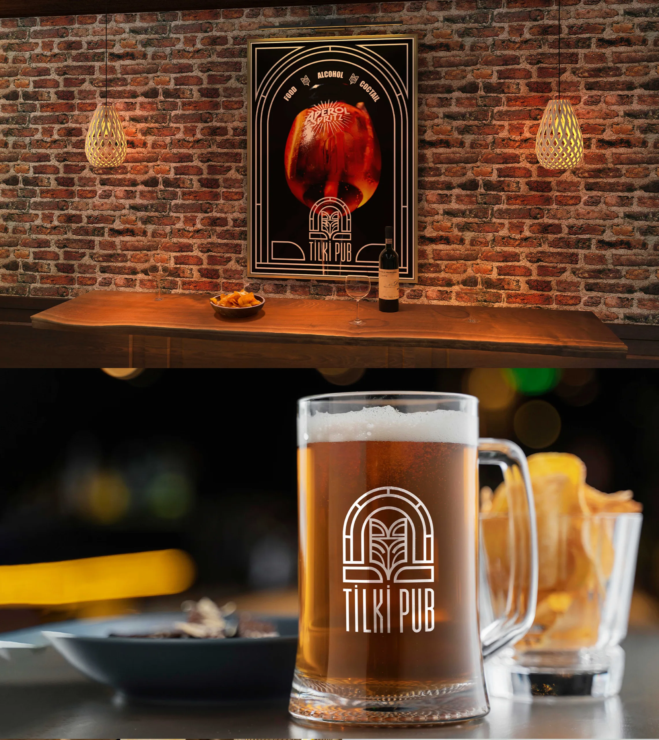
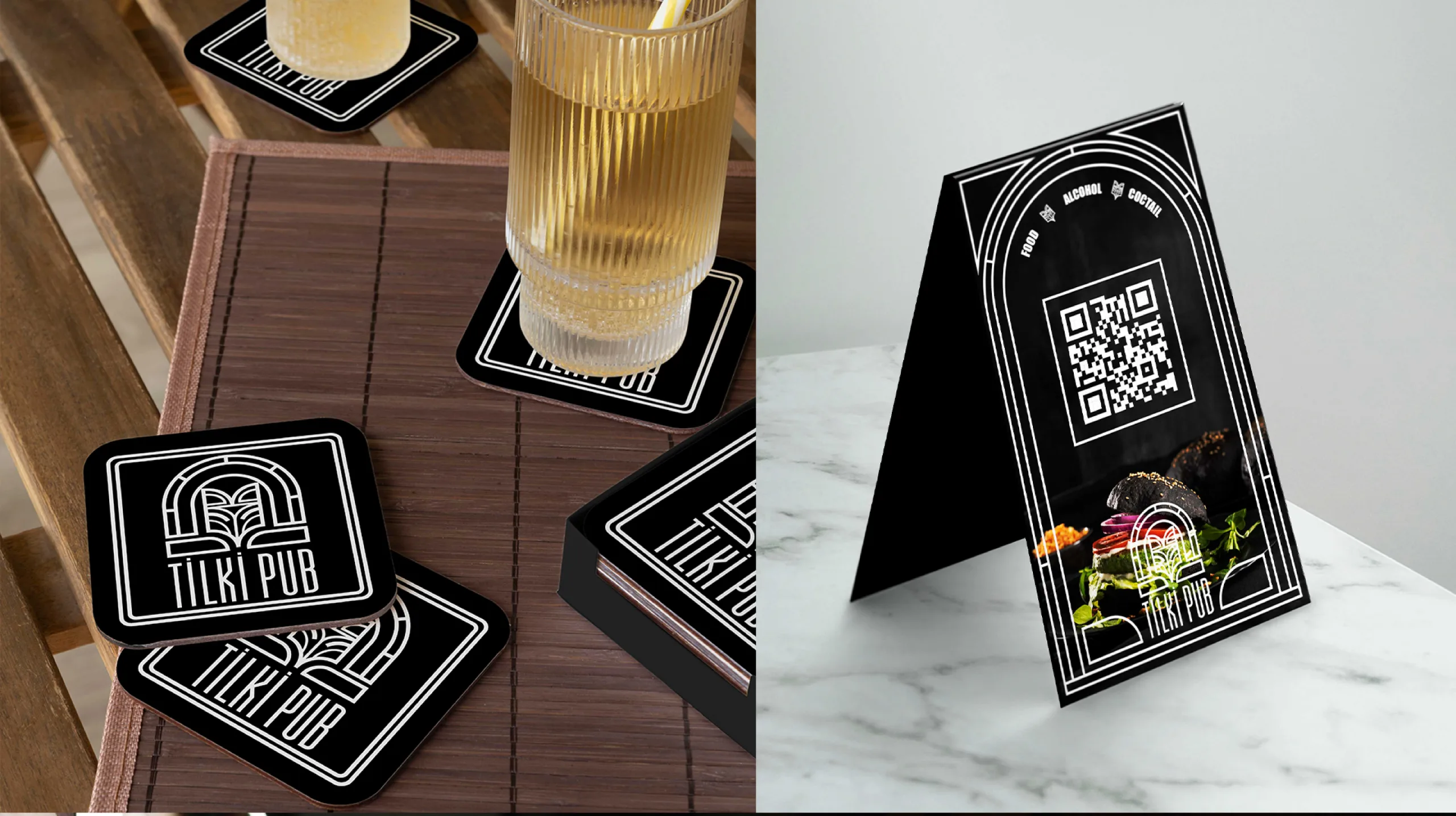
The new logo was applied across various brand touchpoints, from signage to menus and promotional materials. This consistent visual identity ensures a professional and cohesive look, strengthening Tilki Pub's brand image.
THE BRAND IDENTITY DEVELOPED FOR TİLKİ PUB SUCCESSFULLY REFLECTED THE PUB'S ETHNIC AND WELCOMING ATMOSPHERE. THE COMBINATION OF A STYLIZED FOX, AN EARTH-TONED COLOR PALETTE, AND TRADITIONAL TYPOGRAPHY CREATED A STRONG AND DISTINCTIVE VISUAL IDENTITY THAT STRENGTHENED THE BRAND'S PRESENCE AND ENHANCED ITS APPEAL.
RESULT
The brand identity developed for Tilki Pub successfully captured the pub's ethnic and welcoming atmosphere. The combination of a stylized fox, an earth-toned color palette, and traditional typography created a strong and distinctive visual identity that strengthened the brand's presence and enhanced its appeal.


