fbpx
LOADING, PLEASE WAIT..
Visual Identity
THE BRAND WAS REBORN WITH A YOUNG AND DYNAMIC IDENTITY.

Type Agency

THE COMBINATION OF CLEVER TYPOGRAPHIC DESIGN AND A STRIKING COLOR PALETTE CREATES A STRONG AND MEMORABLE VISUAL IDENTITY THAT STRENGTHENS THE BRAND'S PRESENCE AND ENHANCES ITS APPEAL.

BRAND STRATEGY
DESIGN PROCESS
BRANDING

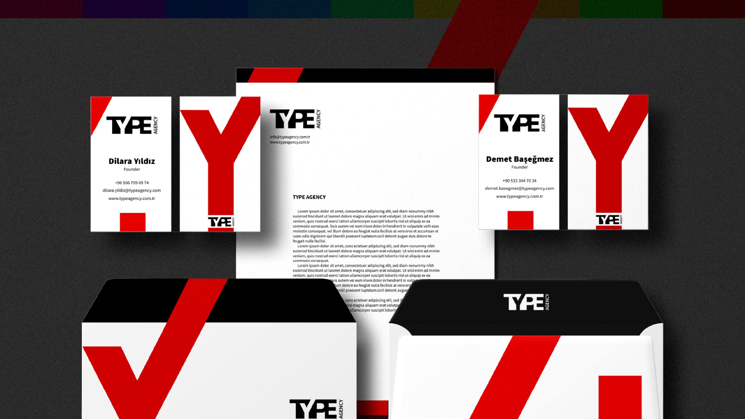
Type Agency, a newly established event PR and advertising agency, approached our firm seeking a strong and high-quality visual identity. They wanted a logo that would stand out in a competitive industry and effectively represent their brand.

Design Concept:
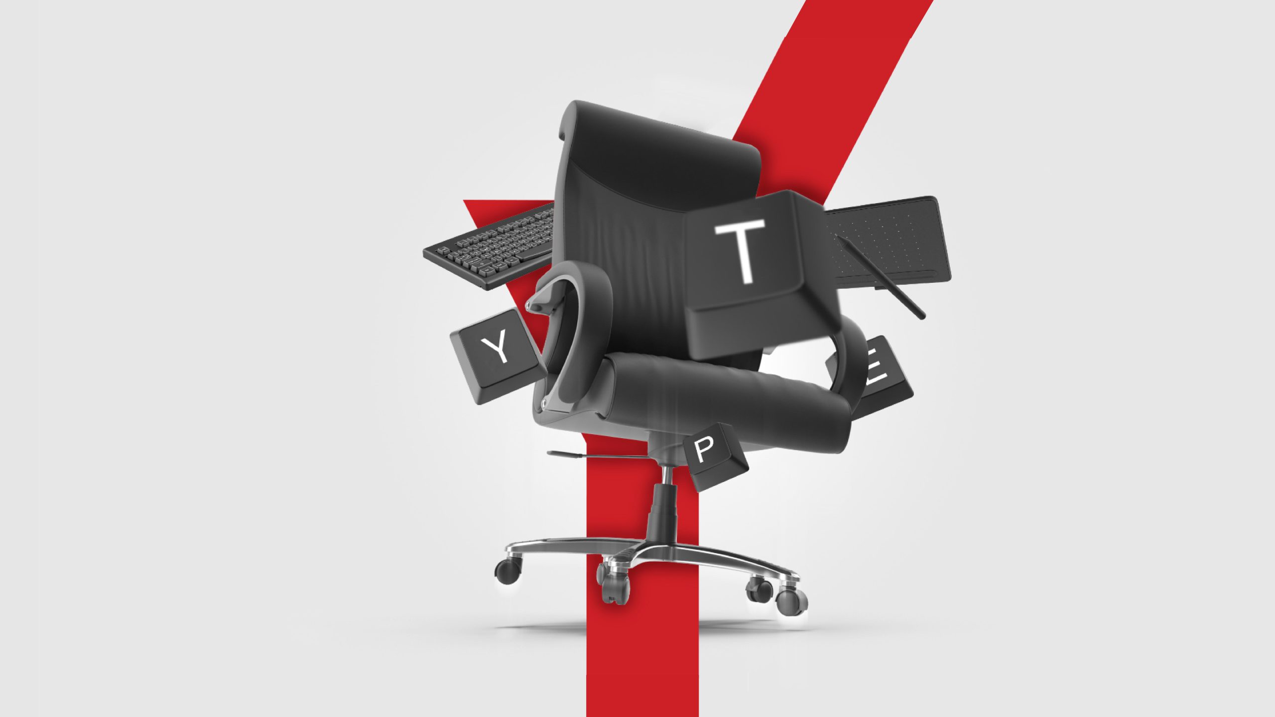
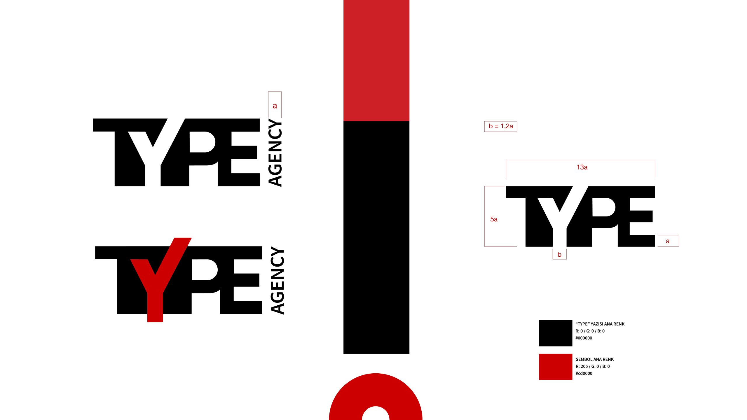
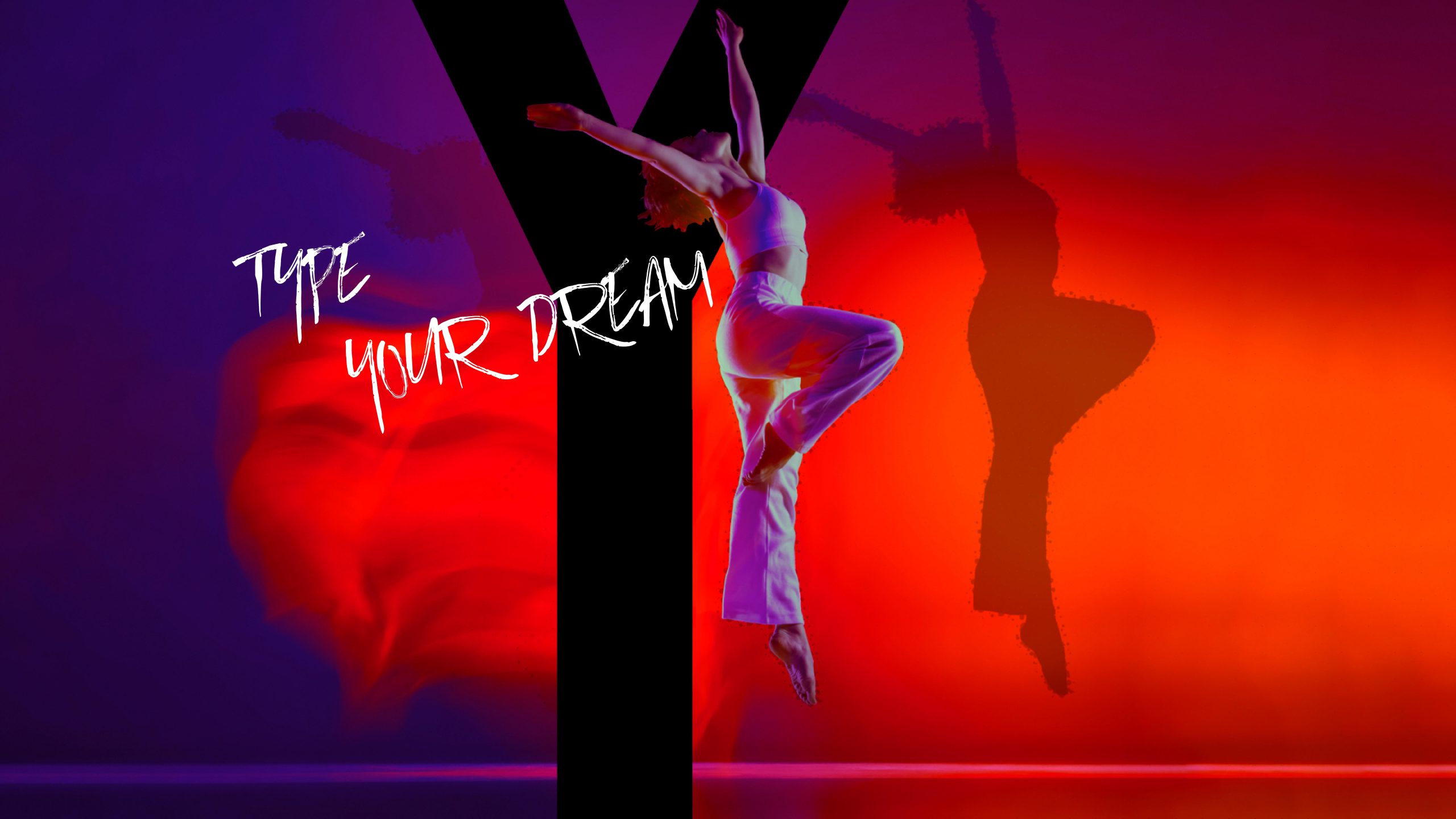
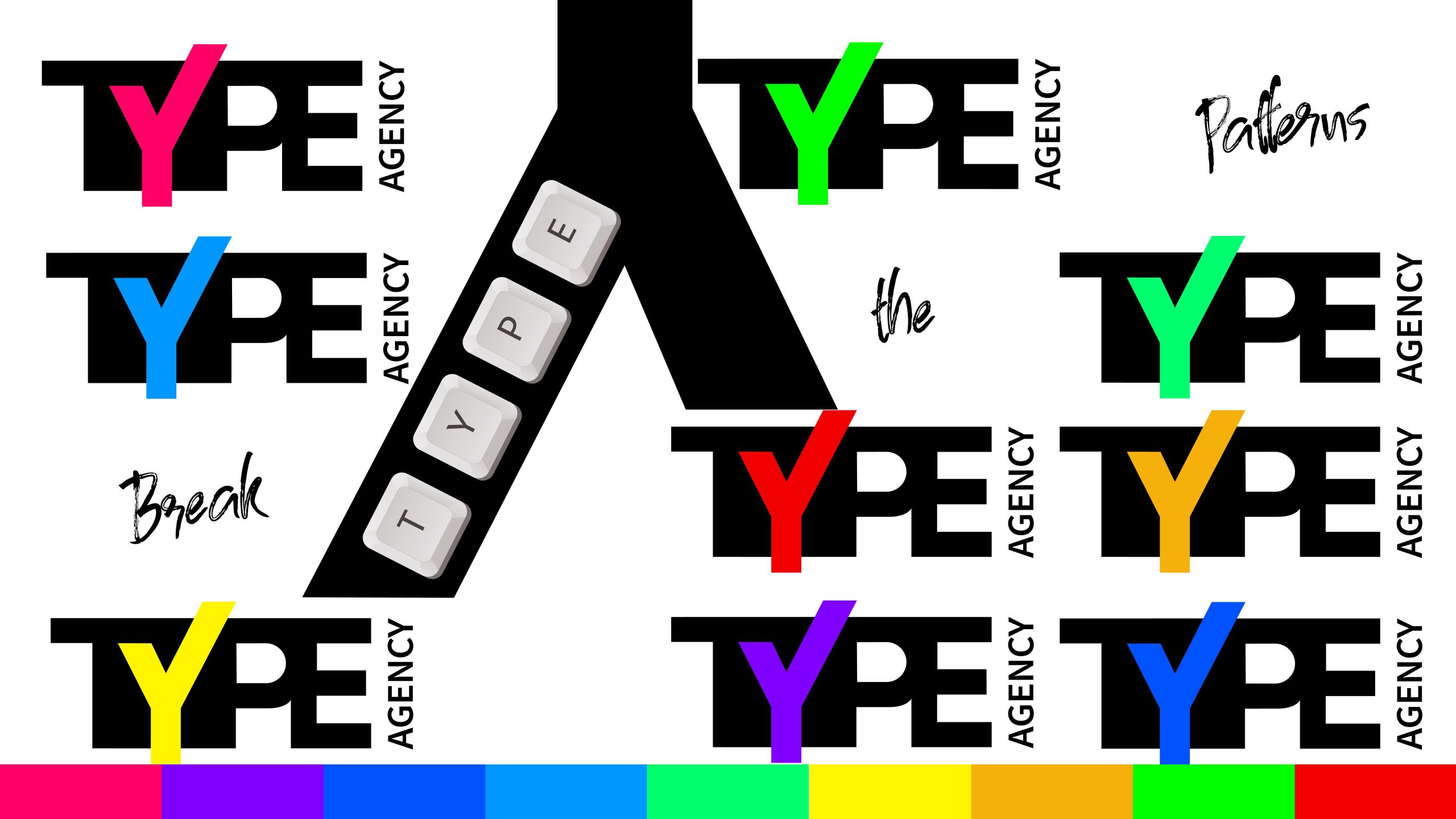
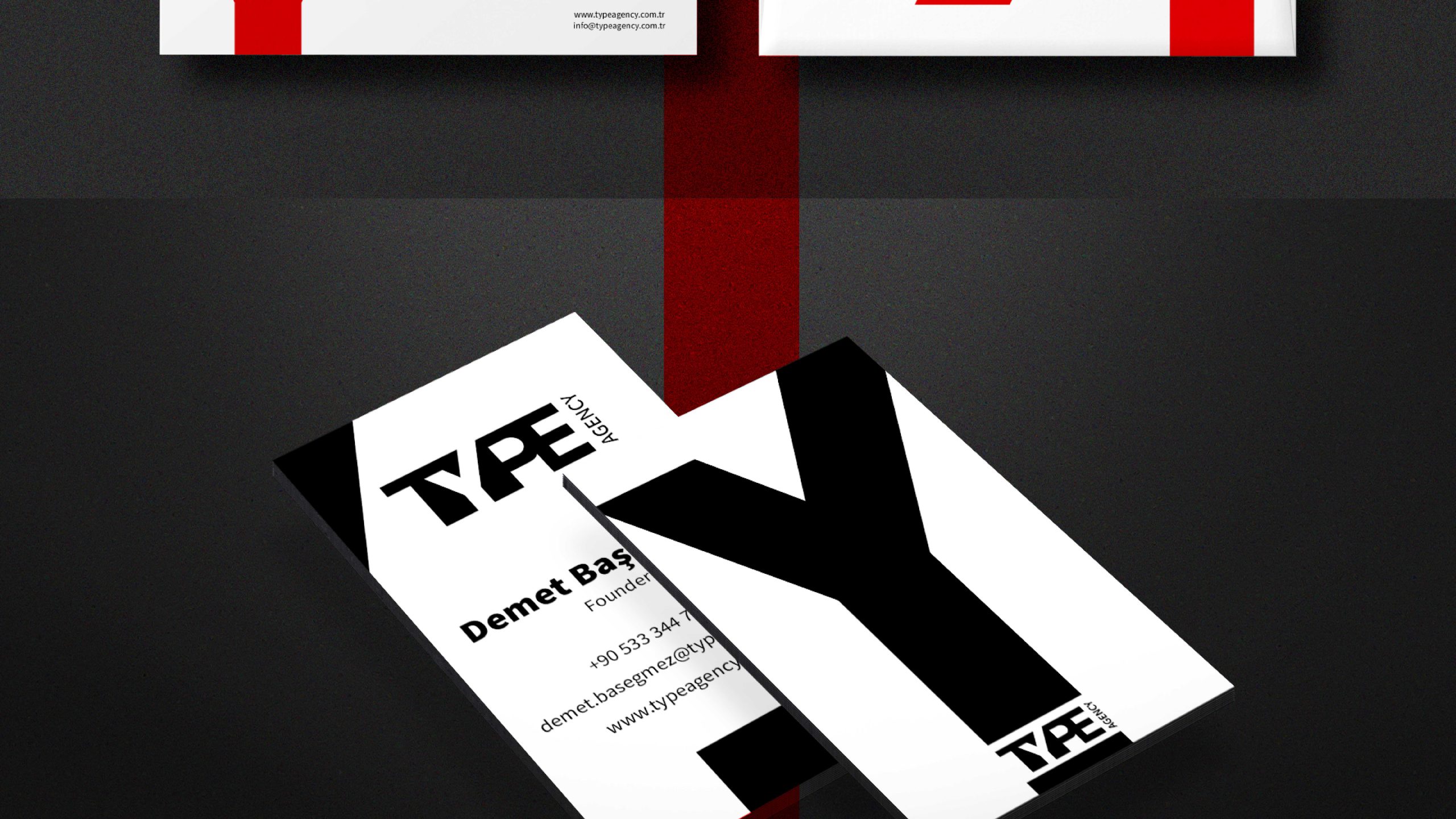
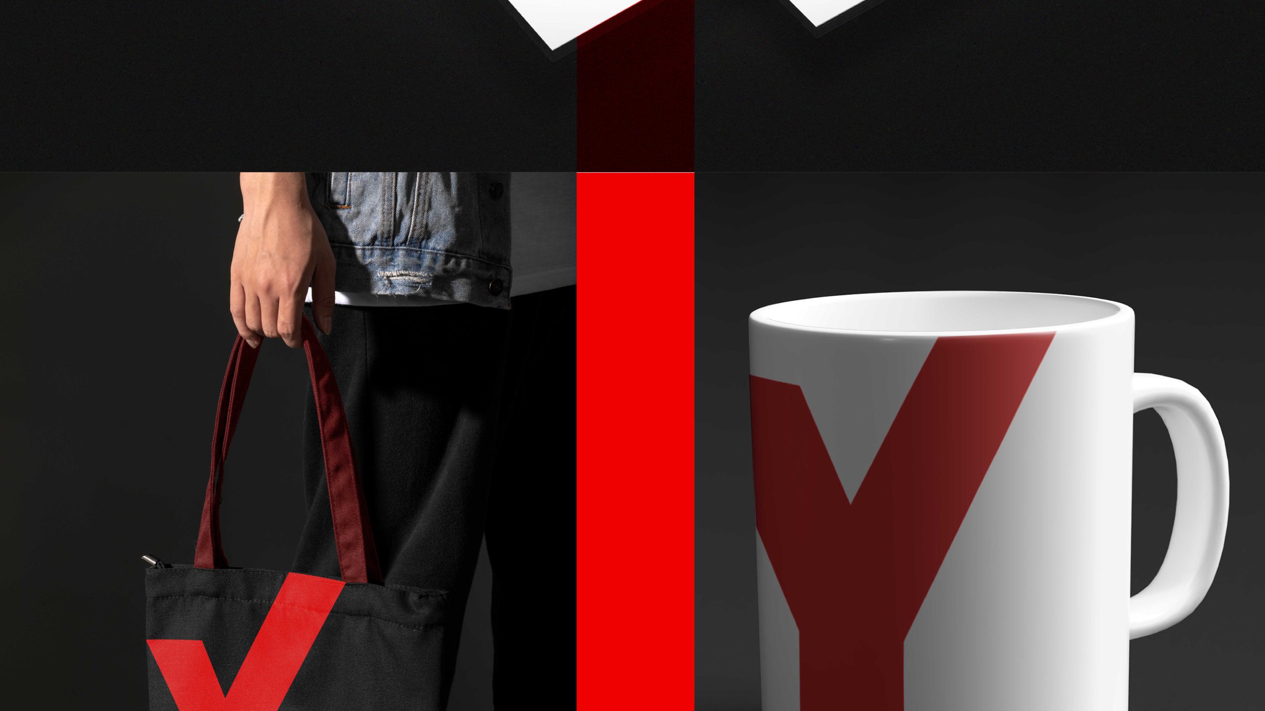
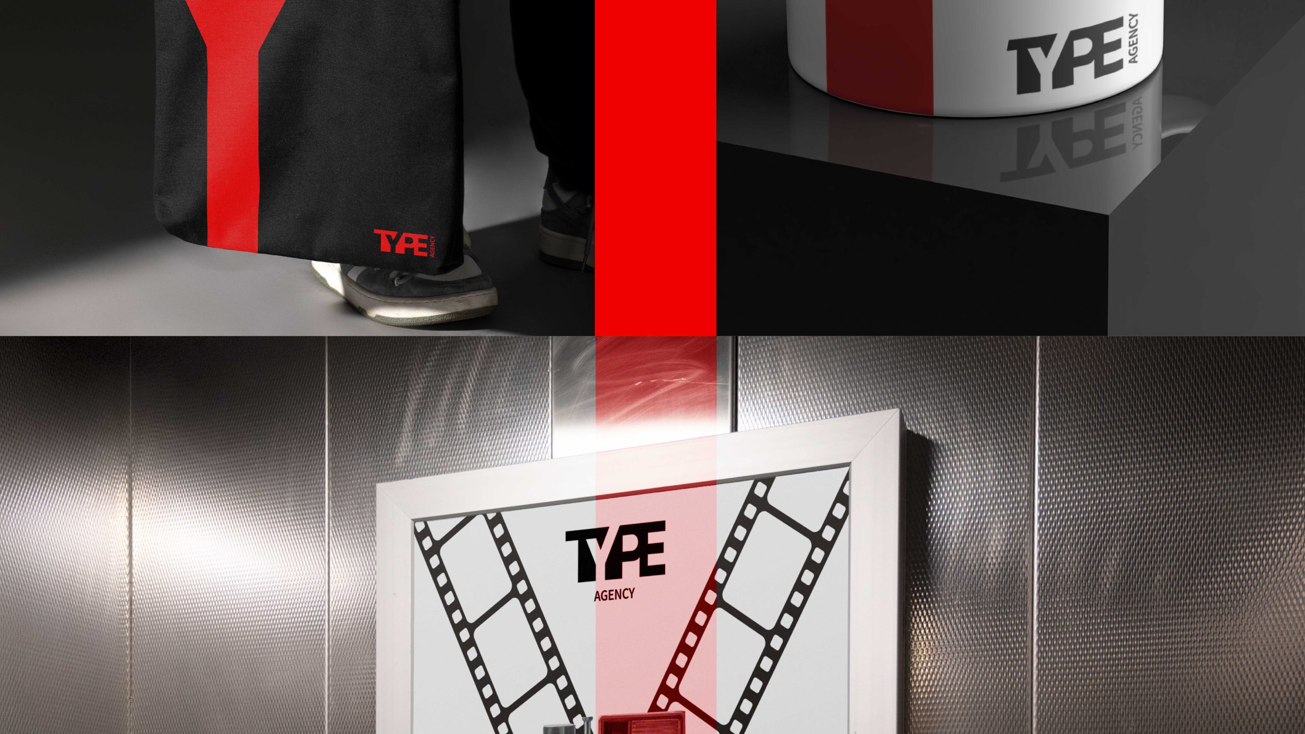
Our design goal was to create a logo that forms the letter "Y" using negative and positive space. This approach not only provided unique visual appeal but also reinforced the brand's identity.

Logo Design:
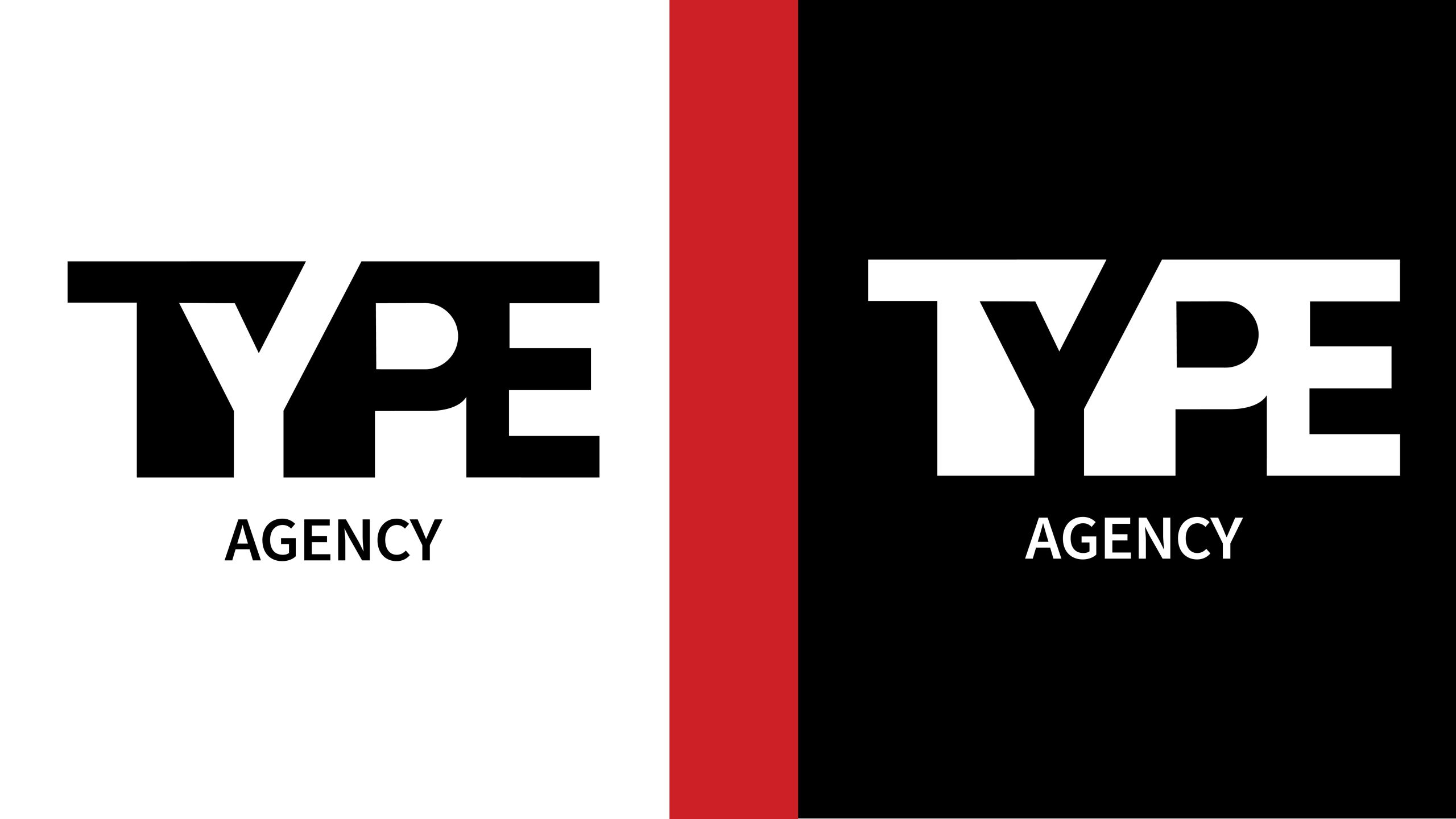
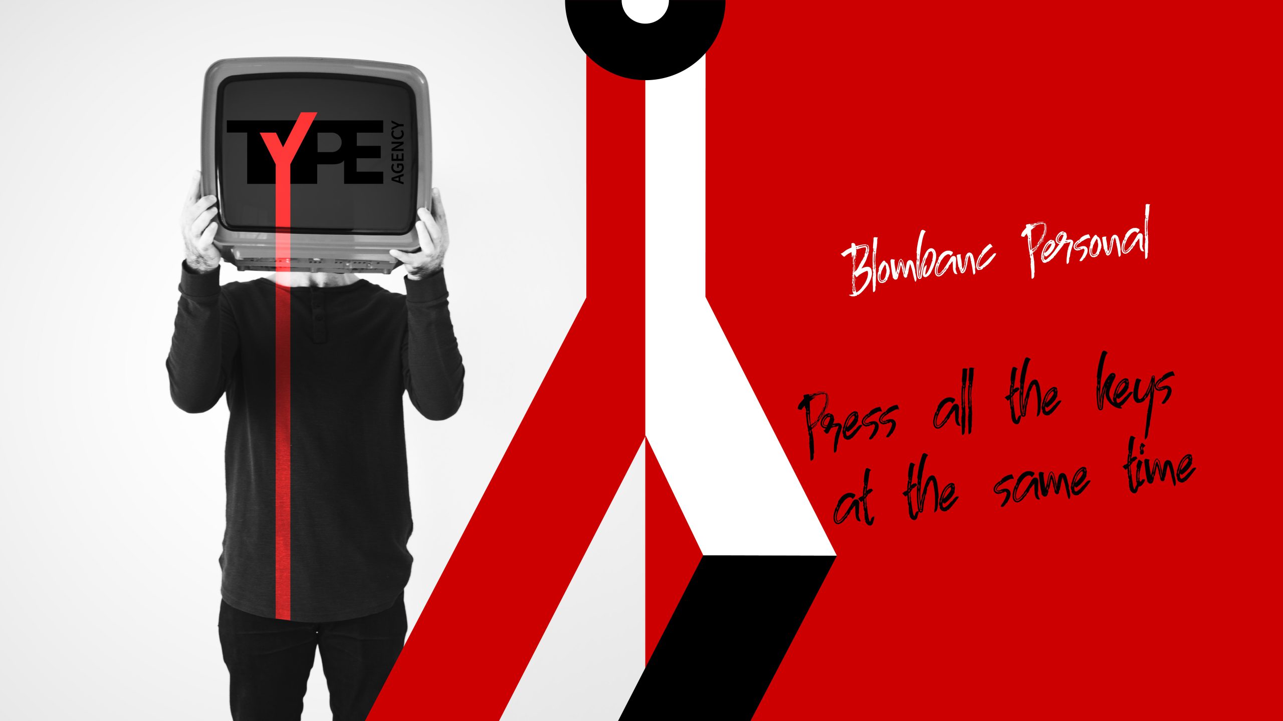
The logo design focused on the letter "Y," created through the use of negative and positive space within the word "TYPE." This innovative design choice generated a striking visual impact and helped emphasize the agency's creativity and forward-thinking approach.

Typography

The selected font is a bold and modern typeface that ensures the logo is easily recognizable and impactful. The use of clean and strong lines contributes to the overall quality and professionalism of the brand.

PROJECT

The primary color palette consists of black and red. Black represents sophistication and authority, while red adds energy and dynamism. This combination enhances the visual impact of the logo and aligns with the agency's brand values.

Symbolism: The "Y" formed through the interaction of negative and positive space becomes a distinctive emblem symbolizing Type Agency's innovative and strategic approach in the PR and advertising industry.

The brand identity developed for Type Agency successfully reflects the agency's commitment to innovation and quality. The combination of clever typographic design and a striking color palette creates a strong and memorable visual identity that strengthens the brand's presence and enhances its appeal.