LOADING, PLEASE WAIT..
BrandingLogo Design
A BRAND IDENTITY ROOTED IN THE ENSO CIRCLE

Enso Social Kitchen

THE ENSO CIRCLE, DRAWN IN A SINGLE BRUSHSTROKE, REFLECTS THE BRAND'S SIMPLE YET MEANINGFUL CHARACTER.

BRAND STRATEGY
DESIGN PROCESS
BRANDING

Enso's brand identity was inspired by the elegance of Japanese culture and the deep meaning of the Enso philosophy. The Enso circle, a symbol of the perfect cycle, is strongly emphasised in the logo, while translating ideas such as the cyclical nature of life, perfection within imperfection and balance into a visual language.

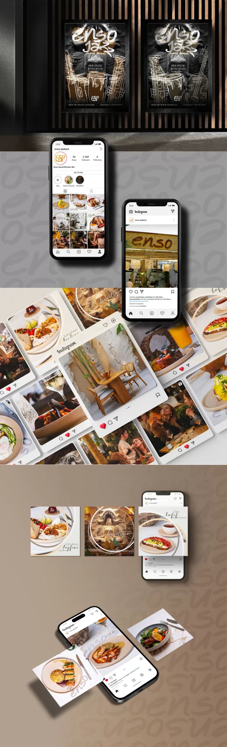
Minimalism and elegance were at the forefront of the logo design. Drawn in a single brushstroke, the Enso circle reflects the brand's simple yet profound character. The symbol sits at the centre of the brand across digital platforms and printed materials, strengthening the identity as a defining mark.

Enso Social Kitchen – Branding, Logo Design – Holl Graphic

DESIGN PROCESS

Our social media strategy was built to carry Enso's sophisticated, distinguished stance into the digital world. Every post consists of carefully chosen content that connects with users and invites them to become part of the story. Short videos carrying the energy of Afro music, photographs reflecting the venue's atmosphere and strong copy let our followers feel the Enso experience. By choosing an elegant and appealing tone, we carry the brand's premium positioning into the digital space.
Enso is not just a venue; it is an experience, a philosophy and a way of life. From the logo to social media posts, our brand identity aims to reflect this spirit in every touch, because Enso tells a story in every detail, and that story is inspired by life itself.


Enso Social Kitchen – Branding, Logo Design – Holl Graphic