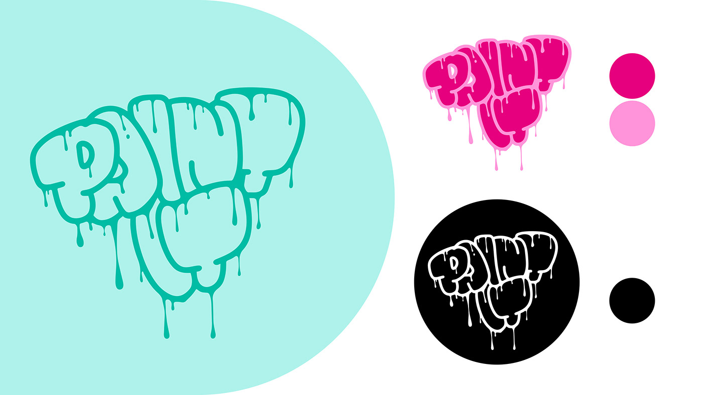
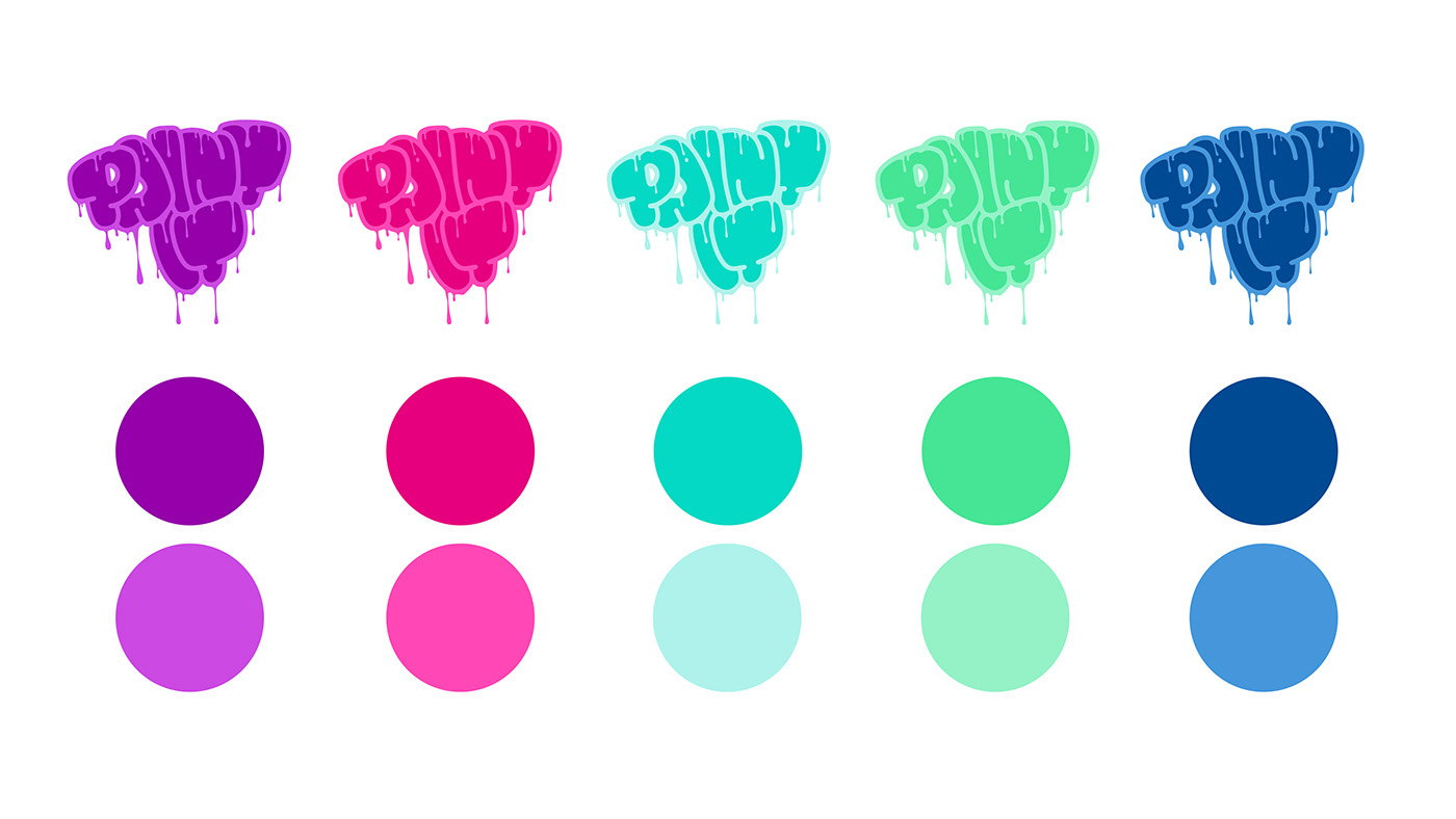
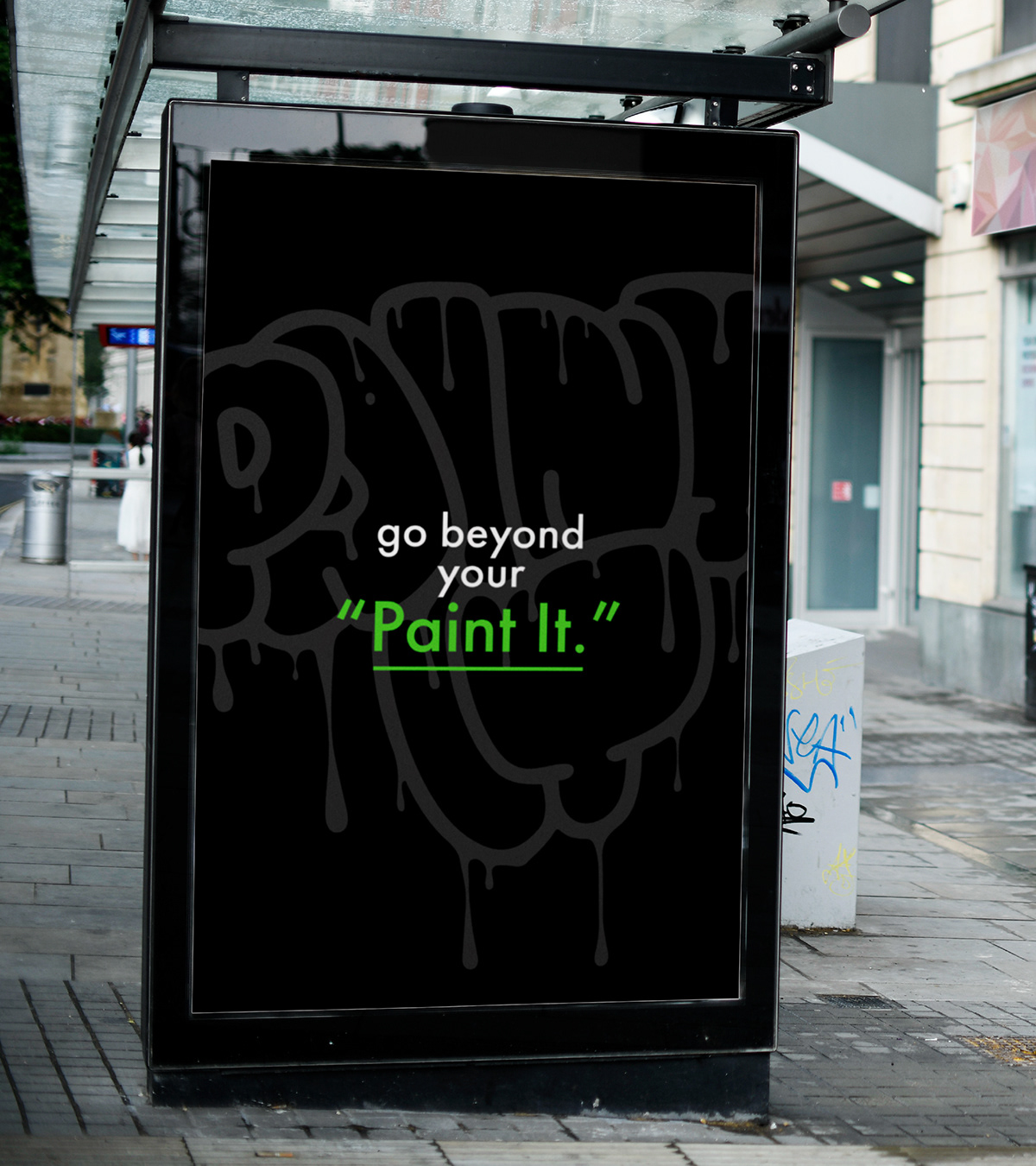
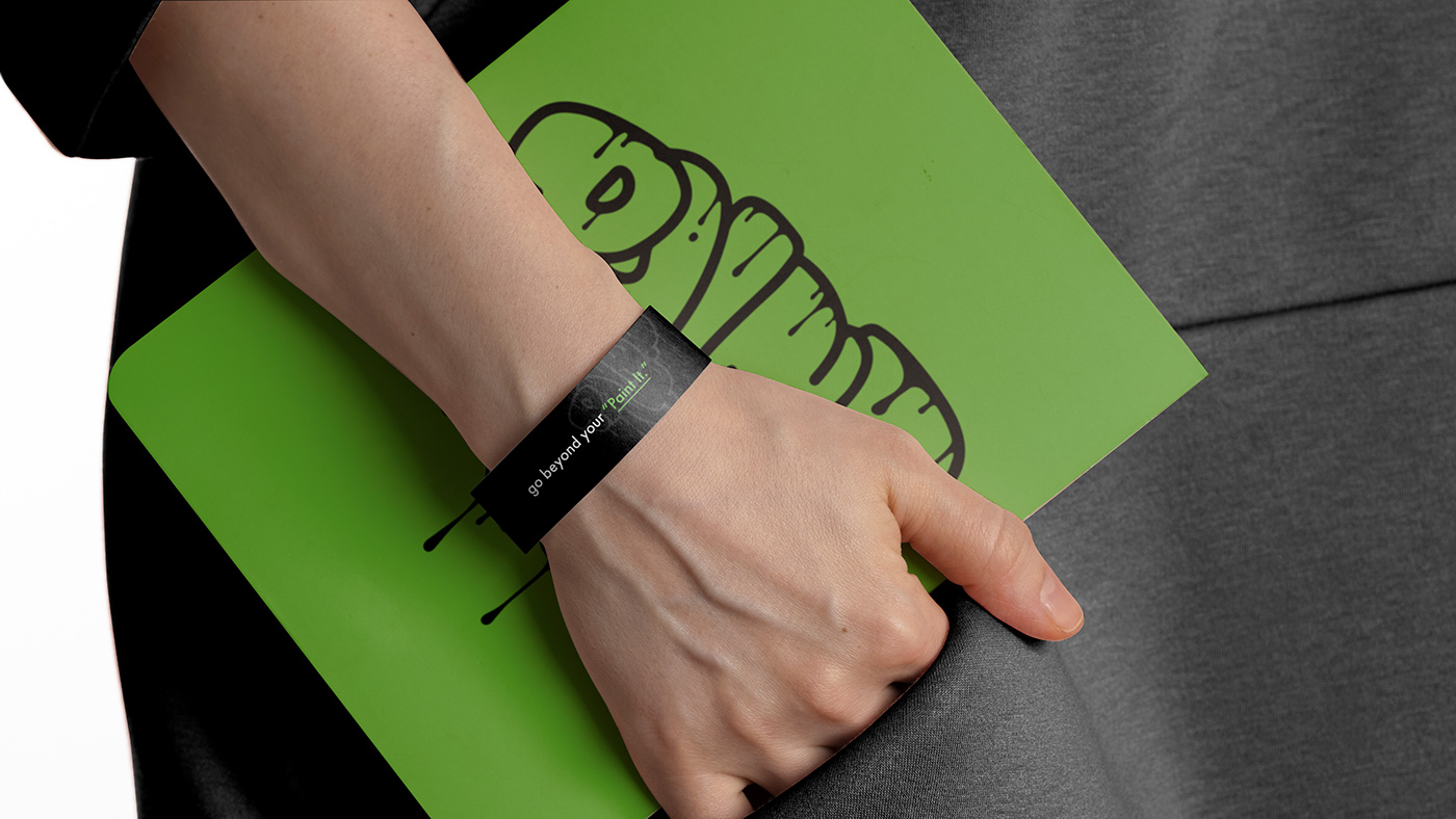
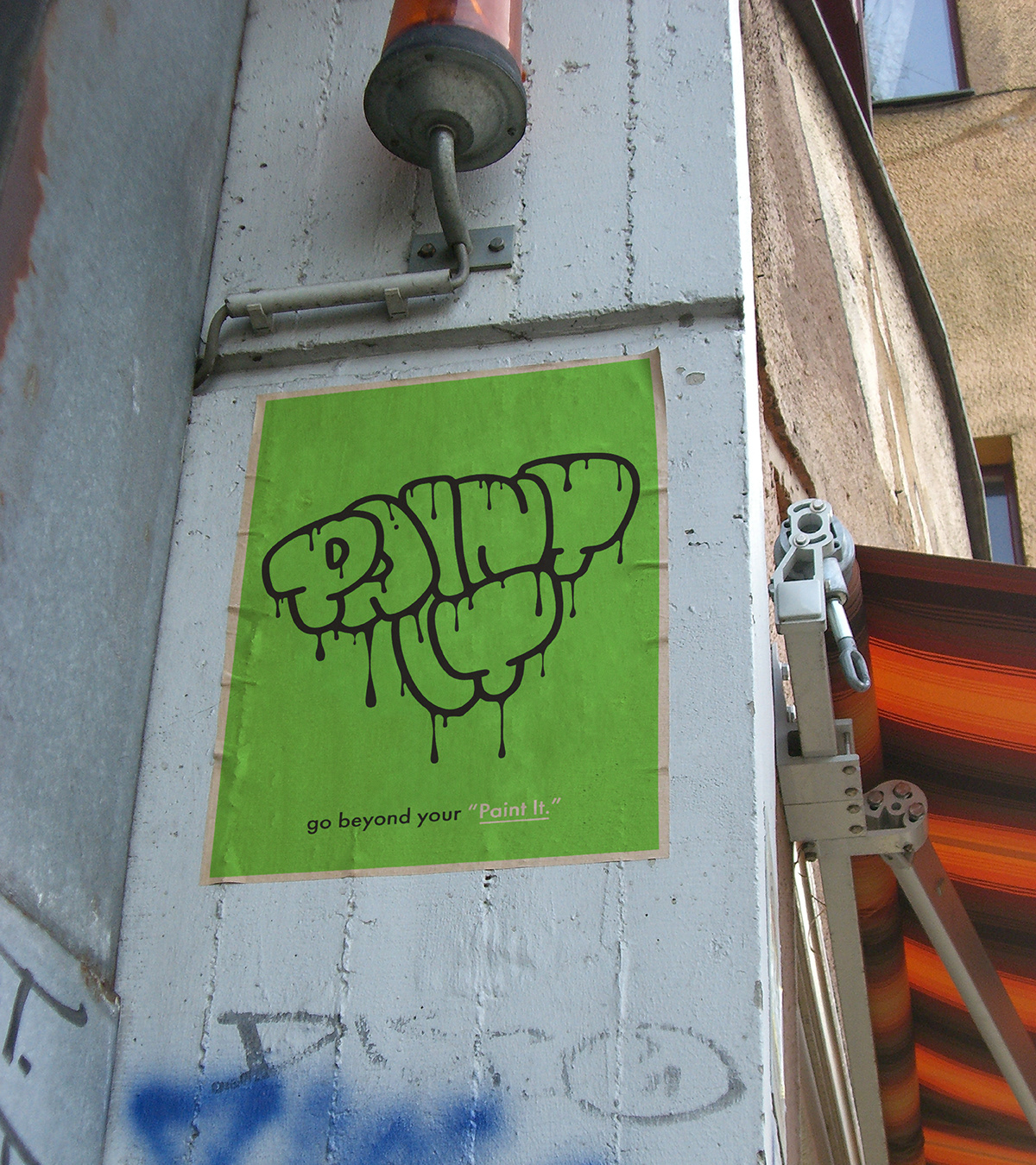
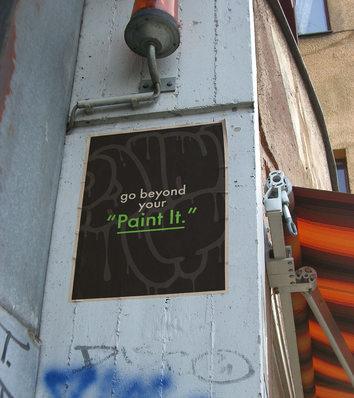
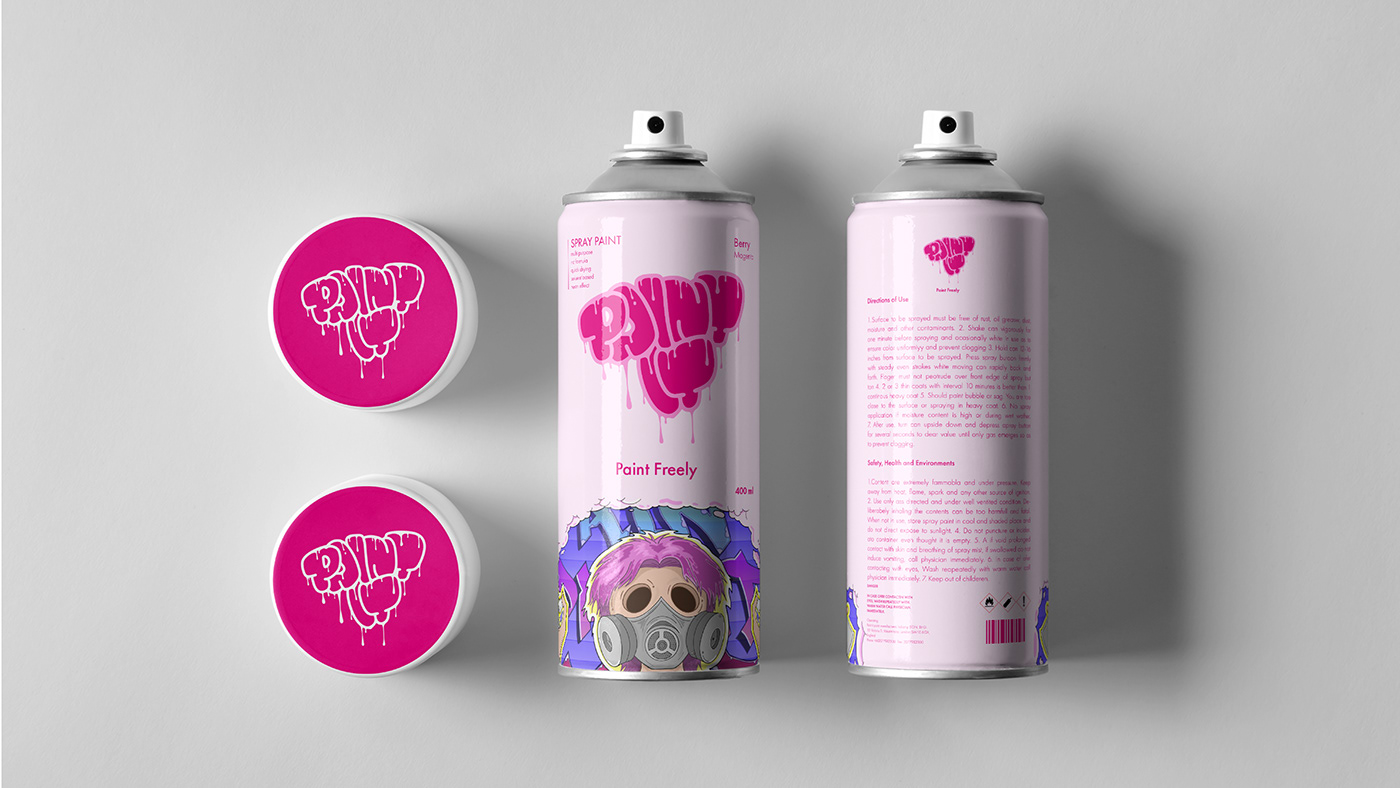
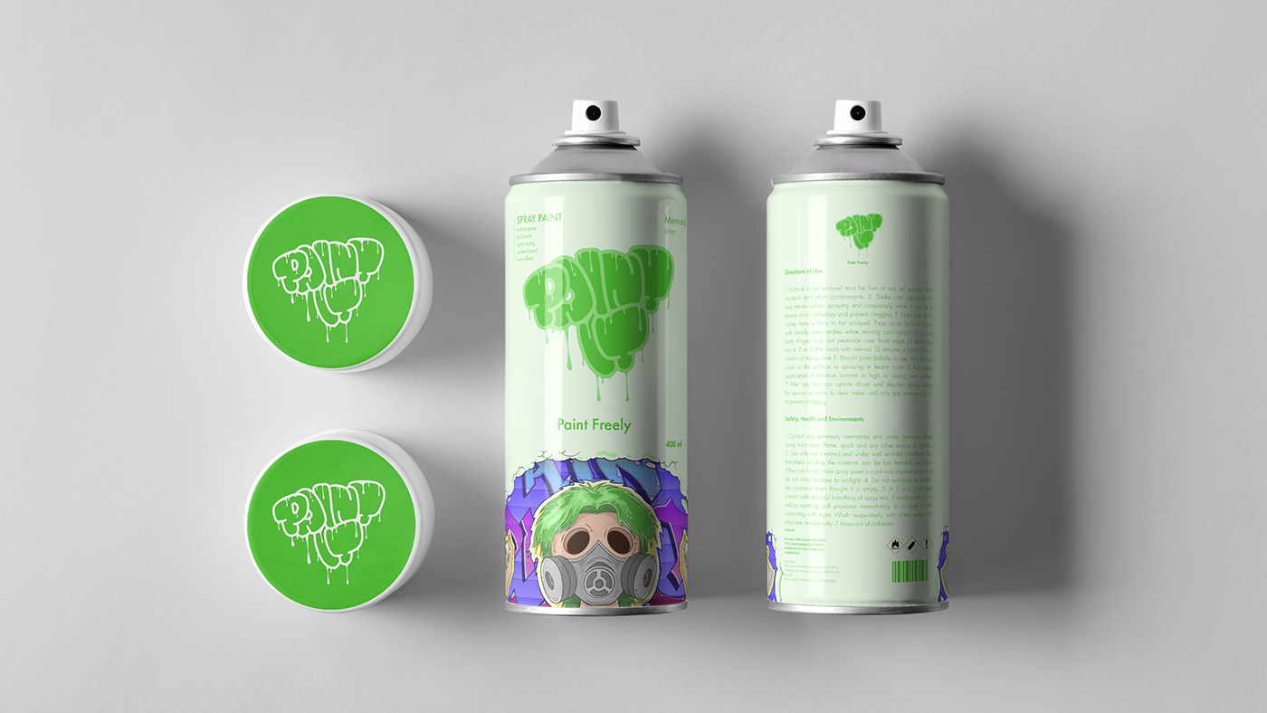
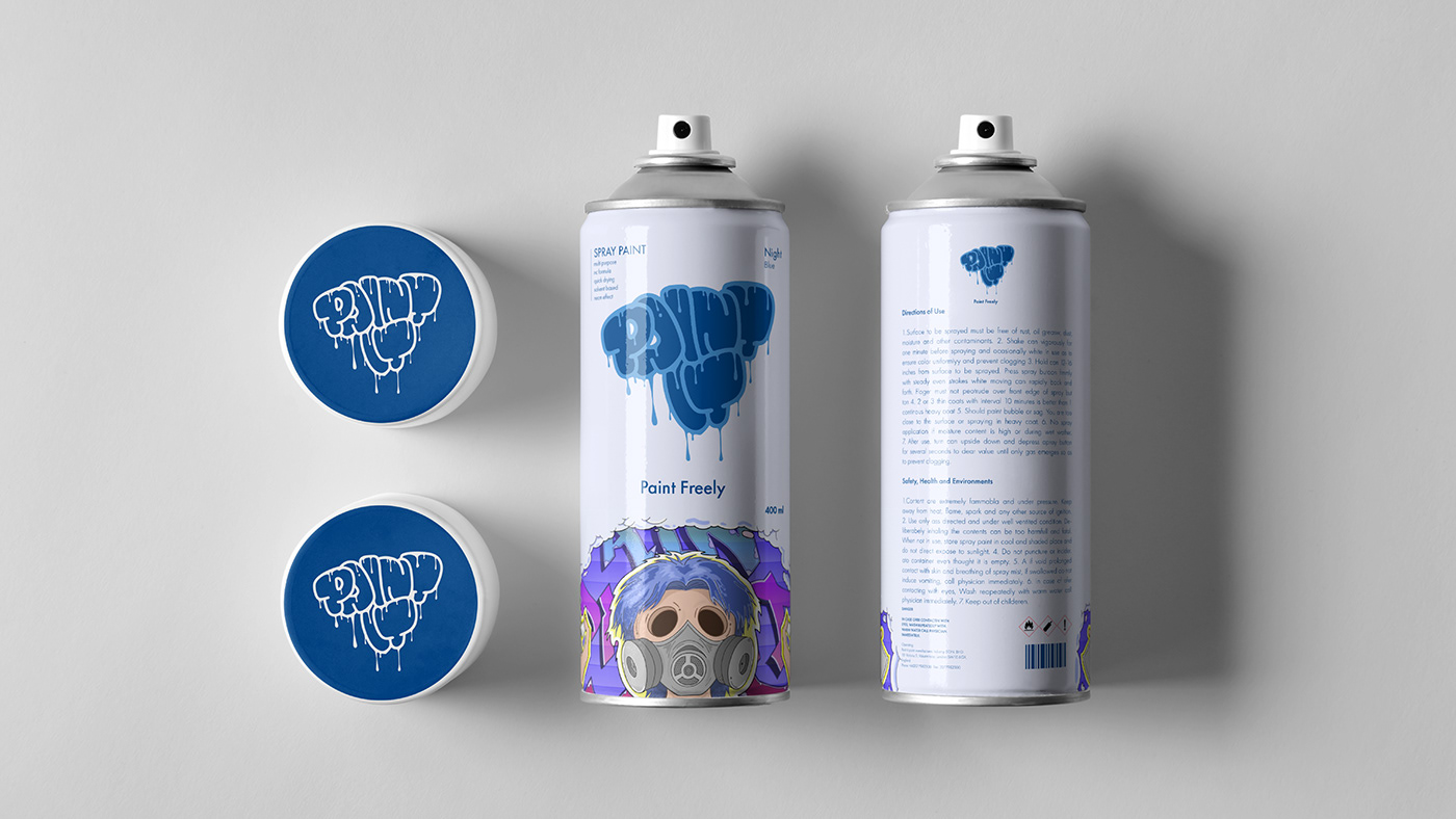
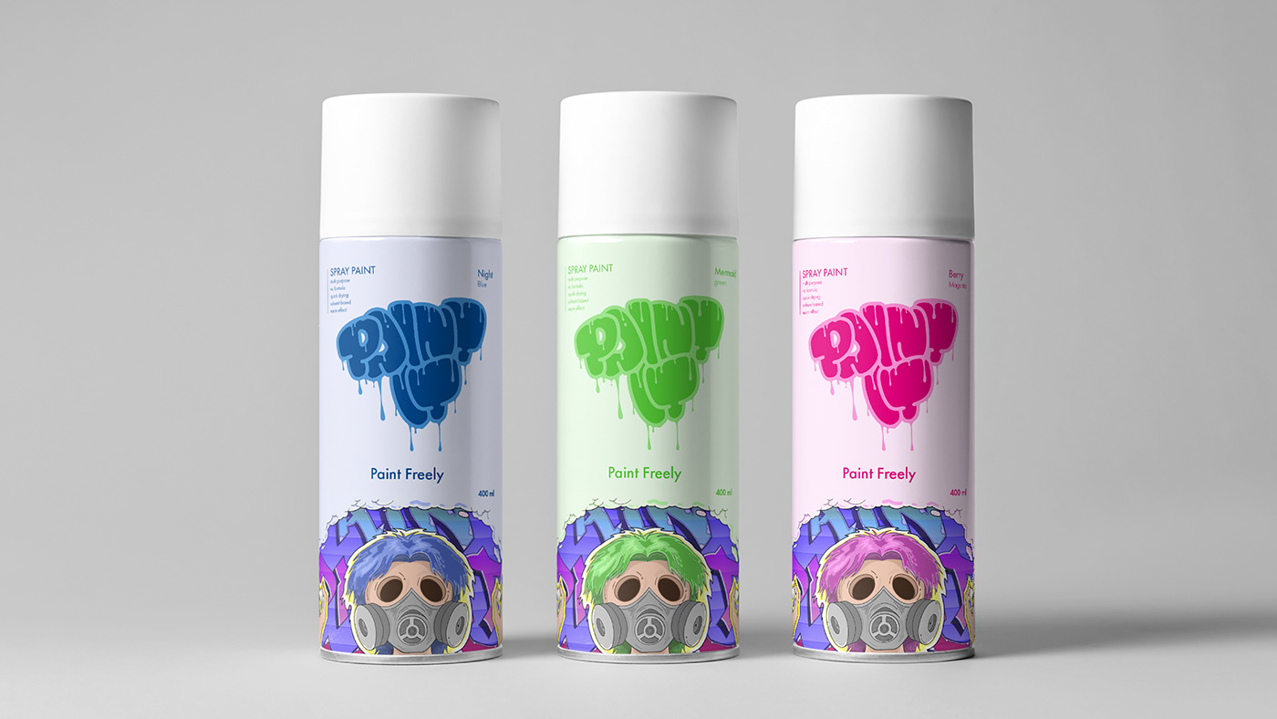
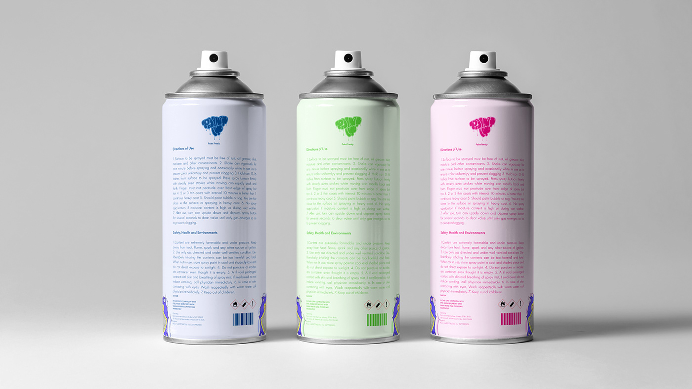
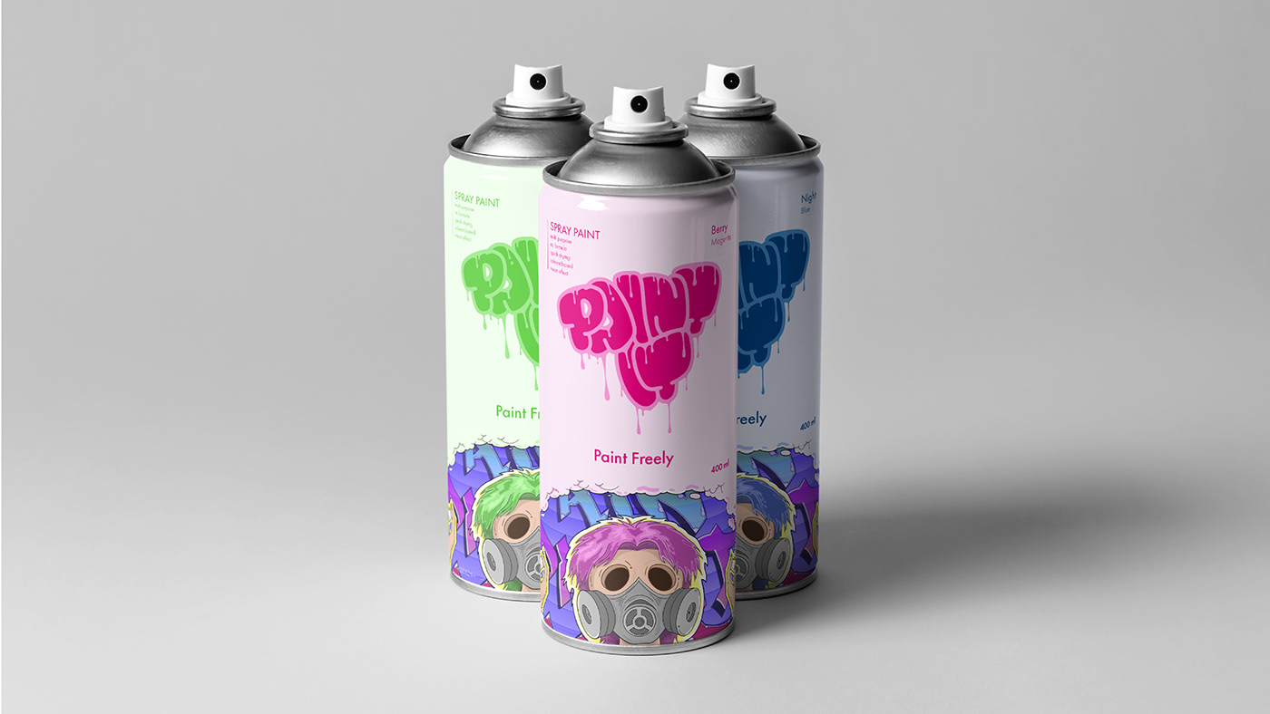
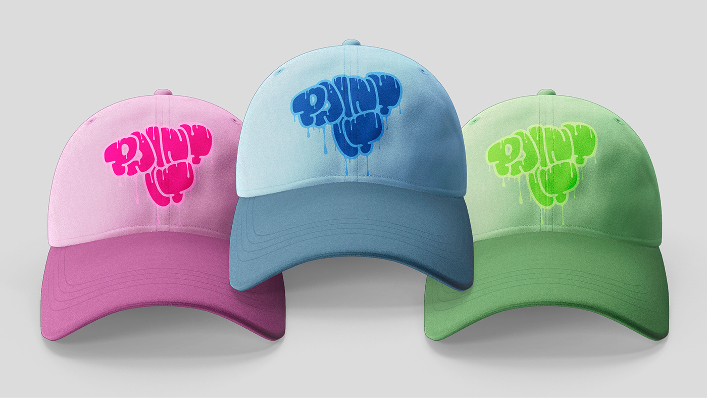
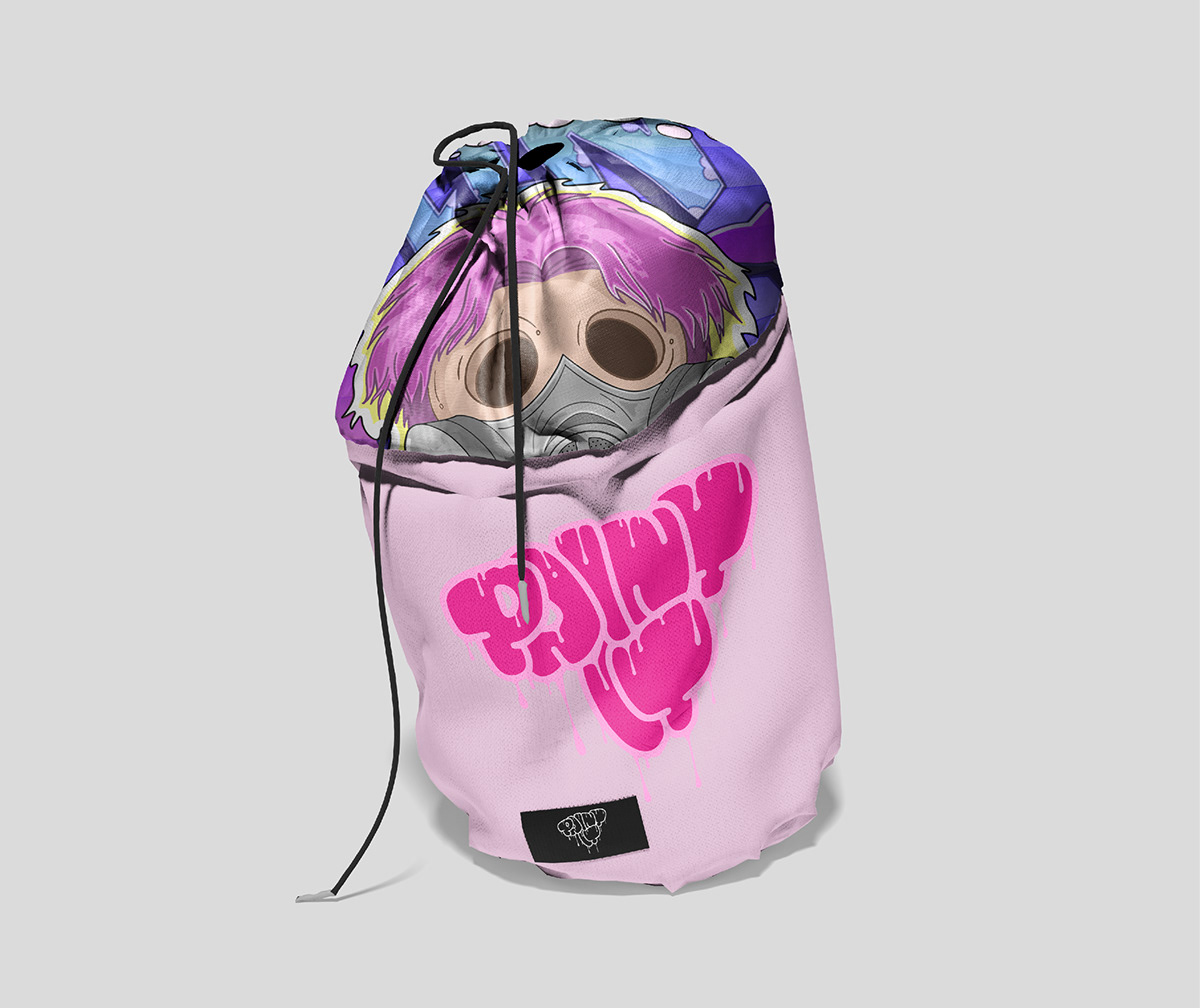
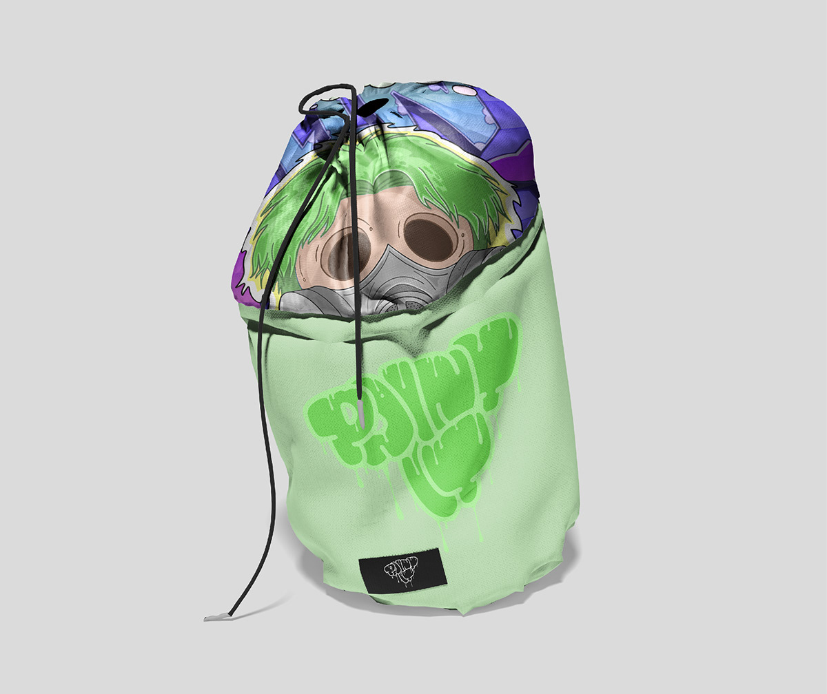
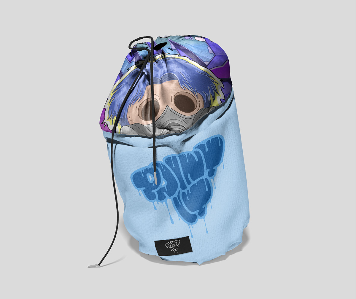
Paint It asked us to create a vibrant, dynamic corporate identity that would appeal to a young audience and highlight graffiti culture. Our goal was to reflect the energy and creativity of street art through modern design elements. Details: Logo Design: The logo was designed with a fluid, dripping paint effect that captures the essence of graffiti. Several colour versions were created for different media and backgrounds. Colour Palette: The palette includes bold, bright colours such as purple, pink, blue and green that evoke creativity and youth. Each colour variant was carefully chosen to complement the brand's dynamic nature.


BOLD COLOURS, A DRIPPING-PAINT LOGO AND GRAFFITI-INSPIRED PACKAGING BRING THE ENERGY OF STREET ART TO THE BRAND.
LOGO DESIGN
CORPORATE IDENTITY
PACKAGING DESIGN
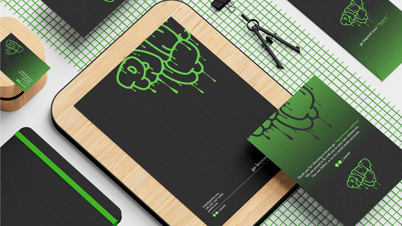
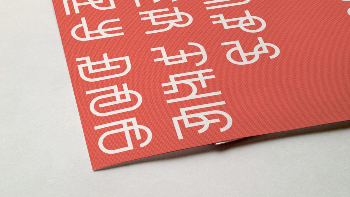
A modern, bold typeface was chosen to reflect the brand's energetic and playful nature. The typography was designed to be easy to read and visually appealing, in harmony with the graffiti-inspired aesthetic. Corporate Identity: Corporate identity materials such as business cards, letterheads and promotional items were designed with the graffiti theme in mind. Consistent use of the logo, colour palette and typography created a cohesive, recognisable brand image. Packaging Design: The spray paint cans were designed to stand out with vivid colours and the graffiti-inspired logo. The packaging also features an illustration of a masked graffiti artist, emphasising the brand's connection with street art culture.

RESULT
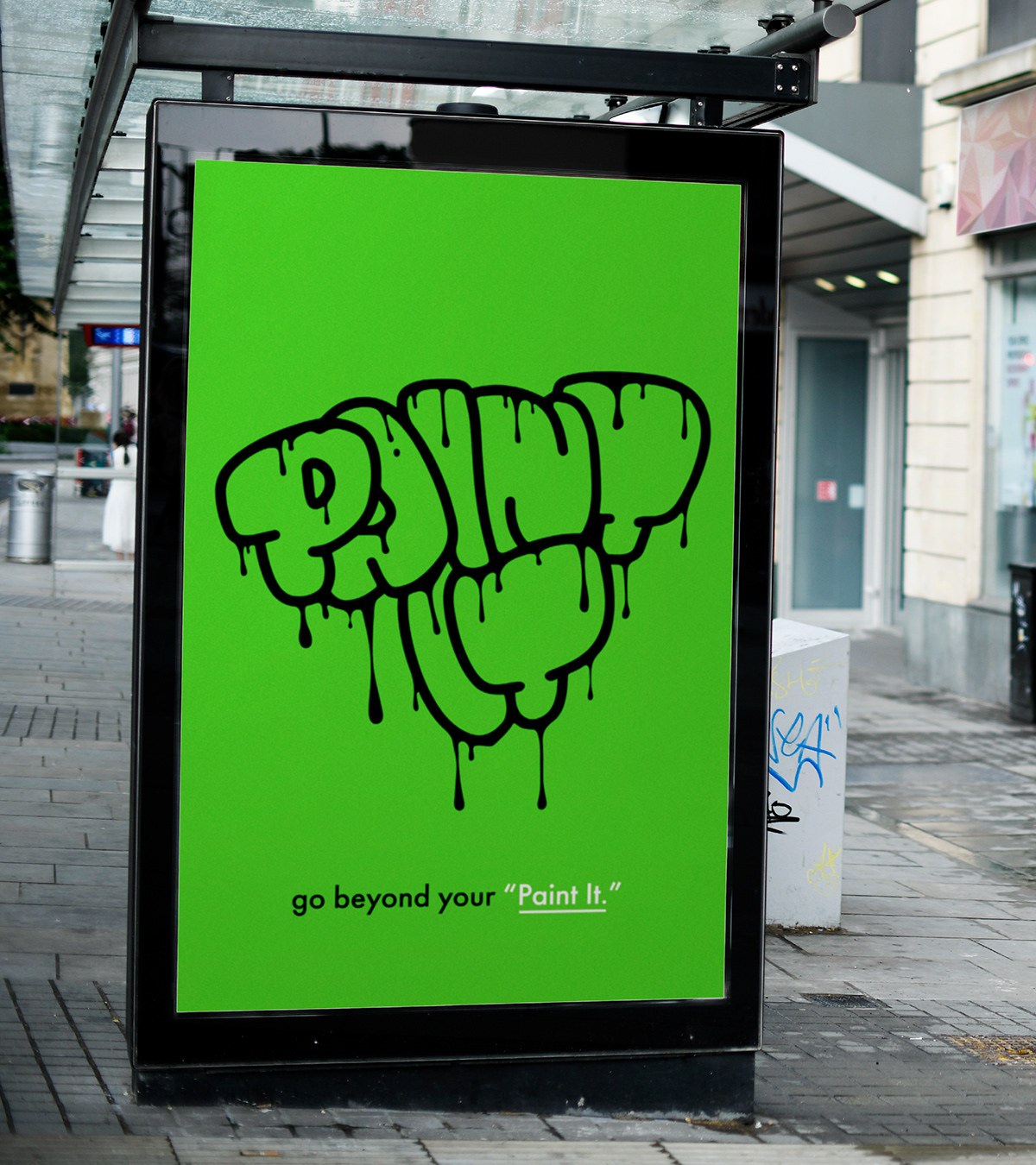
The corporate identity and packaging design for Paint It successfully reflect the brand's young, creative spirit. Graffiti-inspired elements help the products stand out on the market and create a strong visual impact. With this project, Paint It is positioned as a dynamic, innovative brand for young audiences and street art enthusiasts.