By highlighting the birth and evolution of each letter, Fertile Display offers a fresh, innovative perspective on type design, making it a valuable addition to every designer's toolkit.

FERTILE DISPLAY IS PERFECT FOR
HEADLINES,
POSTERS
AND OTHER CREATIVE PROJECTS
THAT CALL FOR A BOLD,
STRONG TYPOGRAPHIC PRESENCE.
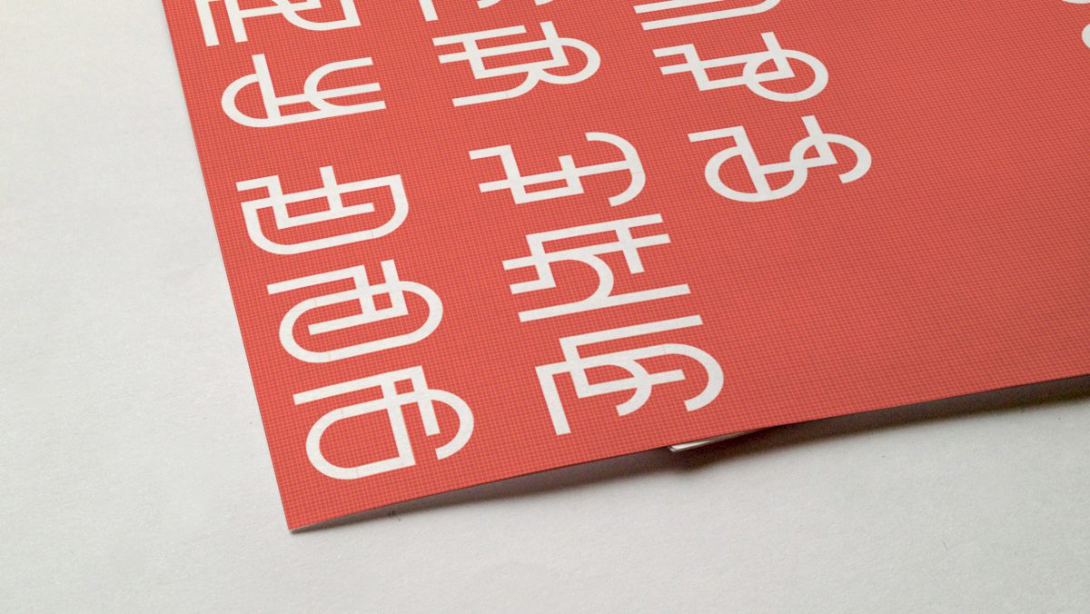
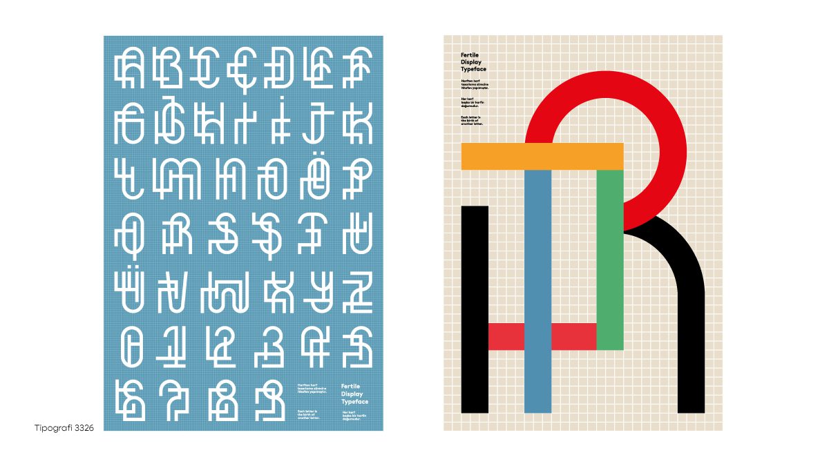
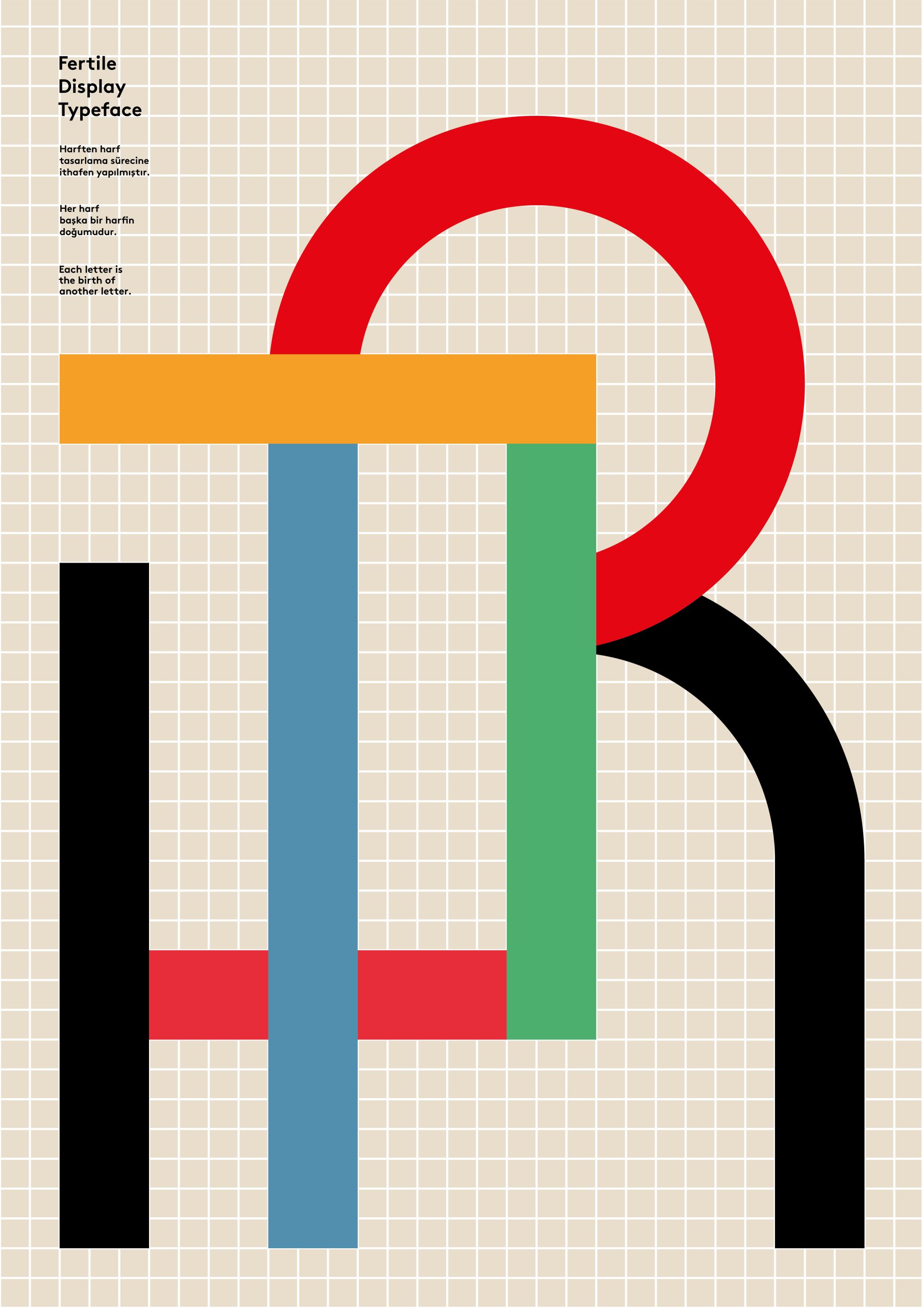
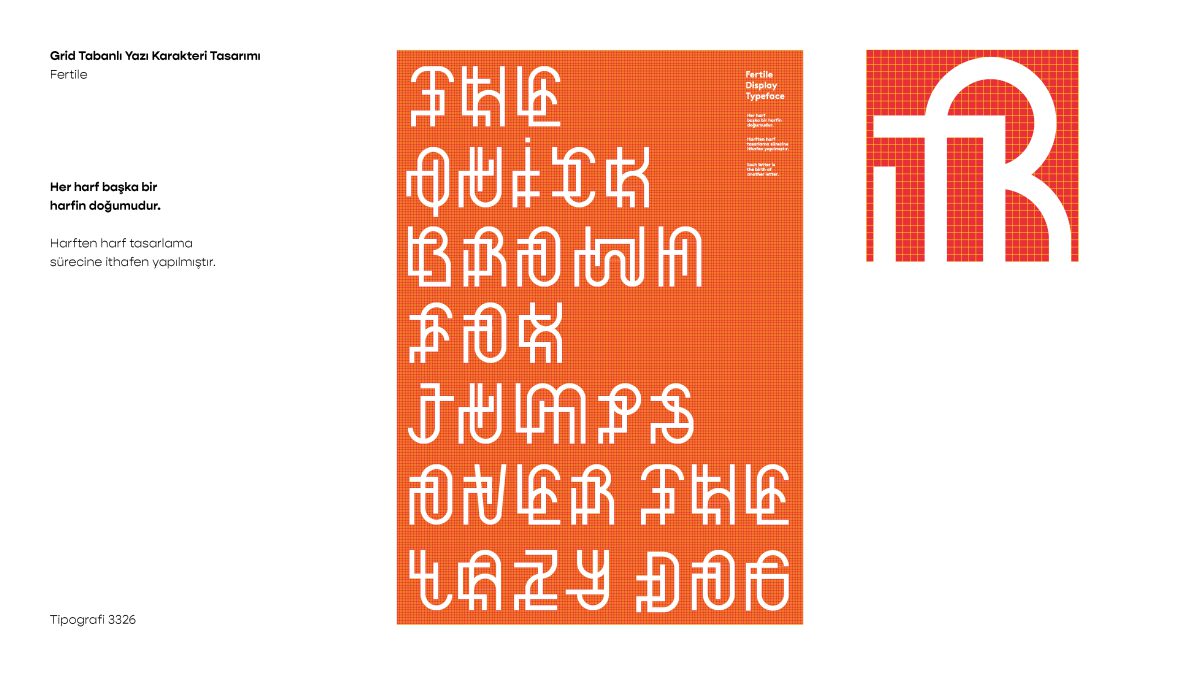
Concept and Design: Inspired by the letter design process, Fertile Display showcases the evolution of typography through a grid-based system. The typeface explores the relationship between form and structure, highlighting how each character can be born seamlessly from another. This connection is evident in the geometric, modular structure of the letters.
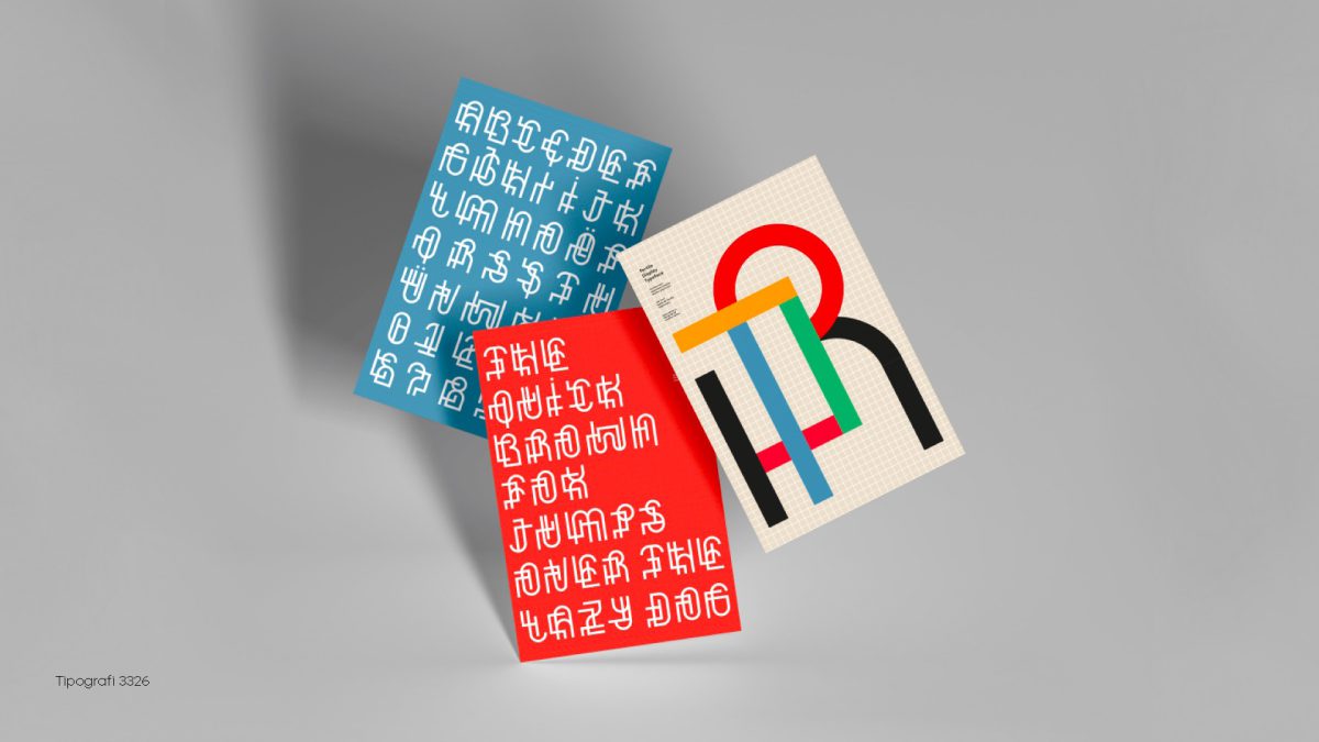
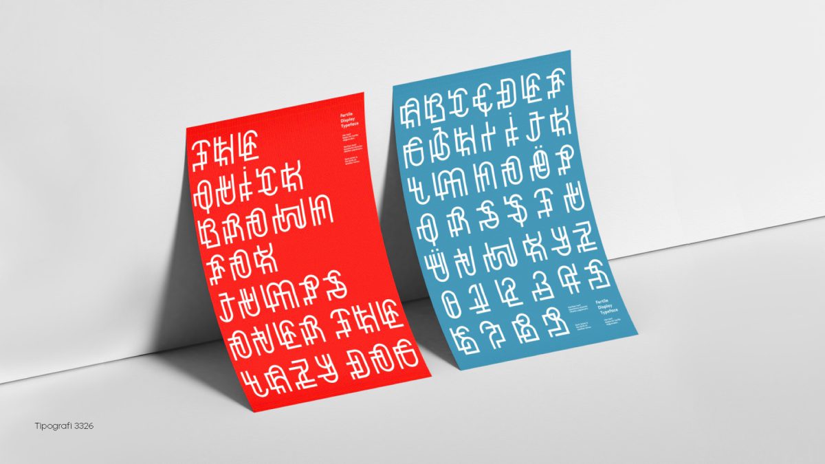
Visual Identity: The typeface has a bold, versatile design suited to a wide range of display uses. Its vivid, contrasting colours further increase its visual impact, making it an ideal choice for posters, graphic design projects and other creative applications.
Typography Details:
Grid-Based Structure: The typeface was carefully crafted on a meticulously built grid system to ensure consistency and harmony across every character.
Colour Palette: The use of primary colours adds a dynamic, playful element, making the typeface visually appealing and versatile.
Applications: Fertile Display is perfect for headlines, posters and other creative projects that require a bold, strong typographic presence.
Project Gallery
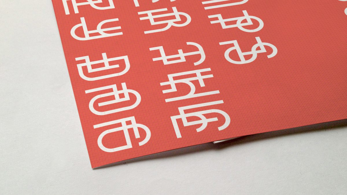
Project Gallery: Poster Design: The posters present Fertile Display in various colour combinations, showing its versatility and visual impact. Type Specimen: Detailed specimen pages highlight the construction and design principles of each character.
Project Strategy
Application Examples: The typeface is shown in different design contexts, including editorial layouts and brand materials.
By highlighting the birth and evolution of each letter, Fertile Display offers a fresh, innovative perspective on type design, making it a valuable addition to every designer's toolkit.